Colour Schemes – Part 3 of 6 – Pastel Delights
Our exciting journey in the world of colour has lead us through the hallways of the dynamics, functionality, influence, application, harmonious and spectacular results of colour in our everyday life and living space.
We have discovered colour is alive, communicates, sets a mood and attracts attention. (http://letsrevamp.com.au/what-a-wonderful-colourful-world-we-live-in)
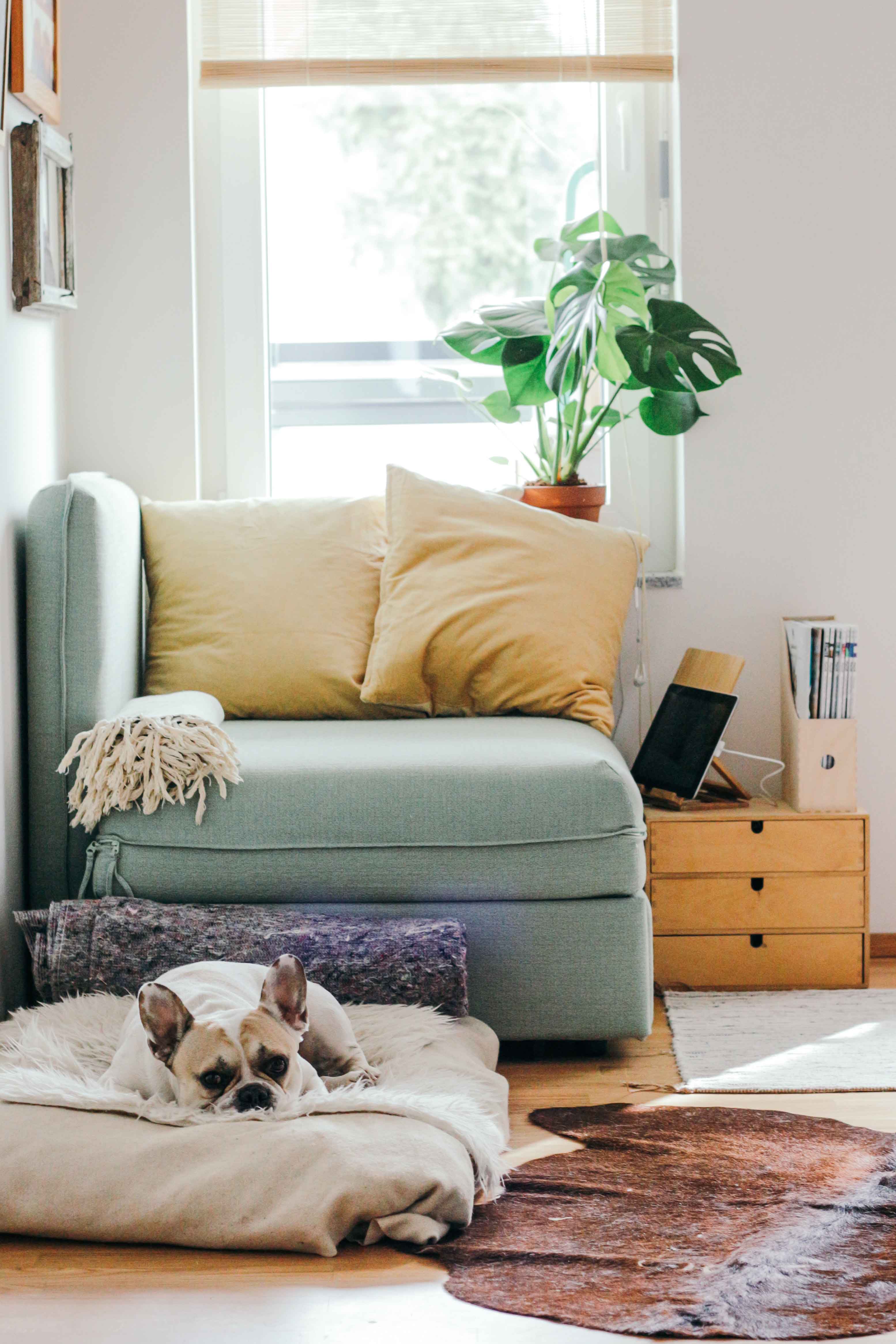
Pastels are colours mixed with white to bring forth those soft, welcoming, embracing, pale, gentle and soothing colours.
Surprisingly, after the winter months one would expect that the bold, vibrant and spectacular colours would be embraced. Yet, as it appears, not so.
Advertisers target our springtime emotions through pastel colors. Pastels have a calming effect, and everywhere you look companies are using them to feed our desire to feel a bit of spring.
Pastels are less saturated than primary colours, making them feel light, soft, and calming. For spring, they work well with neutral colours to create a feeling of earthiness and sophistication.
(https://www.xrite.com/blog/spring-color-update-psychology-of-pastels)
Though attention is given to pastel colours especially at spring, these colours are actually great to make your living space feel light, cosy and airy all year round.
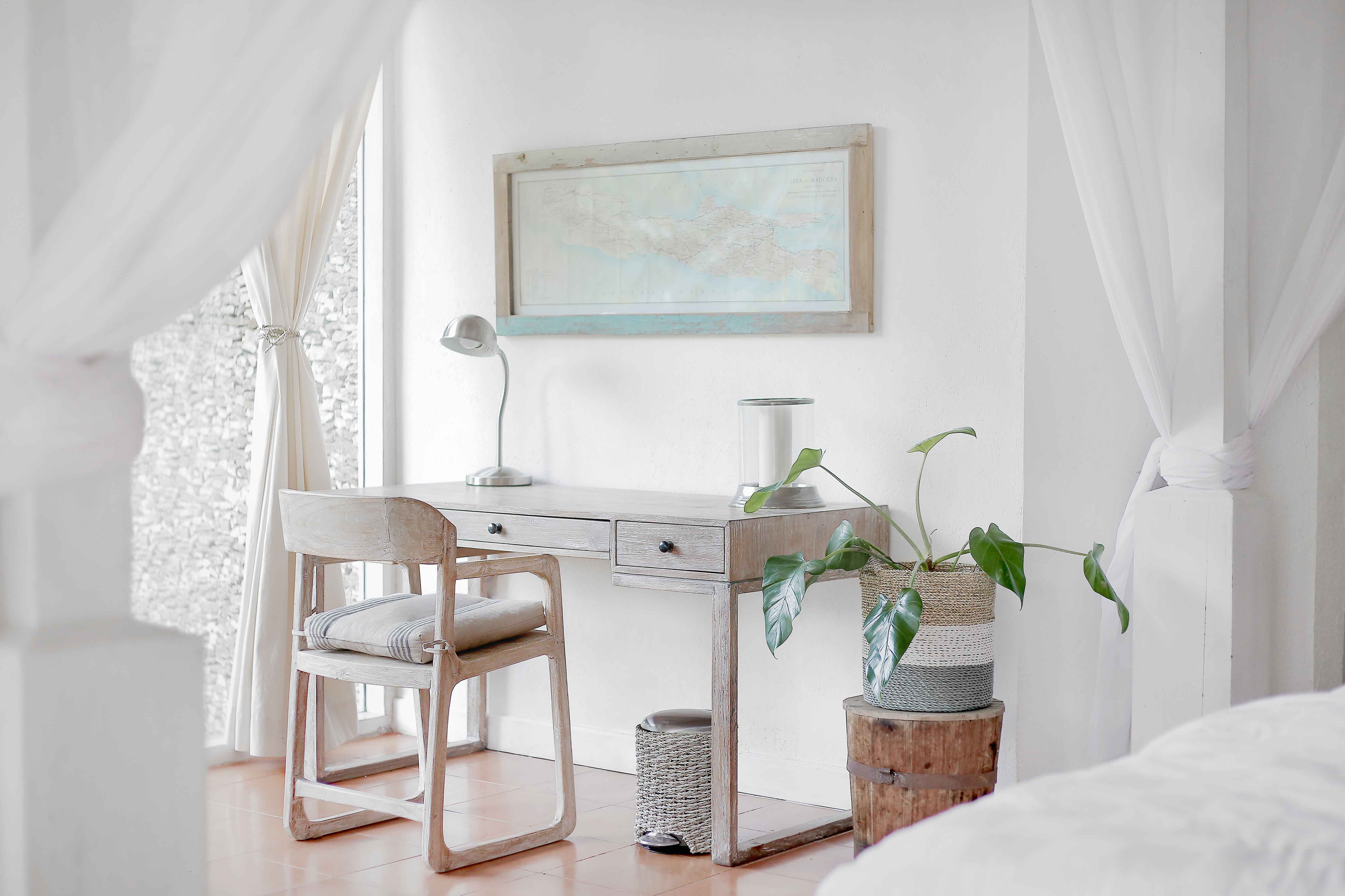
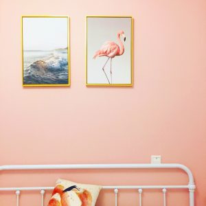
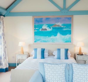
1. Pastels in the bedroom
Pastel colours in the bedroom are not just for little girls and baby rooms; these colours are in fact stylish with a sense of being all grown-up.
Pastels combine well with bolder and brighter accent colours,

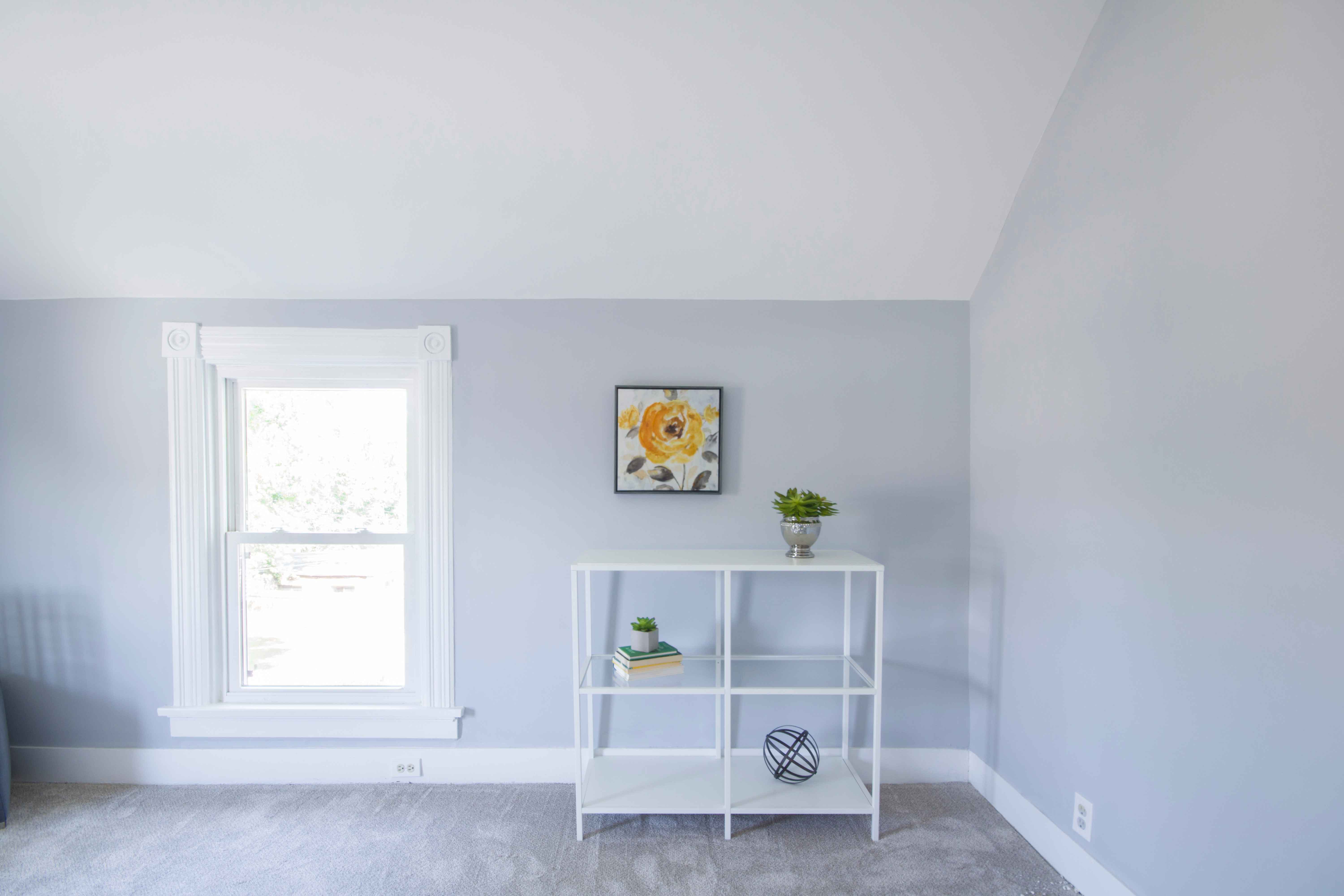
2. Pastels Look Great On Walls.
They make small rooms look spacious.
3. Pastels when staging your home for sale.

Image courtesy of [ Idea go] at FreeDigitalPhotos.net
http://www.freedigitalphotos.net/images/Property_g196-Sales_Home_In_Color_p18406.html
Perhaps you are thinking of selling your home. Are the walls currently pastel in colour? Do you feel the need to repaint although the paint is still in excellent condition?
No need. As it turns out, pastels do very well when a property is in the market for sale. Pastels present a soothing clean feel and fresh look, and need to be the background and secondary colours in the room.
- Should the new home owner decide to paint the walls another colour, pastel colours are easy to repaint, and more than likely would only need one coat of paint.
- Pastels colours are complementary and do not overwhelm. The comforting and relaxing atmosphere encourage potential buyers to slow down, linger, assess and visualize living there.
- Pastels are cheerfully toned colours. They tend to initiate reminiscences of happy moments like birthdays, family and friend visits, Christmases and other celebrations.
I hope you have been inspired. We continue our journey, and will spend time at Incredible and Unusual Mates – Blue and Green.
See you next time (image from https://photos.icons8.com/)