Consider Classic Blue in 2020
The Pantone Colour Institute’s 2020 colour of the year is a focus on “Classic Blue”; not quite dark navy in shade and described as a “restful colour” evoking calmness and “suggestive of the sky at dusk”. The colour can easily be used in many applications inside and outside the home.
You might be considering selling your property this year or updating its look and feel. Look at different materials in different shades, textures and patterns of the same colour and mix with other colours. Consider layering shades of the same colour.
Don’t be afraid to experiment with Classic Blue or other Pantone colours and get creative. If you paint a darker feature wall such as Classic Blue as a cost effective option for example, but you decide you don’t end up liking it after all or it’s time for a change later on, you can always repaint.


Use Pantone colours in larger and smaller quantities to suit different areas of your home. Just weigh up what you really like versus how it will look and last over time and how easy it is to change as well as the expense. If you’d like expert advice contact Let’s Revamp for property staging services and interior decorating services.
We’ve set out some ideas to get you started when it comes to adding Pantone colours to your home.
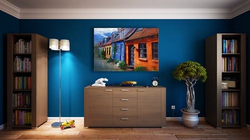
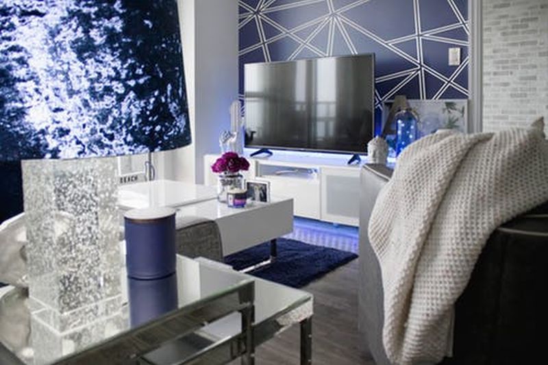
- On walls, from an accent wall or feature wall providing a focal point to all walls both for higher visual impact and to inject additional character to most rooms or spaces. Select a suitable colour and appropriate wall (behind your TV may be one option) in a room or a feature wall in Classic Blue may help define one space from another in an open plan setting. Consider the type and size of the area if you’re considering all walls as a bolder colour may make a room look smaller.
- On your floors from vinyl flooring to stone flooring if you’re sure the colour is for you, as this is generally a longer term and higher expense item or a rug in an open area or space which will also clearly define the function of the space.
- From a contrasting colour in some cabinets or backsplash to all cabinetry in your kitchen depending on the size of this space and your budget.
- Perhaps as a feature wall for the bedroom behind the head of the bed or on the bedhead, or a throw for the bed.
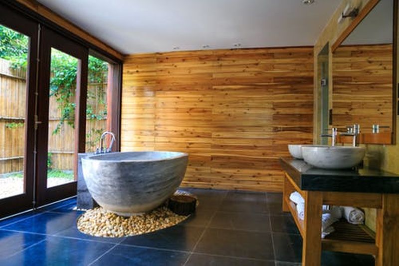
- Incorporating some colour into your bathroom, from towels to feature tiles or vanities or more extensive use of the colour with this year’s Classic Blue representing the ocean.
- In furniture pieces such as a large lounge or prominent in chair fabric to make more of a ‘statement’ rather than take over the whole space.
- In your home office for splashes of colour and to enhance the mood of your working area.

- Artwork and accessories such as cushions or curtains, or vases and bowls or kitchenware for more little pops of trendy colours for a new feel throughout your home.
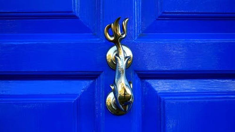
- Features of the exterior of your home such as a bolder Pantone colour to draw your eye to the front door.
- Add more colour to your garden or entertaining area such as a bench or outdoor feature wall.
Contact Let’s Revamp’s consultants for pre-sale property styling to maximise your profit and sell in good time, or for full property styling or partial property styling to add colour with impact to your home.