12 Calming and Stress-Reducing Paint Colours
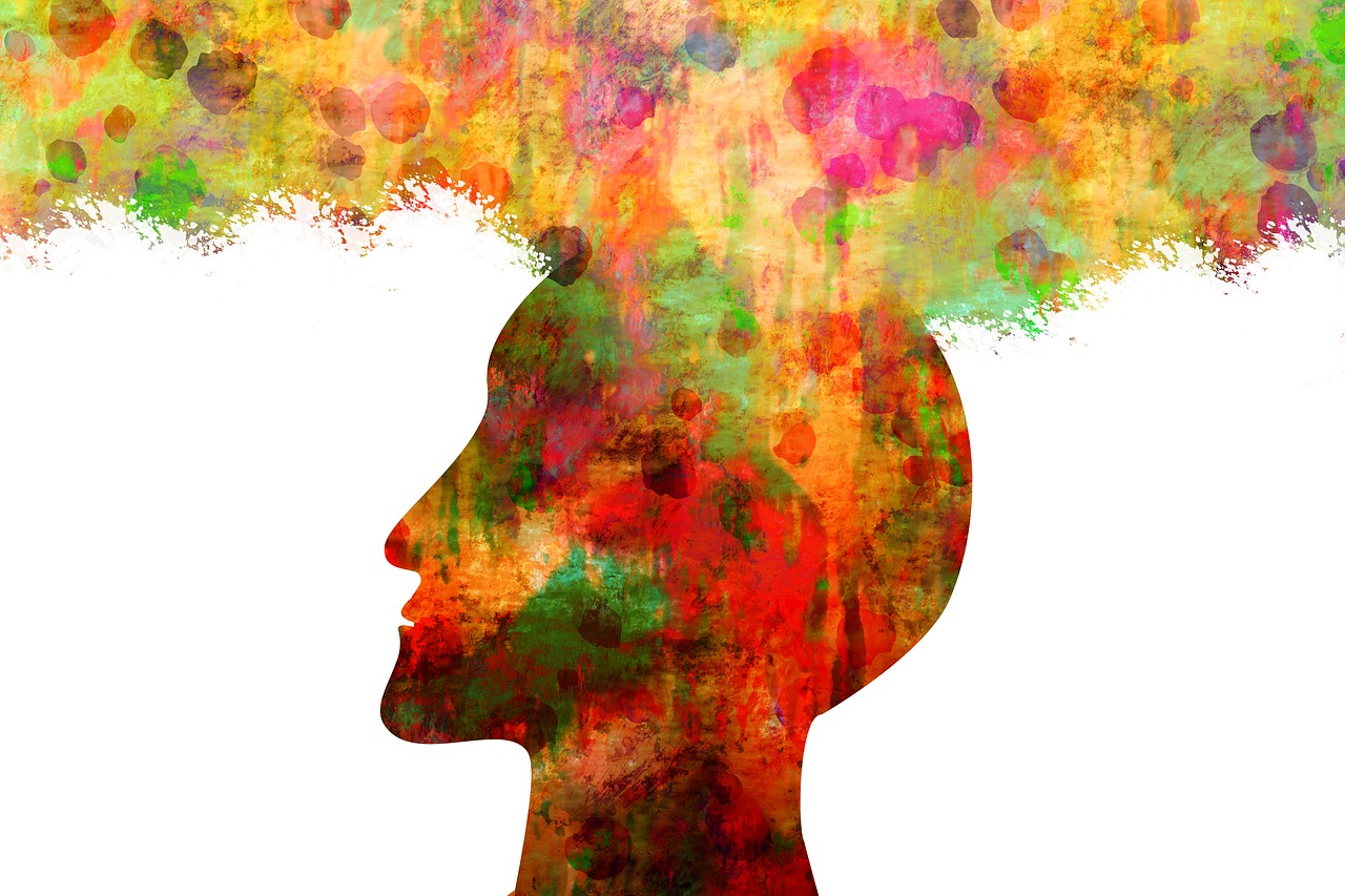
1. Why does colour affect you?
Unfortunately, stress seems to follow us like our own shadow and with it comes consequences to our health. We don’t go looking for it, it is just there. Many factors contribute to stress and something that’s stressful to you may not bother someone else.
When we talk about how different colours seem to affect you, what is true to you may not be true to another. It is not about the colour per se, it is about personal preference and your inner association and reaction to certain colours.
Scientific studies have proven that colour does affect our mood.
2. Therefore Let Us Paint a Wall
Being informed empowers you! Next time you feel down and out, take a good hard analytical look at the colours that surround you.
“Certain colours alter mood states and can change patterns of behaviour, for example, bright colours reflect more light, as in the colour of yellow which may over-stimulate the mind, causing strain and irritability” (Dr Linda Mayer and Prof Rashid Bhikha, July 2014)
We may not be able to eliminate all stress contributing factors e.g. Covid-19, but at least we can paint and change the colours in our homes.

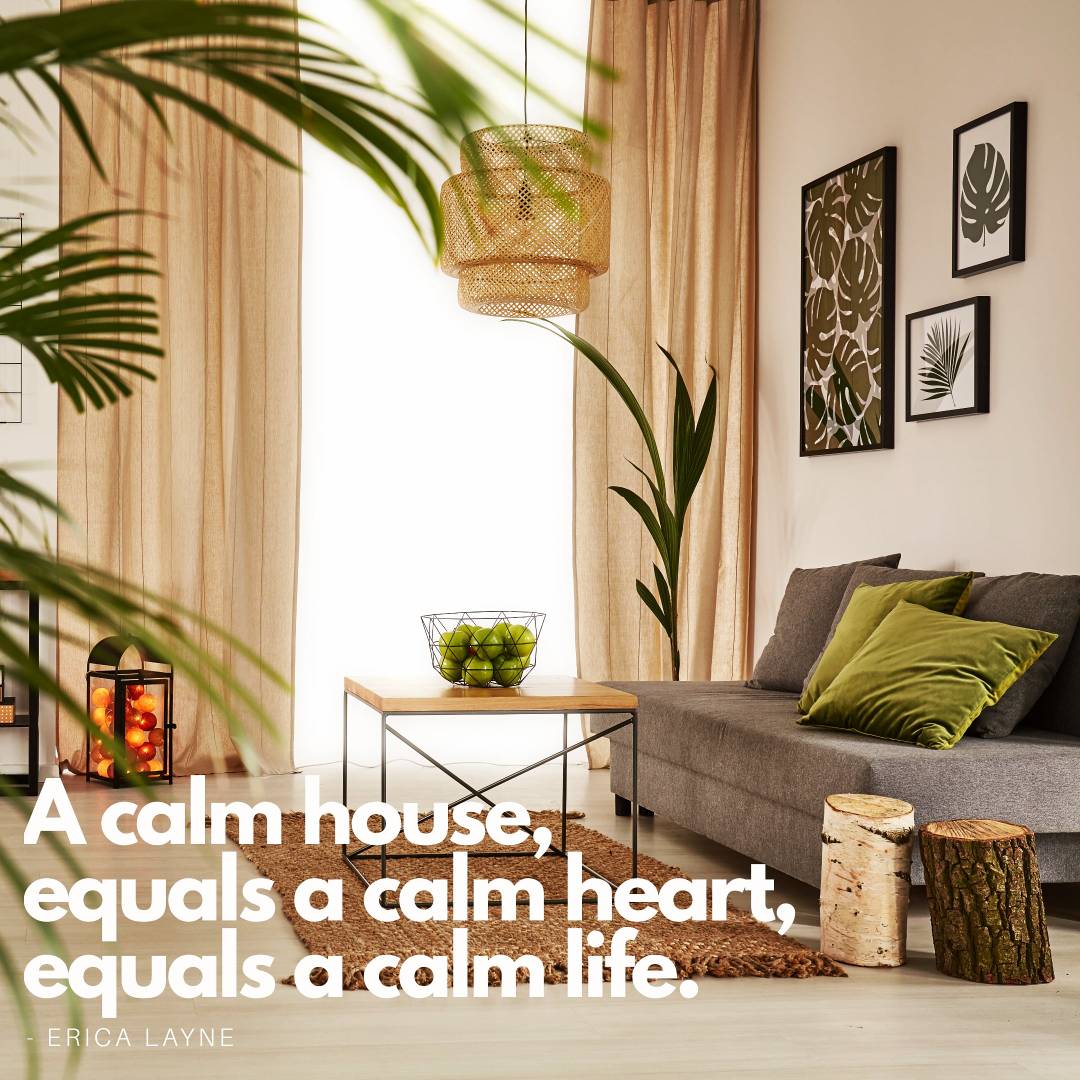
3. 12 Calming and Stress-Reducing Paint Colours That You Did Not Know
The following is a list of 12 colours (in no particular order) known for their calming, relaxing and stress-reducing properties.
These would mostly be your lighter colour tones, neutrals, beige colours, greys and pastels and a few surprise colours that you may have thought not to be listed here.
If you are not sure of your colour choice and would like a second opinion or you just need more information, please contact our property stylists and interior decorators. They are experts in their field and provide creative thinking solutions, tips and ideas gained from their experiences as interior decorators and renovators.

GREY
This colour provides a soothing, relaxing, and cool presence. Natural light bounces well off this colour and therefore makes a room painted with grey and tones of grey appear larger.
Grey blends well with other colours. Use dark grey to emphasise a feature wall, door frame or focal point.
Grey goes well with blue and white elements creating a relaxing atmosphere.

BLUE
Blue is often used on bedroom walls, because of it’s calming and tension reductions qualities. When choosing blue go for softer shades and pastel colours, though the bolder shades of blue work well for accent walls and areas. Classic Blue was nominated as Pantone colour of year 2020 – described as “reassuring blue, full of calm and confidence” – Laurie Pressman, Vice President of the Pantone Color Institute.
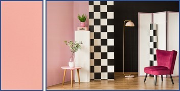
PINK
Not your average “girly” colour. Using the right tone can make any room look amazing especially if the colour choice is more your coral pinkish shades. (hex #f88379 known as Coral Pink)
Did you know that Living Coral was Pantone colour of the year in 2019? This colour is best described as a colour of feeling – inviting feelings of being happy, comfort, security, warmth, and socialising.

GREEN
Green symbolic of nature is a soothing restful quiet colour. People are more relaxed in places when surrounded by this colour. Think about how good a walk in the park makes you feel. This colour is easily incorporated into your living area, not just as green paint on the walls but with plants, whether live or artificial. Green plants make excellent focal points in a room.

SKY BLUE
Colours copied from nature are the best de-stressing agents. The serenity of a cloudless day swathed in blue skies calms the mind, spirit, and soul. Imagine the outcome when painting a room this colour. It will be like taking deep breaths of fresh air, clearing the mind, releasing the body of the toxicity of stress.
BLUSH
Blush is often used in theatre makeup, and one could, therefore, be forgiven for assuming the colour to fall in the same category as pink and pink tones.
Blush (HEX Code #FE828C) is actually a medium tone of red-violet.
Accessorise a room painted in this colour with plants and décor to create the perfect relaxing atmosphere in which just to chill out and to get lost in a good book.

VIOLET
Did I hear you ask what is the difference between violet and purple? In a nutshell, Violet is more bluish and less saturated. Purple is more reddish and saturated.
Using the right shade of violet brings inner peace, wisdom, and balance for your soul.
Because the darker shades can create a cold and impersonal environment, they are best used for accent areas and features in the room.
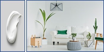
WHITE
Whites are generally thought to be clinical, clean, pristine, sterile, and cold. To the contrary. Whites are calming and symbolise clarity and freshness.
White reflects natural light creating the illusion of a space being larger.
Choose clean and bright whites. Avoid whites with dark, moody undertones. White walls embellished with bold colour artwork will heighten the calm and restfulness of the room.
White walls splendidly showcase both bold and neutral coloured furnishings and accessories.

YELLOW
Yellow is an active and positive colour.
Though it may not be a “soothing” colour to enhance de-stressing, it’s positive energy and attributes makes you feel vibrant and energetic and therefore expels the lethargic feeling often associated with stress.
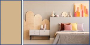
TAN
Tan is an incredibly relaxing warm colour reminiscence of the gentle soft glow of candlelight. An extraordinary colour that works well as a base and for highlighting other colours. Recommended for the dining room or breakfast nook.

BLUE GREEN
Blue green is commonly found in nature. A beautiful calm colour to reduce anxiety and even slows down the heart rate. Soft, quiet shades for the bedroom, living room and other relaxing living areas.

LAVENDER
I’ll admit to being bias. I purposely left lavender till last.
Lavender is such an extraordinary, stunning colour that will never cease to give you options to use in interior decorating.
The lavender plant exhibit healing properties and the colour de-stressing properties.
Lavender is a mixture of white and purple (purple is created by mixing red and blue – blue has a calming effect) and has several shades that go very well with other colours such as white and grey.
The lightest shade of Lavender, namely Lavender Blush can be used as a substitute for white.
Lavender Grey is a pale bluish grey and can be substituted for grey and silver.