Did you know, different colours have an impact on our feelings, moods and behaviours? This is what is referred to as colour psychology. You want to present a certain “feel” or mood to a room, and you want others to experience that same “feel” when in the room.
For example a child’s room. You want this to be a happy place.

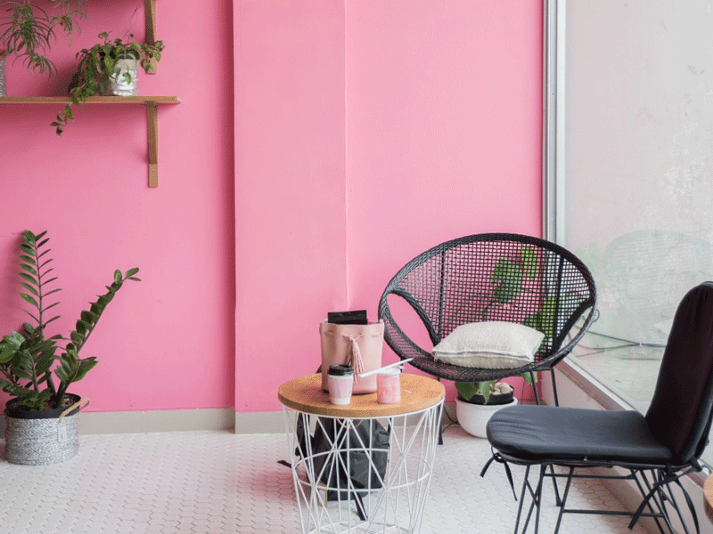
- Delightfully Pink
Paint and Accessories
So you would perhaps paint the ceiling grape arbor, the walls a light yellow, and add a few accessories – sunburnt orange umbrella (pink and sunburnt orange go very well together), a white bedside lamp with cerise colour shade, round white bedside table and bright pink artificial flowers in a galvanized planter/pot. Metallic colours and pink partner well.
The Bedding
As for the bedding, the choices are endless, so too are the colour combinations. Here we have many colour variations of pink. The valance sheet (also known as bed skirt or dust ruffle) is horizontal strips of candy pink and white. The two-sided duvet (or doona) cover, is versatile and quite pretty. Delicious bright red cherries with their delicate green stems are abundantly scattered on a background of marshmallow pink. The flip side of the duvet is light yellow, (matching the colour of the wall) with bold dark pink flowers with light green stems.
Display Cushions and Continental Pillow
Beautifully orchestrated. The display cushions and continental pillow, simply bring all the colours and feel of this room together in one crescendo. I love the cuteness of the display cushion to the left of the bed. A very interesting feature. This small cushion, captivates the ambience and colours of the whole room, not in a floral arrangement, but in criss-cross strips.
…and as for the brown wooden tea tray – a statement that the owner of this room is truly spoilt.
2. Pink The New White
Did you know that the colour psychology of pink is a sign of hope? It is a positive colour that inspires warm and comforting feelings.
All the more reason to incorporate pink and pink hues into your home. Pink definitely is not just clouds of pink soft marshmallows, pink petal flowers and for little girl bedrooms.
Shades of pink mellow from the generous softness of colours to the bold and darker shades of rosewood and spice.
Pink, the new white, masterfully blends with other colours and textures.
3. Pink Sophisticated
- Combine pink with darker colours such as dark blue, dark green, black or grey. Combining pink with these colours will make it more appealing and pleasing to the adult eye, and at the same time make this colour strong and more sophisticated.
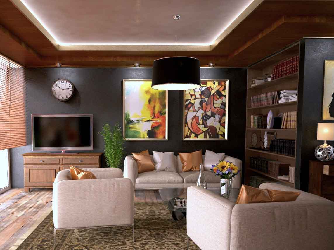
IMAGE FROM PEXEL: https://bit.ly/2MUcLsX
Just stunning. I invite you to walk with me through this well presented pink lounge area.
As we enter the living room space, our eyes are drawn to the richness and grandeur of the room. We experience comfort, warmth and wellbeing. Sophistication par excellence.
The magnetism of this room is amazing. You just seem to take it all in, in one 360 degree focal sweep. The focal points luring your eyes from one to the other – floor, window, back wall, room divider, ceiling, chairs, accessories, rug and then back to the floor. The feelings of warmth, comfort and sophistication certainly has been achieved.
The natural rustic beauty of wide board timber flooring immediately catches the eye. The statue then lures your eyes from the floor to the timber window blinds.
The wall clock now gets the attention. Note, the television does not invade the space. Your eyes drop to the beautiful wooden television cabinet.
The dark charcoal colour of the back wall, serves well as depth of field.
Like sunshine breaking forth from dark skies, the gorgeous autumn colour abstract artwork adds warmth to the scene in front of you.
From the corner of your eye, to the right something catches your attention. To reach this “attention getter” one’s eye seem to glide over the dark wooden bookcase/room divider, to come to rest upon the abstract ball-shaped chrome table lamp upon the dark wood chest of drawers.
From here our eyes are drawn to the centre of the room. The “dirty pink” – or “dusty rose” coloured fabric textured lounge suite comprises of two chairs and a two seater sofa on chrome legs. As mentioned previously, metal and pink colours go very well together.
Inadvertently our eyes seem to move from the lounge suite to the stunning and captivating hues of the dirty pink/dusty rose tray ceiling, framed by a soft light and dark brown ceiling.
Our eyes then drop back to the floor, pass the black lamp shade to the rug. The rug is exceptional beautiful. The darker contouring colours show off the “dirty pink” – or “dusty rose” background colours of the rug, and enhances the colour of the floorboards, whilst captivating the appeal of the lounge suite.
The coffee table is rectangular tempered glass on chrome legs. Chrome is also featured in the vase containing artificial sunflowers.
The gold display cushions certainly add panache. The shiny dusty rose coloured display cushions blend in perfectly.
And so we are nearing the end of our current series on colour schemes. Our last and final one in this series is grey on grey.