Tips for Arranging Furniture

Tips for Arranging Furniture

Tips for Arranging Furniture

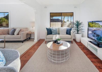
Just moved into a new place and have no idea what should go where? Or maybe you’ve been in a property for a while but have realised that the overall flow can be improved. There aren’t necessarily right and wrong ways to arrange your furniture but here are some tips that can hopefully steer you in a direction that can help;

1. Highlight the natural focal point with a feature piece

This initial focal point should be the area that you place any feature pieces you may have. Whether it’s a piece of artwork, a sofa, bedframe or feature wall, you’ll want to make sure that it is fitting as something that’ll first catch your eye when you enter the room.
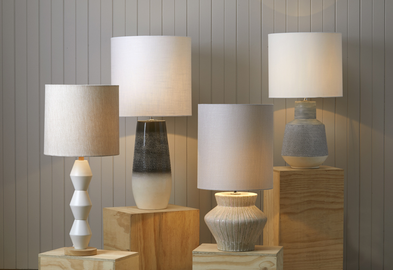
2. Embrace natural lighting and add lamps to darker areas

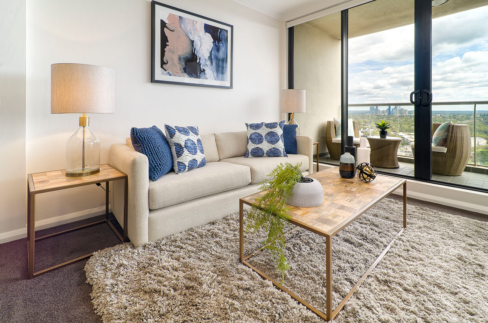
It is important to consider where the natural light will come through to take into account any possible glares being created, to be able to utilise the light when necessary and also to ensure that there is a balance of light within the space. Determine where the darker areas of the room are and play around with floor or table lamps in those dimmer areas.
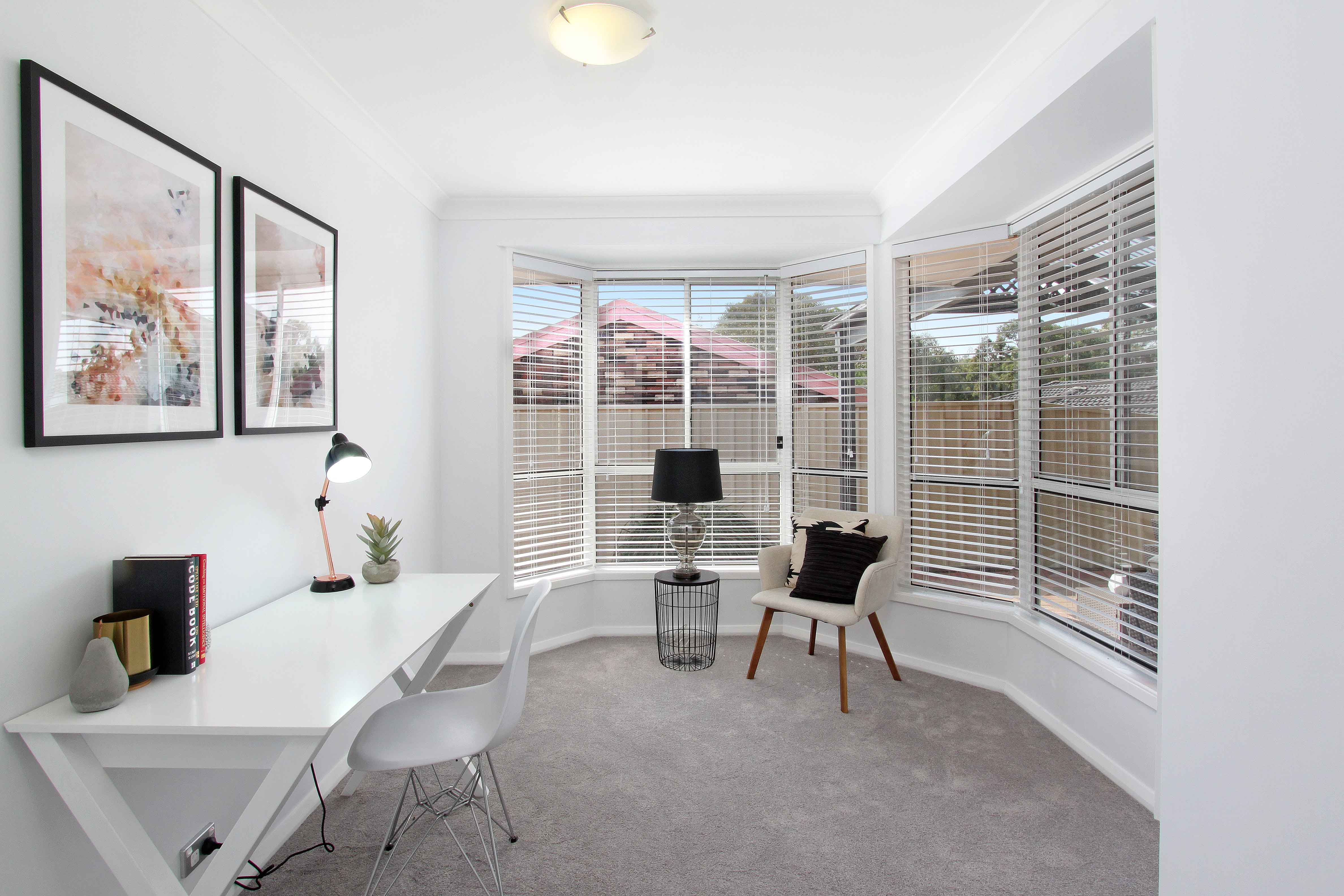
3. Consider and allow for movement:

As much as we want the space to look good, it also has to function and be practical. Think about where people spend their time in the space and make sure the layout compliments that. You want to ensure that your guests are not just comfortable on the sofa but can also move around easily within the space.
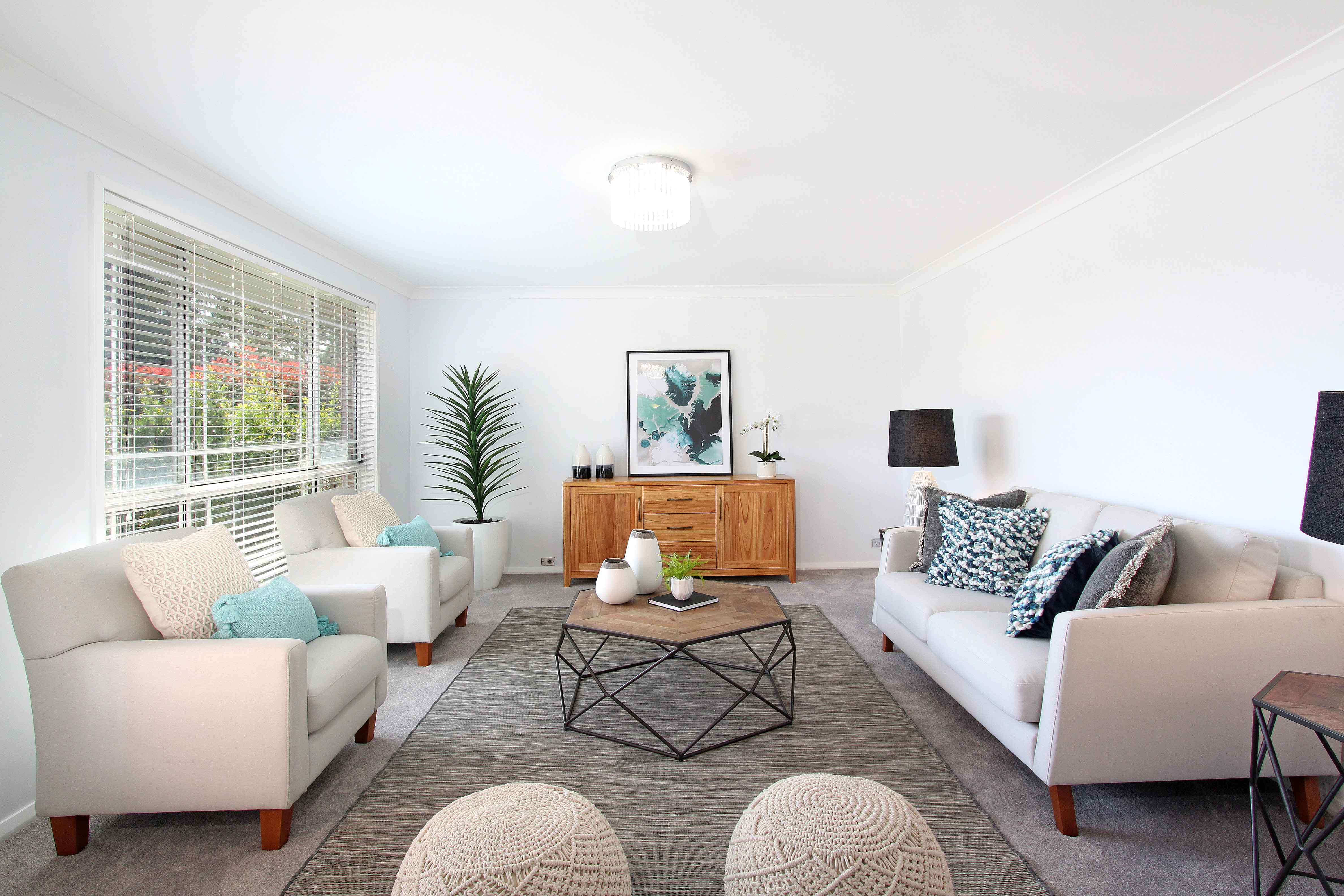
4. Zone areas with the furniture and rugs

I often distinguish two different types of preferences from clients. Some prefer their spaces to feel cosy and others prefer it to be open. Try and figure out which you prefer and adjust your furniture and rugs accordingly. For example, if you have quite an open space, closing off the space slightly with a couch or rug can help zone the space and give off that cosy feeling. If you prefer it open, place the couch against a wall or in an area where you will be able to see most of the rest of the room from the seat of the couch.
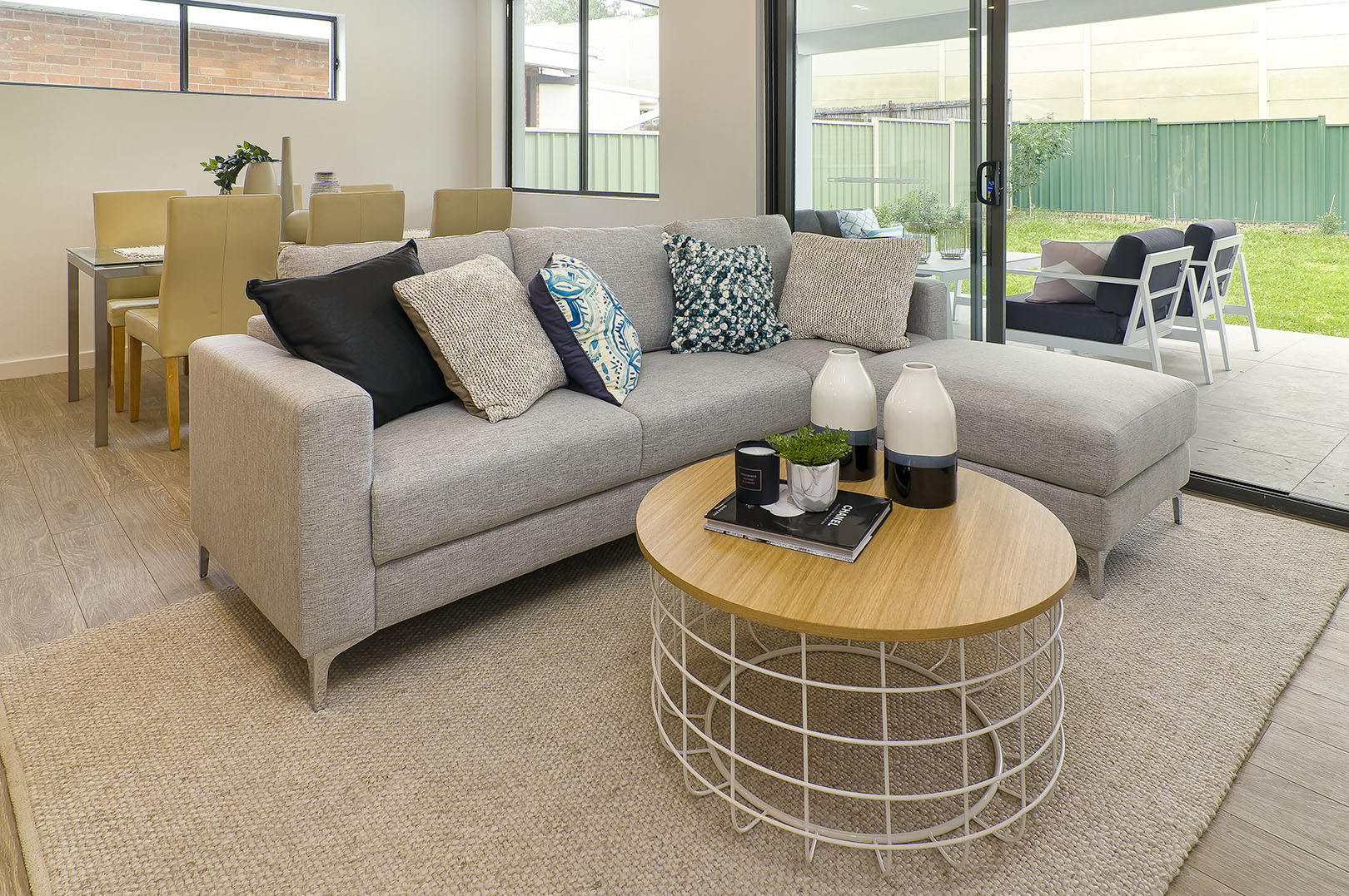
5. Keep it balanced

Most of the time when arranging furniture, we have our heads down and analyse the floor space only. However, it is important to step back and bring your eyes up and make sure the space looks balanced height-wise. If you have tall objects on one side and short objects on the other side of the room it can feel quite disproportioned. Keeping things symmetrical is a good starting point and once you’re comfortable with doing that, play around with it a bit until you find a balance you’re happy with.
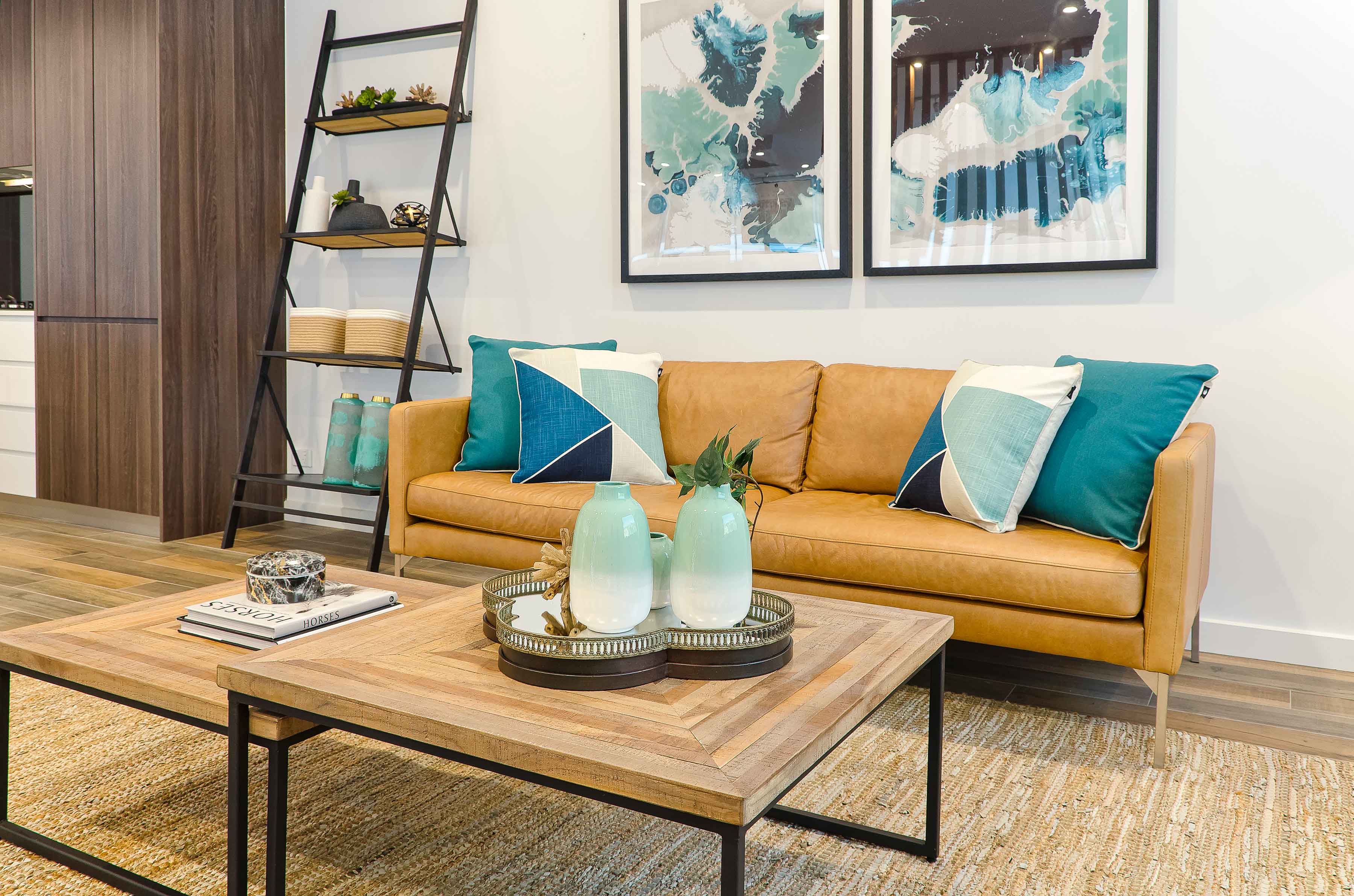
Now that you have these tips, don’t be afraid to mix it up a bit every now and again too! Re-arranging my furniture is one of my favourite things to do as it can completely transform the space and give you a whole new perspective!

Office Furniture Fitouts – top 3 things to help ensure your project is a success

Office Furniture Fitouts – top 3 things to help ensure your project is a success

Office Furniture Fitouts – top 3 things to help ensure your project is a success

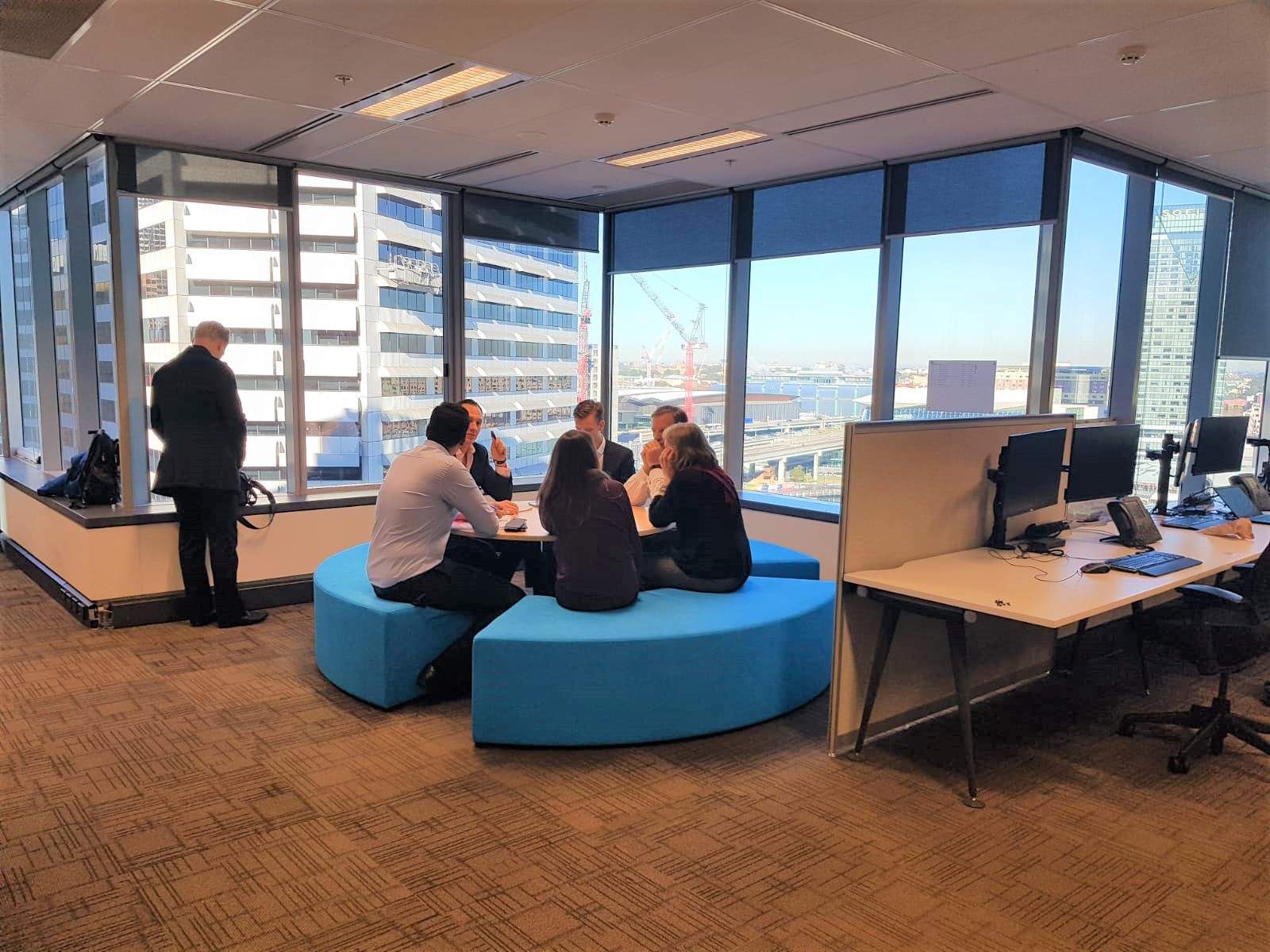
We had a great time working on a large scale office furniture fitout project in the heart of Sydney CBD. The brief we received from the client was that they had to reduce the number of desk in their open plan office space. However, they still wanted to maintain the collaborative and energetic atmosphere amongst the staff on their floor. The Let’s Revamp Team had to come up with designs and recommendations to furnish seven zones where office desks used to be.

We wanted to ensure that the furniture we recommended would help create visual interest in each of the zones, whilst also encouraging staff to have more stand up meetings and team building group huddles. Here are our top 3 tips that helped us ensure successful delivery of the project:

1. Get a clear understanding of your client’s needs

We worked closely with the project manager on the client’s side to understand what the aim of each of the newly opened areas / work zones would be.

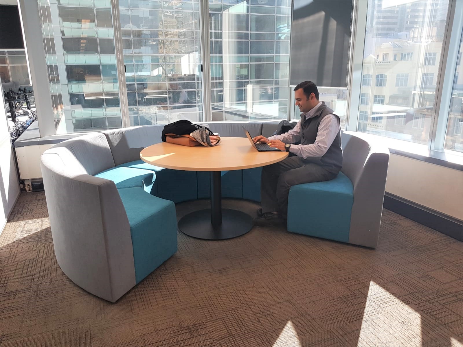
One of the problems our client faced was that their employees needed areas for short meetings, whilst not disturbing other people sitting in close proximity to these zones. Without building a physical wall, we wanted to create that effect through the use of furniture. We opted for upholstered huddle pods and lounges with very high backs that are very good for the acoustics as the design helps to contain meeting chatter.

Another collaboration zone had to be created in the corner of a section with windows overlooking Darling Harbour. In an office environment, beautiful views are essential elements that can positively contribute to employee’s wellbeing. The furniture design we therefore selected in this space was a round ‘Think Tank’ design with no back. This ensured that there were no obstructions to the views, whilst still having a practical area where a small team could gather for brain storming sessions.

2.) Choose colours that accentuate the mood you want in a space

It is very important to always consider the effect of colour to improve mood and creativity. The client’s original office colour pallet was very dull (black, white and greys). We selected bright, vibrant blues and violets from the client’s brand colour pallet, to help stimulate brain activity without overpowering the space.

3. Quality of office furniture is key

We used furniture suppliers that guaranteed the quality of the furniture and selected fabric that is hard wearing and decided on colours that won’t show dirt easily. In this project we used Warwick Fabrics’ Ashcroft range for the upholstered furniture. This material is a heavy commercial upholstery material tested to exacting standards for colourfastness, abrasion, inherent stain resistance and safety. Office furniture should be able to take a lot of wear and tear as it gets used every day.

Contact our Let’s Revamp team if you would like a quote for your next Office Furniture Fitout Project!

info@letsrevamp.com.au

Our 3 best tips when choosing a bedside table lamp

Our 3 best tips when choosing a bedside table lamp

Our 3 best tips when choosing a bedside table lamp

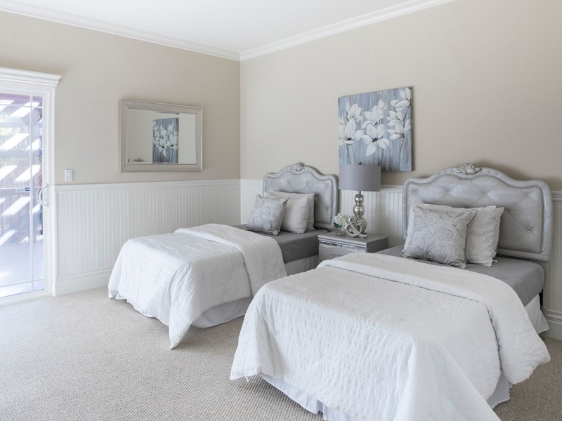
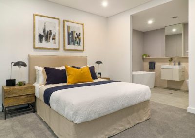
When choosing a bedside table lamp for the bedroom, you should be looking for one that balances a soft light with a style you love.

You can experiment with lamp textures, colours, patterns or sizes, as long as you’re choosing one that complements the overall feel and mood of the room.

Remember, your bed is the largest object in your bedroom. Incorporating lamps and other objects of a larger scale will give and overall balanced feel to the room.

1. Choosing the right height for your bedside table lamp

The height of the table lamp is depended on how you plan to use it:

Bedside lamp used for reading

When using your lamp for reading or writing while in bed, you will need one that is tall enough to spread enough light across your book or tablet.

When you sit in your bed, the bottom of the lamp shade should be between your shoulder and your chin.  This way  you will have sufficient amount of reading light without the light glaring in your eyes.

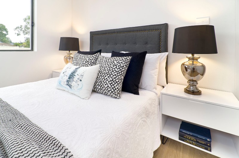
The height of the lamp base depends on the height of your bedside table.  Ideally your bedside table should be a similar height as your mattress.   If this is the case, the ideal length for the lamp base will be between 60 and 68cm.

If your bedside table is higher than the mattress, go for a shorter lamp base.  If your beside table is lower than the mattress, go for a longer lamp base.  (Tip:  you can always place books underneath your lamp to increase the overall lamp height)

Bedside lamps used for decorative purposes

The height of your bedside table lamp does not really matter when you only use it as a decorative piece or to provide enough light so you do not have to walk to your bed in the dark.

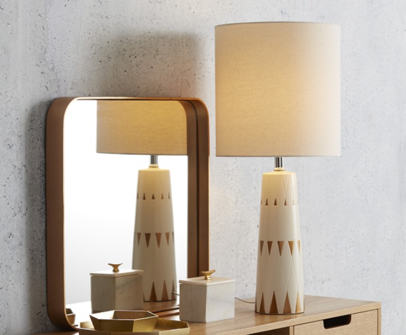
Photo by Stephen Leonardi on Unsplash

2. Choosing the perfect shade for your lamp

Lampshades are not just an accessory for you lamp, they diffuse the light your lamp emits.  If you want a lot of light to stream from your lamp, use a lampshade that is opaque.  If your goal is less light, choose a shade that is non-transparent.

The width of your lampshade should be about twice the width of the widest part of your lamp.  If you have a very thin lamp base, choose a shade that is no wider than the height of the shade.

3. Create Balance

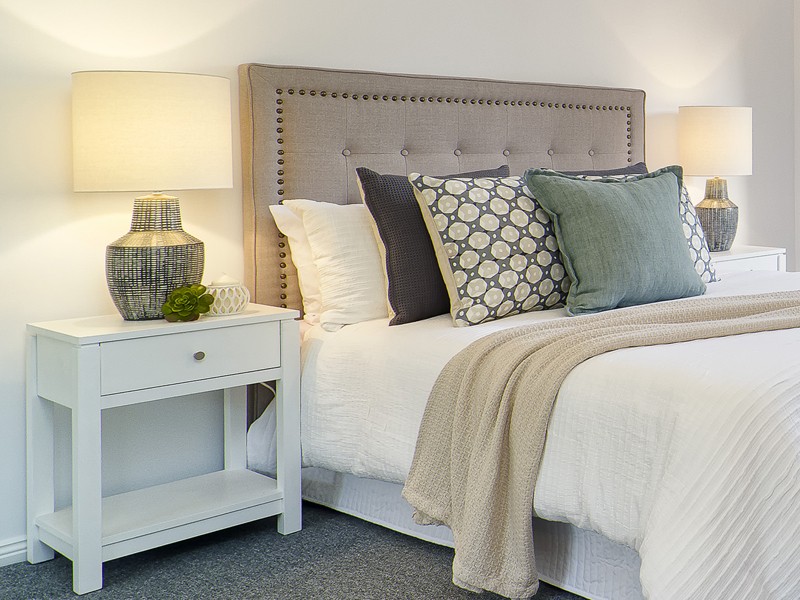
Our table lamp should be in balance with the size of your bedside table and the size of you bedhead.

You do not want your lamp higher than one and a half times the height of your bedside table.

The lampshade should not be wider that the table top.  Measure the widest part of your lamp (normally the base of the shade).  The total lamp width should be only a third to maximum two thirds of your table width.

Meet the new kid on the block – Styling Estimate Calculator

Meet the new kid on the block – Styling Estimate Calculator

Meet the new kid on the block – Styling Estimate Calculator

Meet the new kid on the block – Styling Estimate Calculator Whether selling the house yourself, or through an estate agent you would need to secure the advice and support of a property stylist in preparing your home for sale. The property stylist is a professional who will present your home in a way that is best, so as to attract the highest price possible.

  • Let’s Revamp, Property Styling and Decorating, Sydney:

Let’s Revamp the property styling and decorating company in Sydney, winners of the 2018 Houzz award, have come up with a brilliant idea. Probably a first in Australia.

  • A tool that will save you time and is so easy to use:

The Styling Estimate Calculator can be used from the comfort of your home, during your “five minute” coffee break at the office, or even whilst commuting on public transport, and it is so easy to use.

  • Your FREE Property Styling Quote:

You now have immediate access to your free property styling quote. The Styling Estimate Calculator will enable you to make adjustments as you see fit, to accommodate variables in styling costs. Once completed, further collaboration will take place between you, and the property stylist who will transform your property’s interior into an amazing space, presenting your house for sale in a most appealing way.

Welcome to our webpage: http://letsrevamp.com.au

Please do stay a while. Browse at your heart’s content. See our amazing styling projects, marveling the beauty of homes we have staged for sale. However, should you wish to jump straight into having your quote done, and maybe browse later, please click on “Instant Quote” located on the top right hand corner of our website. Alternatively you can click “here” to be diverted directly to the free quote calculator. http://letsrevamp.com.au/quote/ Our home styling professionals look forward to assist you with your professional interior styling or home staging needs in the Sydney area.

Beautiful kitchens

Beautiful kitchens

Beautiful kitchens

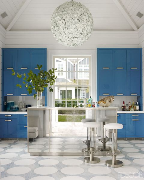
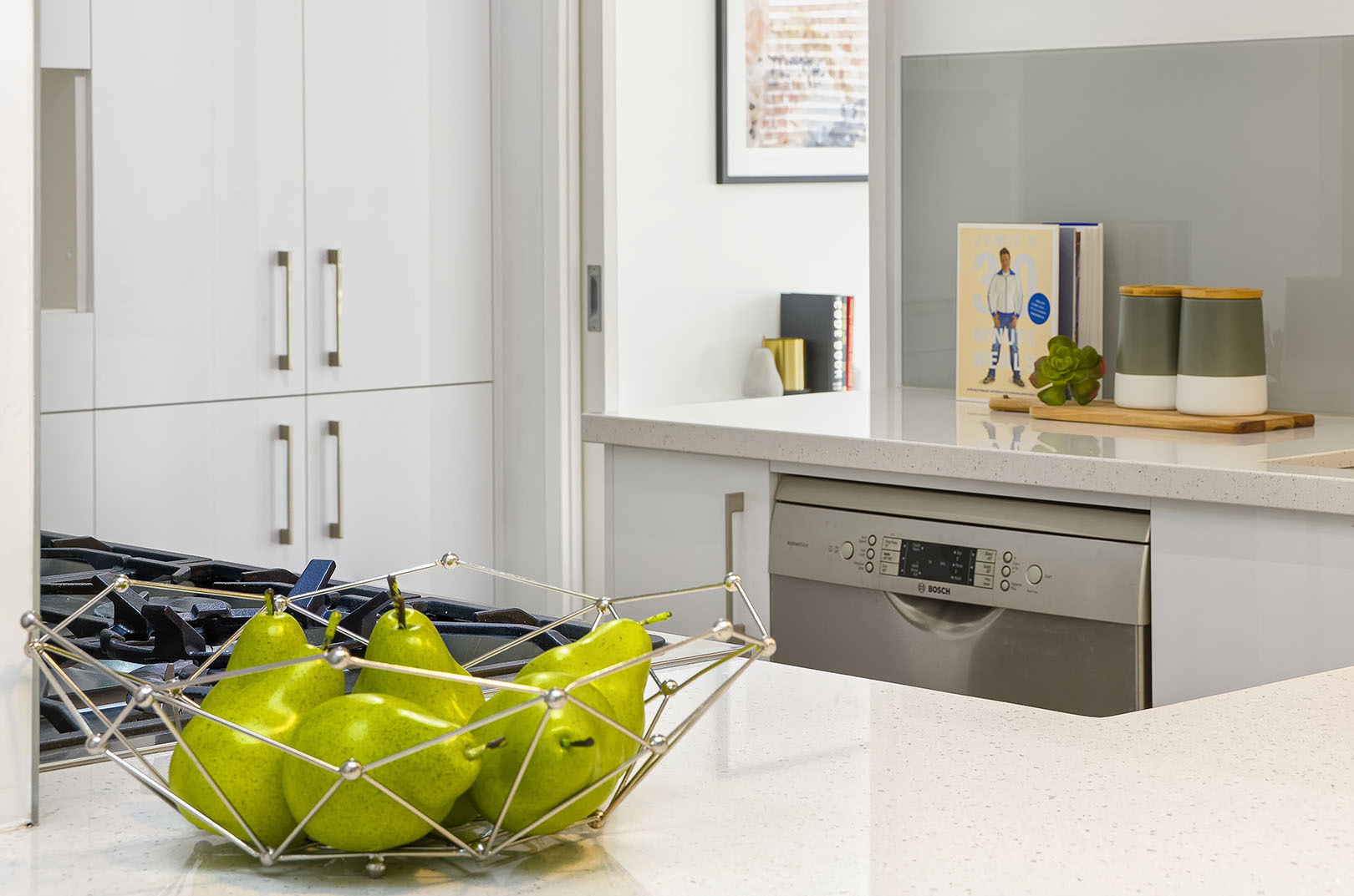
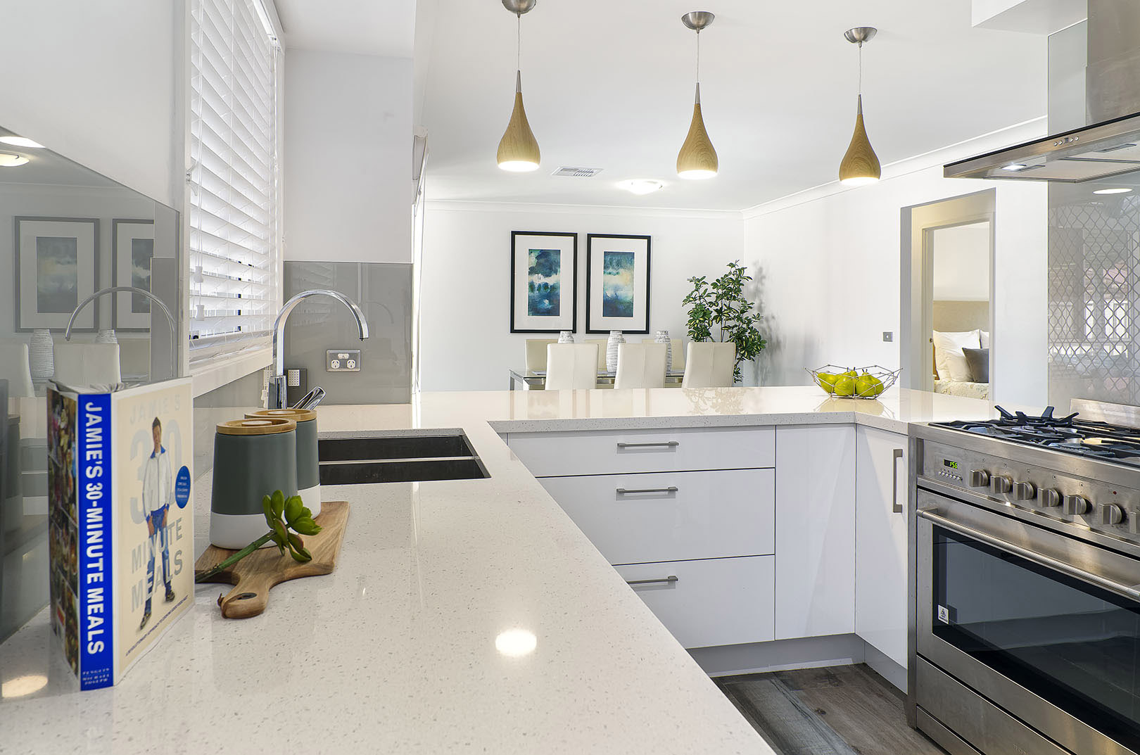
Of all the rooms in a house where decorative sleight of hand can have the biggest visual impact, the kitchen rules, says designer Elaine Griffin. “That’s because kitchen cabinets come in standard sizes with standard door options,” she adds. In other words, they’re builtboring, and it’s up to you to bring them to life.

But cabinets aren’t the only kitchen amenity where customization is critical, Griffin says. Here, she lays out 7 things to consider if luxe is the look you’re going for with your kitchen design.

1. START WITH THE RIGHT LAYOUT

When a perfectly laid out kitchen if your number one priority, the rest is easy, Griffin says. The work triangle – the distance between the stove, the sink and the refrigerator – should be as small a footprint as possible. And as a rule (though there are exceptions), the refrigerator should be closer to the room’s entrance, since it’s typically the kitchen-goer’s primary destination.

2. GO FOR HEIGHT

“I cry when I see 36-inch tall upper cabinets in anything but the lowest-ceilinged spaces,” Griffin says. “The 42-inch models are a way better option (plus, those six additional inches equal another shelf of storage space). In lofty spaces (9-foot ceilings and up), stacked upper cabinets deliver more storage still.

3. KNOW WHEN TO SPLURGE

After the cabinetry (and not counting the floor), the backsplash takes up the biggest amount of a kitchen’s visual real estate. so you’re going to want to make it count. When it comes to backsplashes, Griffin has a singular piece of advice: “Splurge, splurge, splurge,” she says. “Backsplashes are major opportunities to express your style and personality without breaking the bank, because they’re small enough to not require a ton of material to finish them.”

4. DON’T NEGLECT THE DETAILS

Hardware is like earrings for your kitchen cabinetry, delivering major bang for your buck. This is especially true in rentals, where changing your kitchen hardware can add more upscale elegance than anything else, according to Griffin.

5. LIGHT IT UP

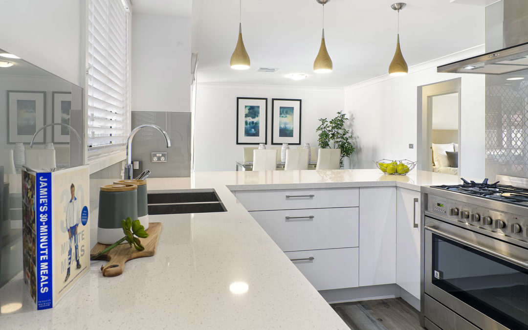
When we first walk into a kitchen, we look up at the ceiling and check out the lights. “Almost. Every. Time,” Griffin says. For that reason, stunning light fixtures over islands, the breakfast nook and the sink are important. “This isn’t a moment for the utilitarian!” But you’ll want to establish a visual hierarchy of ceiling light fixtures, she says. “One zone will act as the ‘star’ and the others ‘supporting characters,’ to keep your kitchen from looking like a Christmas tree.”

6. BE FLOORED

Kitchen flooring is where faux reigns supreme, Griffin says. Wooden floors — which should be the same as those in the rest of the house — make sense in today’s open layouts, but 12-inch ceramic tile could lend your kitchen an equally luxe look, if you have them laid out on the diagonal, as Griffin recommends.

7. THINK LONG-TERM

Because the finish will visibly wear better, buy the best-quality sink you can afford. On the other hand, shop for price, finish and shape – in that order – when choosing a faucet.

Our home styling professionals look forward to assist you with your professional interior styling or home staging needs in the Sydney area.