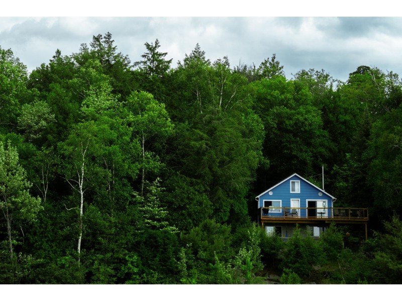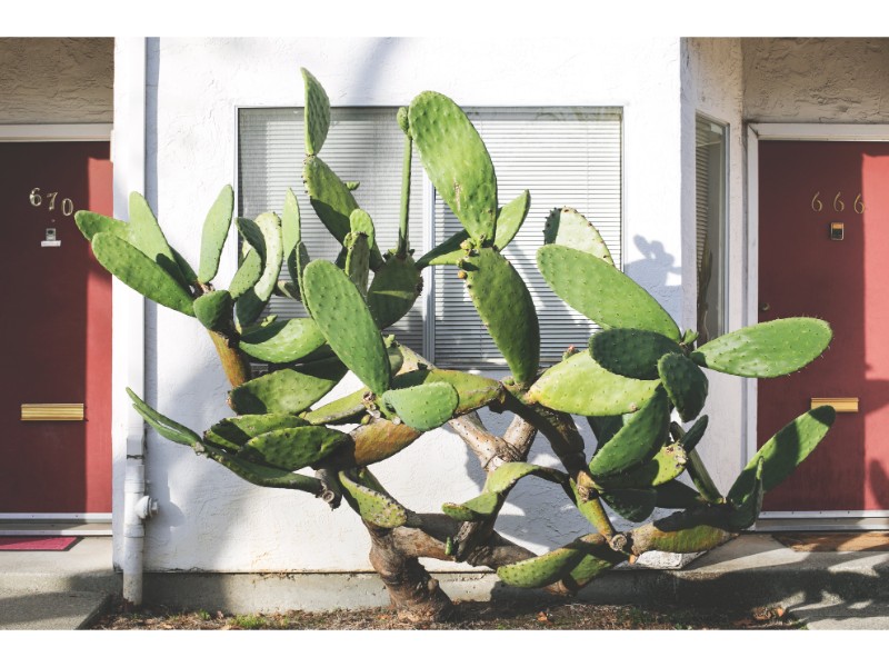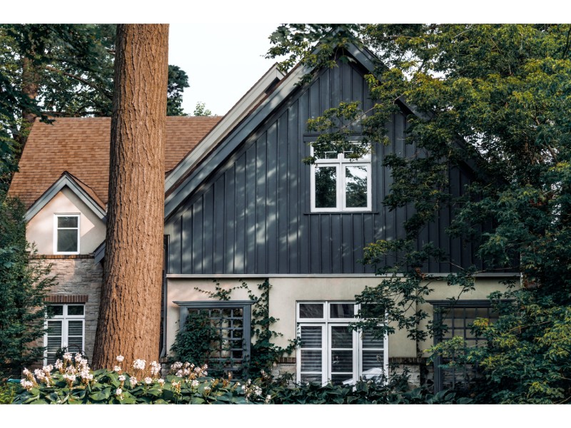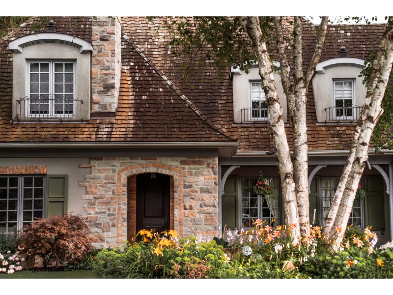
What a wonderful, colourful world we live in..

What a wonderful, colourful world we live in..

What a wonderful, colourful world we live in..

Choosing the right colour for a house, room, and space can be overwhelming and daunting at the best of times.

The assortment and array of colours available today are endless, and new colours and colour combination seem to be on the increase.

Colour is life!

Colour communicates. It makes a statement, sets a mood and attracts attention.

Colour is alive and diversifies our lives.

Colour is music, energizing and calming.

Colour creates warmth, elegance, boldness and tranquility.

Colour is powerful, it conveys an image.

Colour is influential. It affect us both mentally and physically.

(https://www.verywellmind.com/color-psychology-2795824)

Colour is science. Some colours add depth of field. Others capture and reflect light.

Used effectively, colour is our most conspicuous design element. Using colour consciously and   harmoniously create spectacular result.

1. The Colour Wheel

In 1666, Sir Isaac Newton designed the first circular colour diagram.

The Colour Wheel, is the basic tool for combining colours, and is so designed that practically any colour chosen wil look good together.

2. Opposites Attract (Complementary Colour Scheme)

(http://www.tigercolor.com/color-lab/color-theory/color-theory-intro.htm#Color_Wheel)

Colours opposite each other on the Colour Wheel are considered complementary colours.

For example red and green.

3. The Best of Friends (Analogous Colour Scheme)

Three or more colours that neighbor each on the colour wheel, harmonizes and are pleasing to the eye. For example the colours on either side of green; these colours are colours also found in nature.

4. Two Is Company, But Three Is Not A Crowd (Triadic Colour Scheme)

As the name suggests, selecting three colours (in Triangular shape) that are evenly/equally spaced around the colour wheel.

5. Apart, Yet Together (Split-Complementary Colour Scheme)

The Split-Complementary Colour Scheme is a variation of the Complementary Colour Scheme. Here a base colour is selected, and two colours adjacent is used to create a strong visual contrast.

6. Two Pairs Equal Four (Rectangle or Tetradic Colour Scheme)

This scheme offers many variation possibilities. As the name suggests, four colours, are selected into two pairs. Notice the spacing between the shorter connecting points.

7. In The Scheme of Things (Square Colour Scheme)

The name says it all. Four equally spaced colours are chosen.

Understandably, there is so much more to colour and colour schemes than mentioned here.
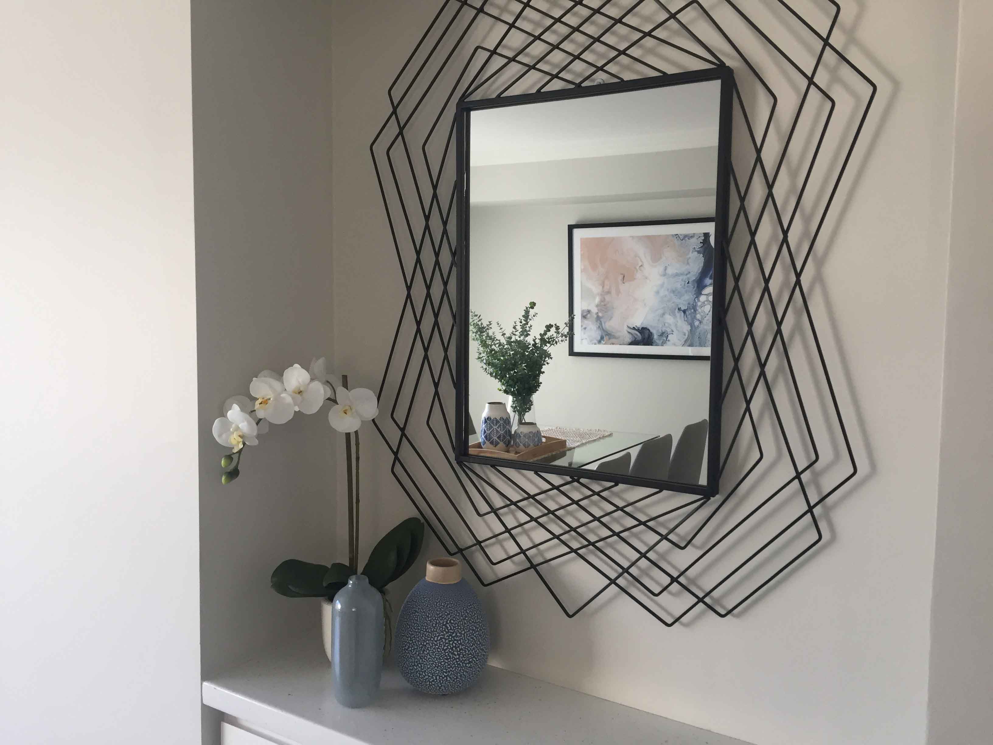
8. Calm and Simplicity – Yet Striking.

Here colour makes a statement of pure elegance and charm, simultaneously presenting a sense of boldness, and captured serenity.

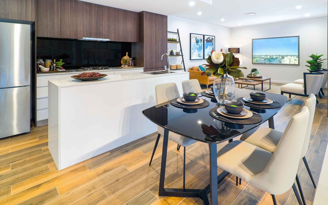
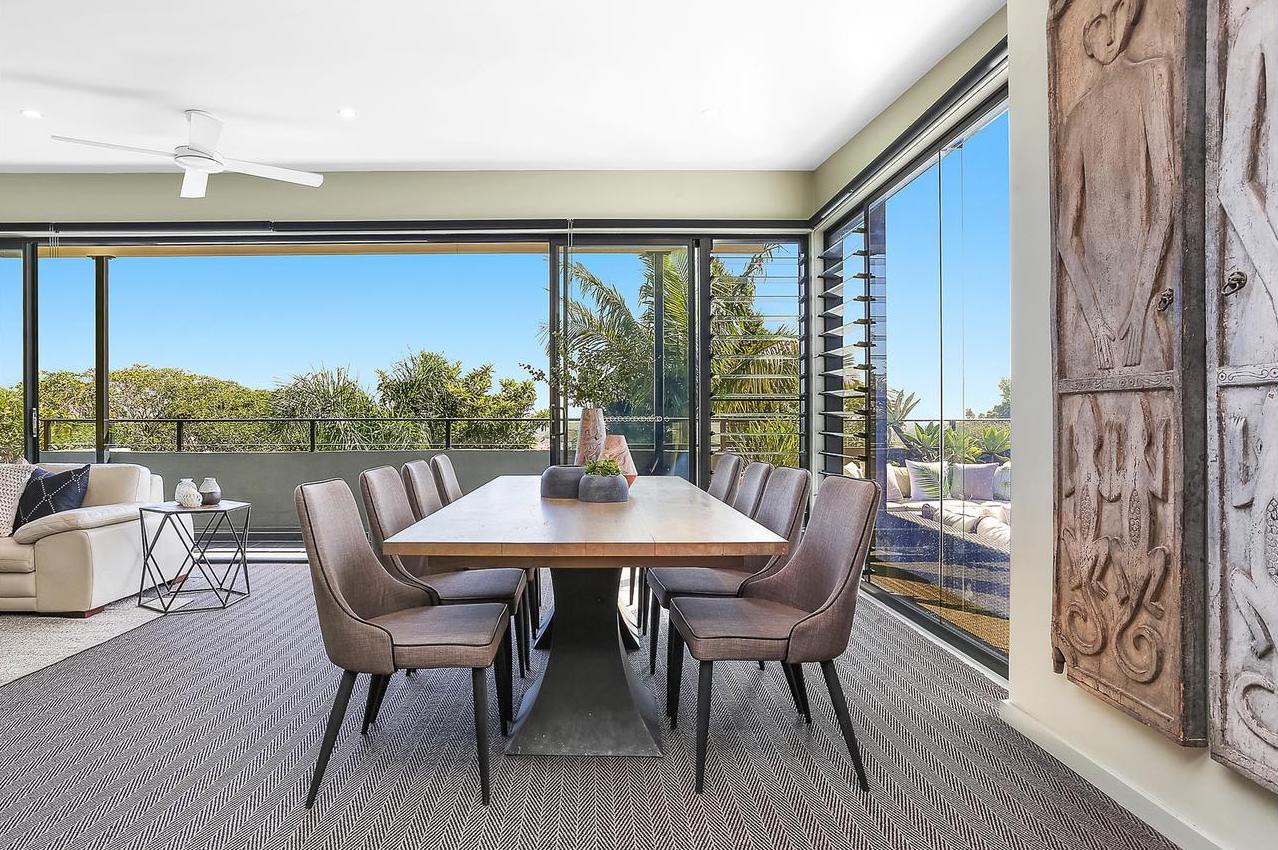
Complementary Colour Scheme, (the colour of the wall and the black abstract metal frame) not only elevates the beautiful mirror but provides depth of field to the area and embraces a reflection of the dining area, which in itself is representative of various Colour Schemes combinations.

See how the colour of wall, captures the light, and is canvas to the whole scene.

9. Winners of the 2018 Houzz Award.

10. Transforming Your Property’s Interior Into An Amazing Space

Let’s Revamp is a property styling and decorating company.

  • Property Stylist
    • As property stylist we present your home to potential property buyers to as to generate the best opportunity for sale and at the highest potential selling price.
    • On line photos of styled property capture immediate attention and interest. Majority of buyers will first look online at the photos of a property before they attend an open home or call an agent.
    • Statistics have shown that a staged property sell much faster than similar unstaged property.
  • Deocrating
    • The process of decorating your home is to artfully design, rearrange and creatively utilise the interior of your home to transform it into a stylish, revitalising and inviting space which reflects your personal style and taste.
    • We assist in finding items that would complete the desired look and feel in your home.

Contact Let’s Revamp today for an obligation free quote to find out how we can transform your property into a perfect space that will suit your needs.

http://letsrevamp.com.au

http://letsrevamp.com.au/decorating

http://letsrevamp.com.au/contact  Tel: 02 9659 2556 Email: info@letsrevamp.com.au

Tips for Arranging Furniture

Tips for Arranging Furniture

Tips for Arranging Furniture

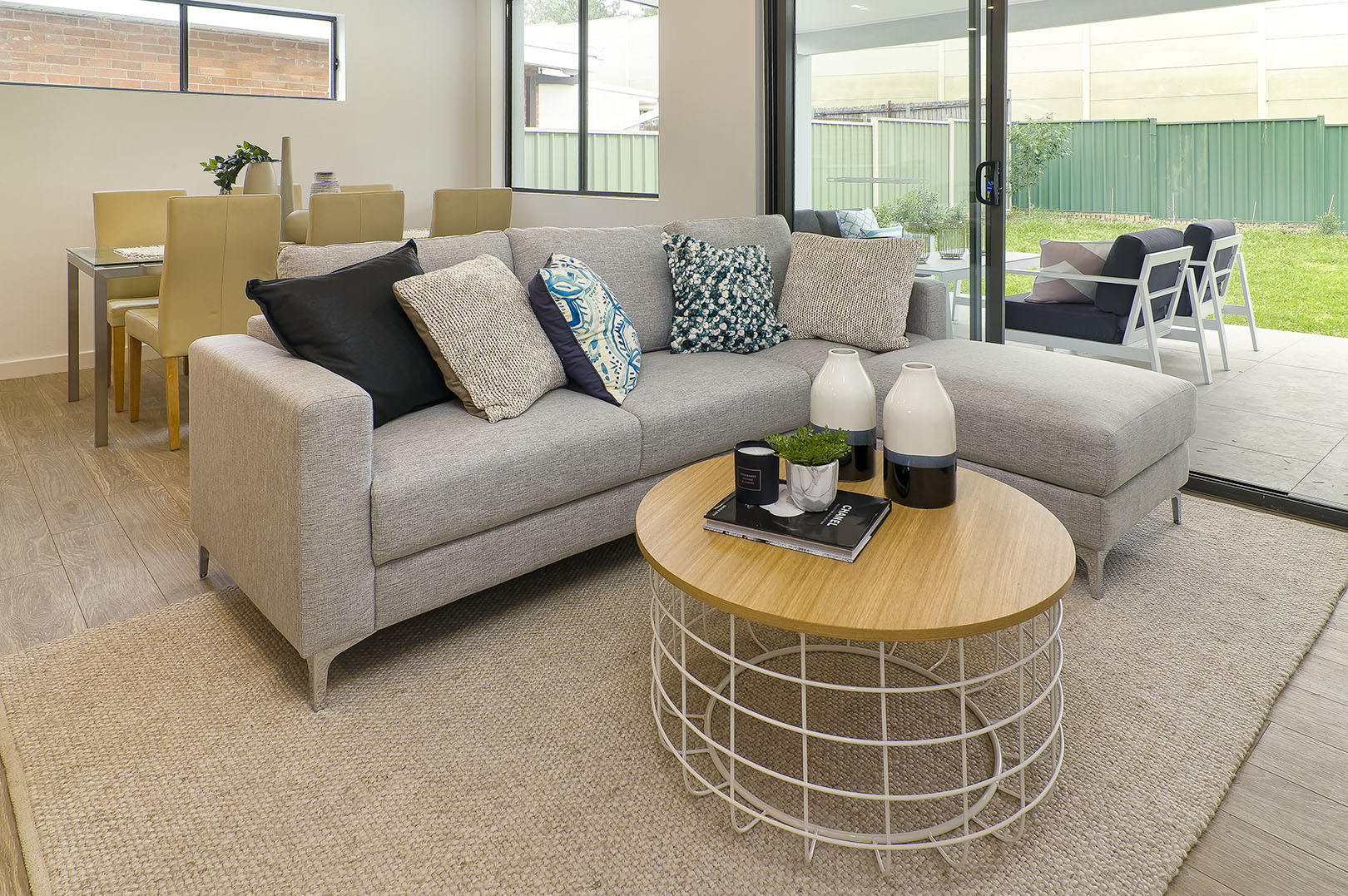
Just moved into a new place and have no idea what should go where? Or maybe you’ve been in a property for a while but have realised that the overall flow can be improved. There aren’t necessarily right and wrong ways to arrange your furniture but here are some tips that can hopefully steer you in a direction that can help;

1. Highlight the natural focal point with a feature piece

This initial focal point should be the area that you place any feature pieces you may have. Whether it’s a piece of artwork, a sofa, bedframe or feature wall, you’ll want to make sure that it is fitting as something that’ll first catch your eye when you enter the room.

2. Embrace natural lighting and add lamps to darker areas

It is important to consider where the natural light will come through to take into account any possible glares being created, to be able to utilise the light when necessary and also to ensure that there is a balance of light within the space. Determine where the darker areas of the room are and play around with floor or table lamps in those dimmer areas.

3. Consider and allow for movement:

As much as we want the space to look good, it also has to function and be practical. Think about where people spend their time in the space and make sure the layout compliments that. You want to ensure that your guests are not just comfortable on the sofa but can also move around easily within the space.

4. Zone areas with the furniture and rugs

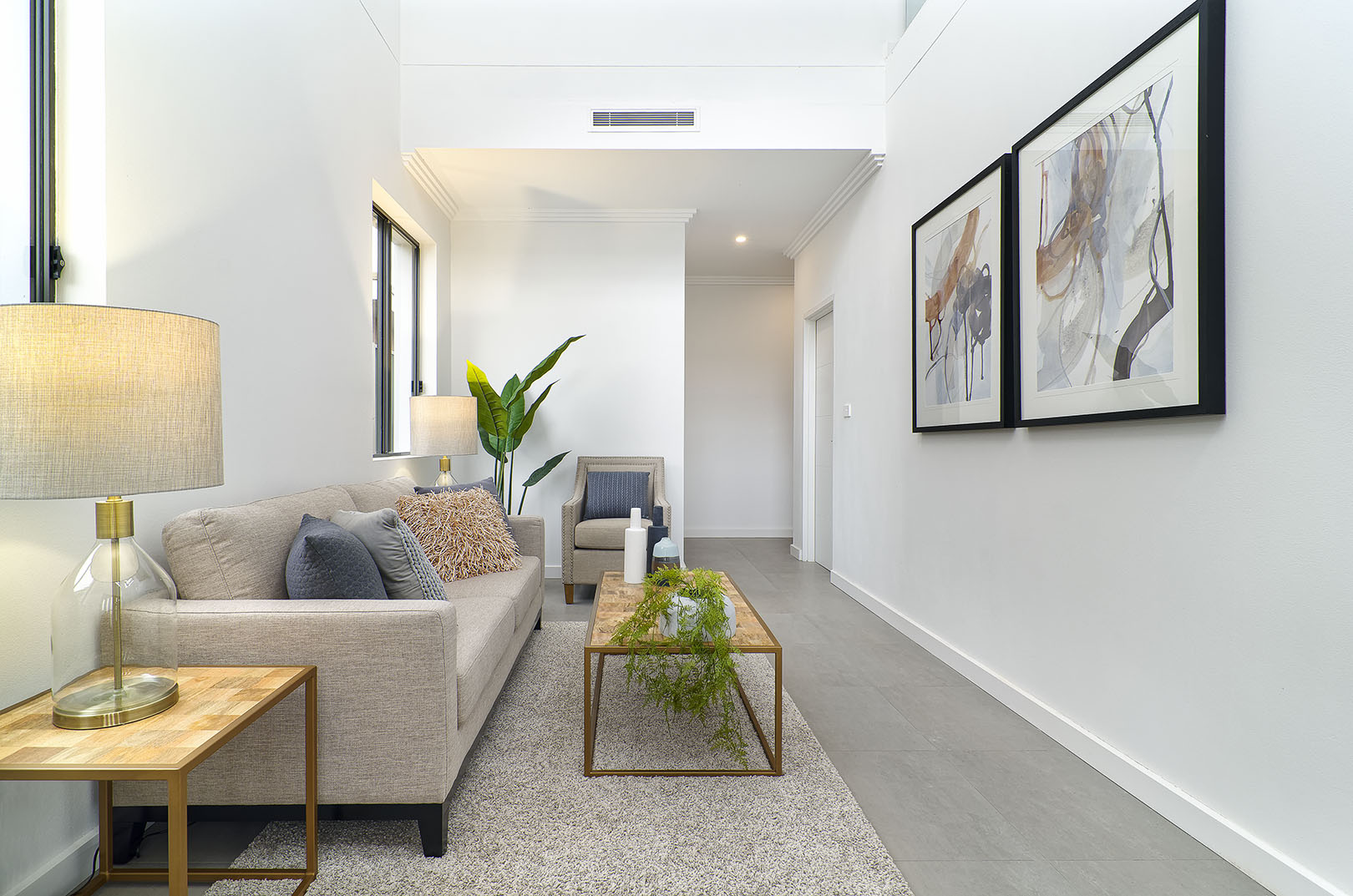
I often distinguish two different types of preferences from clients. Some prefer their spaces to feel cosy and others prefer it to be open. Try and figure out which you prefer and adjust your furniture and rugs accordingly. For example, if you have quite an open space, closing off the space slightly with a couch or rug can help zone the space and give off that cosy feeling. If you prefer it open, place the couch against a wall or in an area where you will be able to see most of the rest of the room from the seat of the couch.

5. Keep it balanced

Most of the time when arranging furniture, we have our heads down and analyse the floor space only. However, it is important to step back and bring your eyes up and make sure the space looks balanced height-wise. If you have tall objects on one side and short objects on the other side of the room it can feel quite disproportioned. Keeping things symmetrical is a good starting point and once you’re comfortable with doing that, play around with it a bit until you find a balance you’re happy with.

Now that you have these tips, don’t be afraid to mix it up a bit every now and again too! Re-arranging my furniture is one of my favourite things to do as it can completely transform the space and give you a whole new perspective!

Office Furniture Fitouts – top 3 things to help ensure your project is a success

Office Furniture Fitouts – top 3 things to help ensure your project is a success

Office Furniture Fitouts – top 3 things to help ensure your project is a success

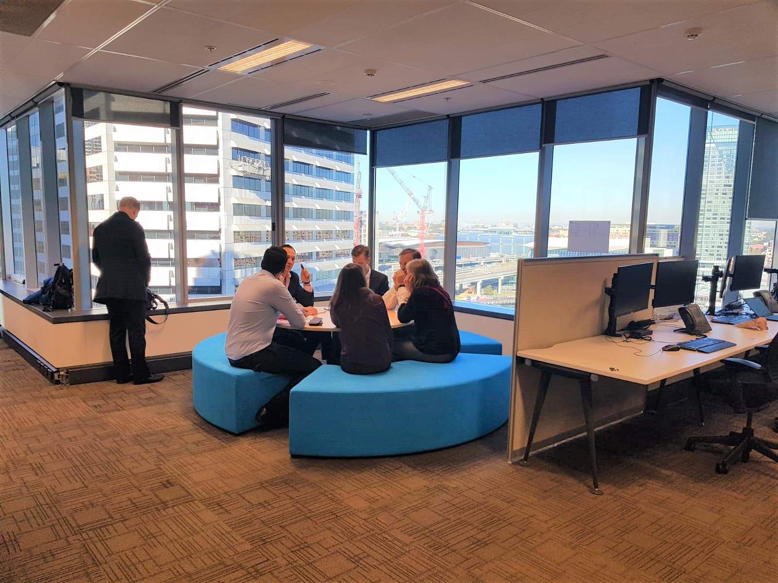
We had a great time working on a large scale office furniture fitout project in the heart of Sydney CBD. The brief we received from the client was that they had to reduce the number of desk in their open plan office space. However, they still wanted to maintain the collaborative and energetic atmosphere amongst the staff on their floor. The Let’s Revamp Team had to come up with designs and recommendations to furnish seven zones where office desks used to be.

We wanted to ensure that the furniture we recommended would help create visual interest in each of the zones, whilst also encouraging staff to have more stand up meetings and team building group huddles. Here are our top 3 tips that helped us ensure successful delivery of the project:

1. Get a clear understanding of your client’s needs

We worked closely with the project manager on the client’s side to understand what the aim of each of the newly opened areas / work zones would be.

One of the problems our client faced was that their employees needed areas for short meetings, whilst not disturbing other people sitting in close proximity to these zones. Without building a physical wall, we wanted to create that effect through the use of furniture. We opted for upholstered huddle pods and lounges with very high backs that are very good for the acoustics as the design helps to contain meeting chatter.

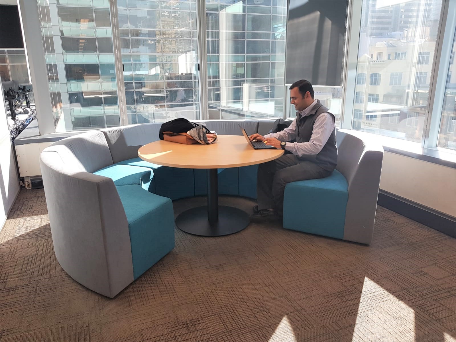
Another collaboration zone had to be created in the corner of a section with windows overlooking Darling Harbour. In an office environment, beautiful views are essential elements that can positively contribute to employee’s wellbeing. The furniture design we therefore selected in this space was a round ‘Think Tank’ design with no back. This ensured that there were no obstructions to the views, whilst still having a practical area where a small team could gather for brain storming sessions.

2.) Choose colours that accentuate the mood you want in a space

It is very important to always consider the effect of colour to improve mood and creativity. The client’s original office colour pallet was very dull (black, white and greys). We selected bright, vibrant blues and violets from the client’s brand colour pallet, to help stimulate brain activity without overpowering the space.

3. Quality of office furniture is key

We used furniture suppliers that guaranteed the quality of the furniture and selected fabric that is hard wearing and decided on colours that won’t show dirt easily. In this project we used Warwick Fabrics’ Ashcroft range for the upholstered furniture. This material is a heavy commercial upholstery material tested to exacting standards for colourfastness, abrasion, inherent stain resistance and safety. Office furniture should be able to take a lot of wear and tear as it gets used every day.

Contact our Let’s Revamp team if you would like a quote for your next Office Furniture Fitout Project!

info@letsrevamp.com.au
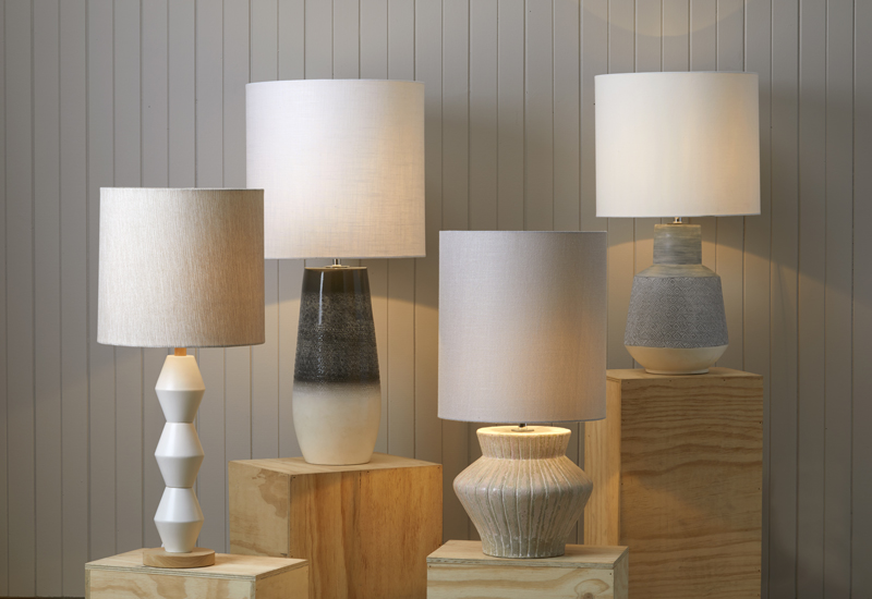
Our 3 best tips when choosing a bedside table lamp

Our 3 best tips when choosing a bedside table lamp

Our 3 best tips when choosing a bedside table lamp

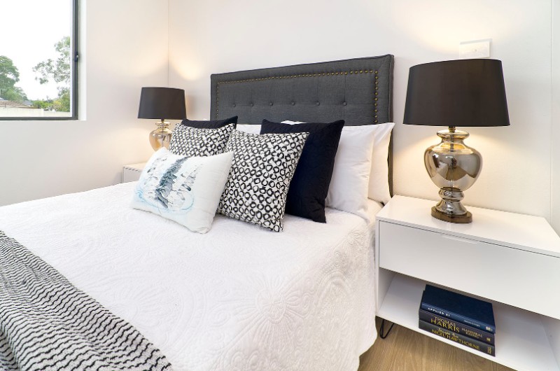
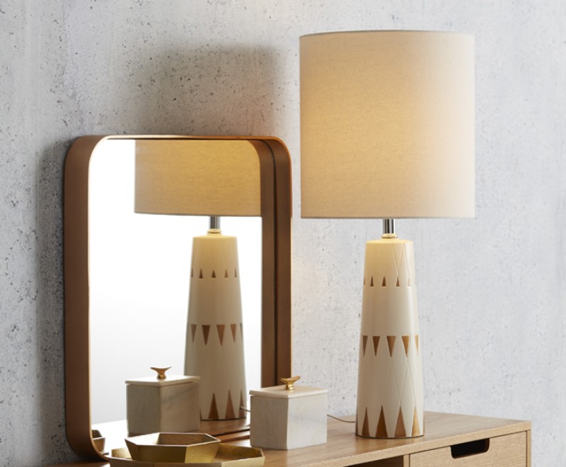
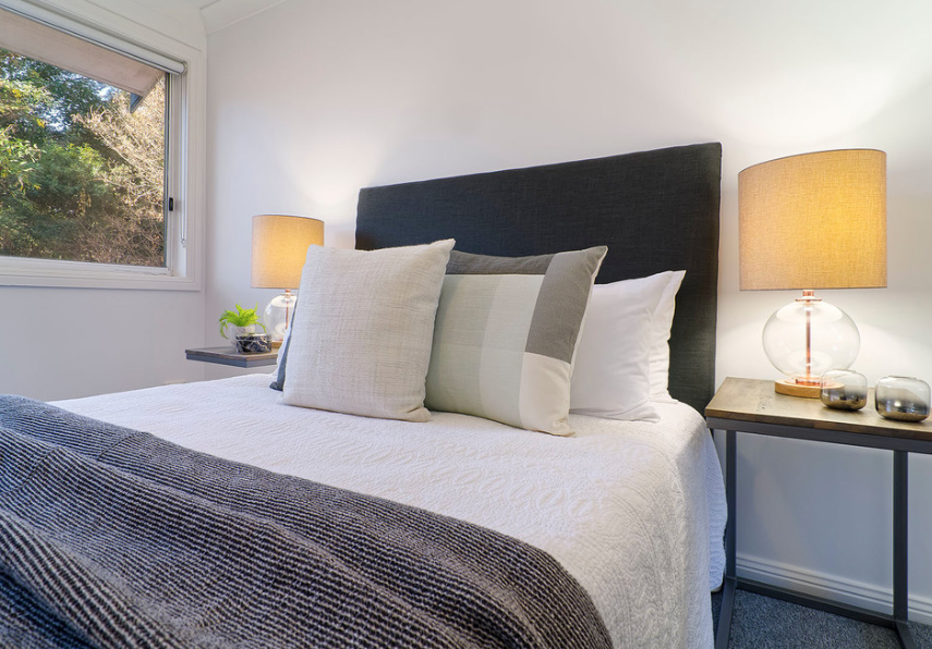
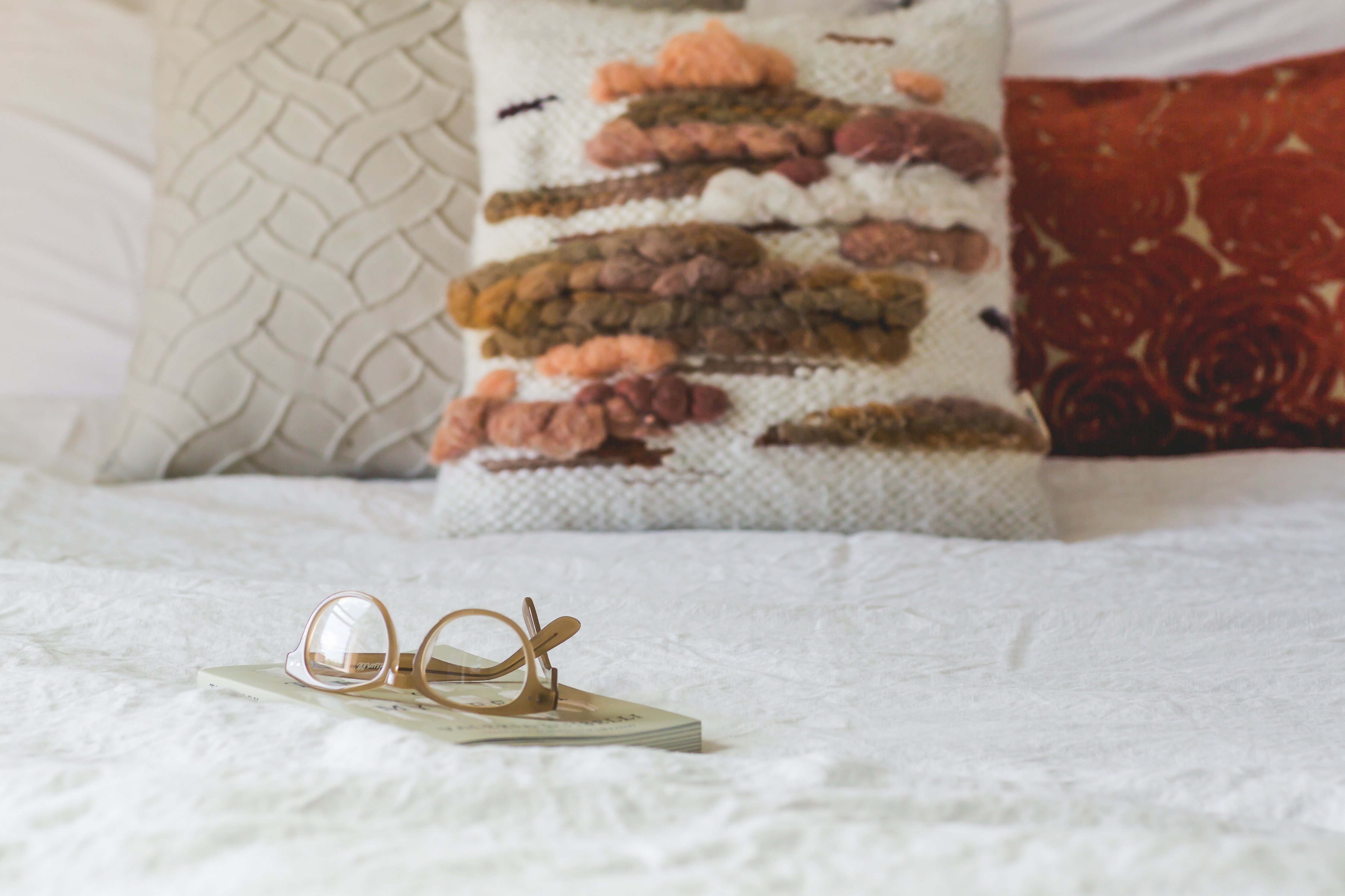
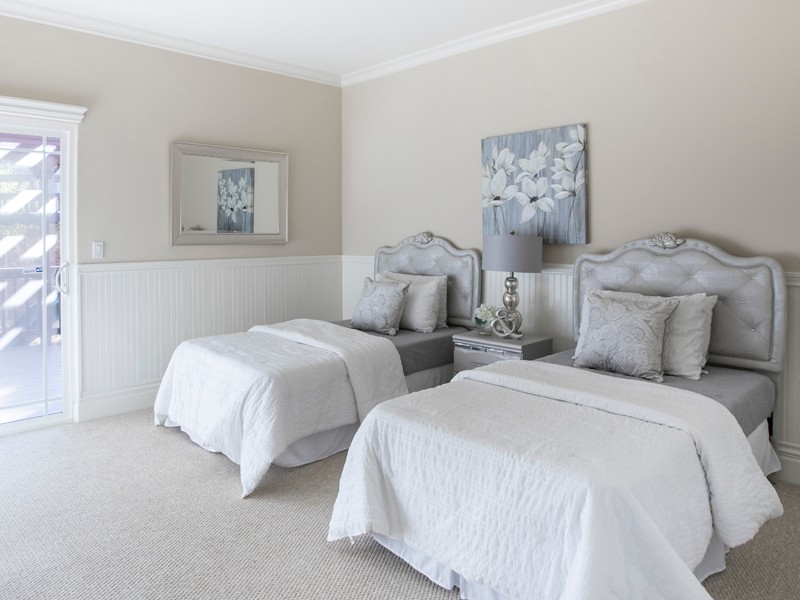
When choosing a bedside table lamp for the bedroom, you should be looking for one that balances a soft light with a style you love.

You can experiment with lamp textures, colours, patterns or sizes, as long as you’re choosing one that complements the overall feel and mood of the room.

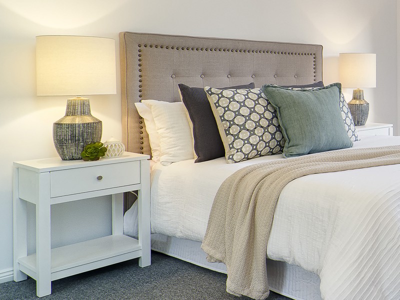
Remember, your bed is the largest object in your bedroom. Incorporating lamps and other objects of a larger scale will give and overall balanced feel to the room.

1. Choosing the right height for your bedside table lamp

The height of the table lamp is depended on how you plan to use it:

Bedside lamp used for reading

When using your lamp for reading or writing while in bed, you will need one that is tall enough to spread enough light across your book or tablet.

When you sit in your bed, the bottom of the lamp shade should be between your shoulder and your chin.  This way  you will have sufficient amount of reading light without the light glaring in your eyes.

The height of the lamp base depends on the height of your bedside table.  Ideally your bedside table should be a similar height as your mattress.   If this is the case, the ideal length for the lamp base will be between 60 and 68cm.

If your bedside table is higher than the mattress, go for a shorter lamp base.  If your beside table is lower than the mattress, go for a longer lamp base.  (Tip:  you can always place books underneath your lamp to increase the overall lamp height)

Bedside lamps used for decorative purposes

The height of your bedside table lamp does not really matter when you only use it as a decorative piece or to provide enough light so you do not have to walk to your bed in the dark.

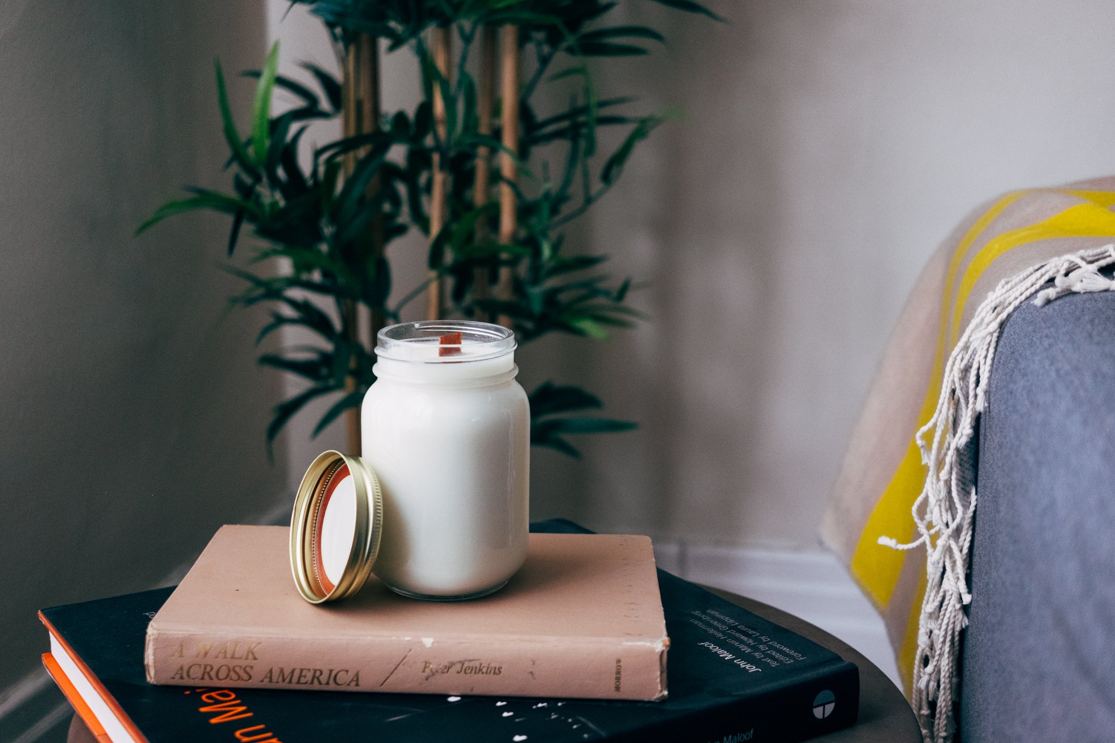
Photo by Stephen Leonardi on Unsplash

2. Choosing the perfect shade for your lamp

Lampshades are not just an accessory for you lamp, they diffuse the light your lamp emits.  If you want a lot of light to stream from your lamp, use a lampshade that is opaque.  If your goal is less light, choose a shade that is non-transparent.

The width of your lampshade should be about twice the width of the widest part of your lamp.  If you have a very thin lamp base, choose a shade that is no wider than the height of the shade.

3. Create Balance

Our table lamp should be in balance with the size of your bedside table and the size of you bedhead.

You do not want your lamp higher than one and a half times the height of your bedside table.

The lampshade should not be wider that the table top.  Measure the widest part of your lamp (normally the base of the shade).  The total lamp width should be only a third to maximum two thirds of your table width.

5 Ways to Add Warmth to Your Home This Winter

5 Ways to Add Warmth to Your Home This Winter

5 Ways to Add Warmth to Your Home This Winter

It’s that time of year again when you just want to spend as much time inside as possible (particularly all rugged up on the couch!) Through our years of experience doing Property Styling all over Sydney, we have picked up tricks and tips along the way that that make sense for the current season, to ensure that our spaces feel inviting as possible for our Clients. Here are 5 ways to add warmth to your home this winter:

1. ) Use lots of warm light bulbs and candles

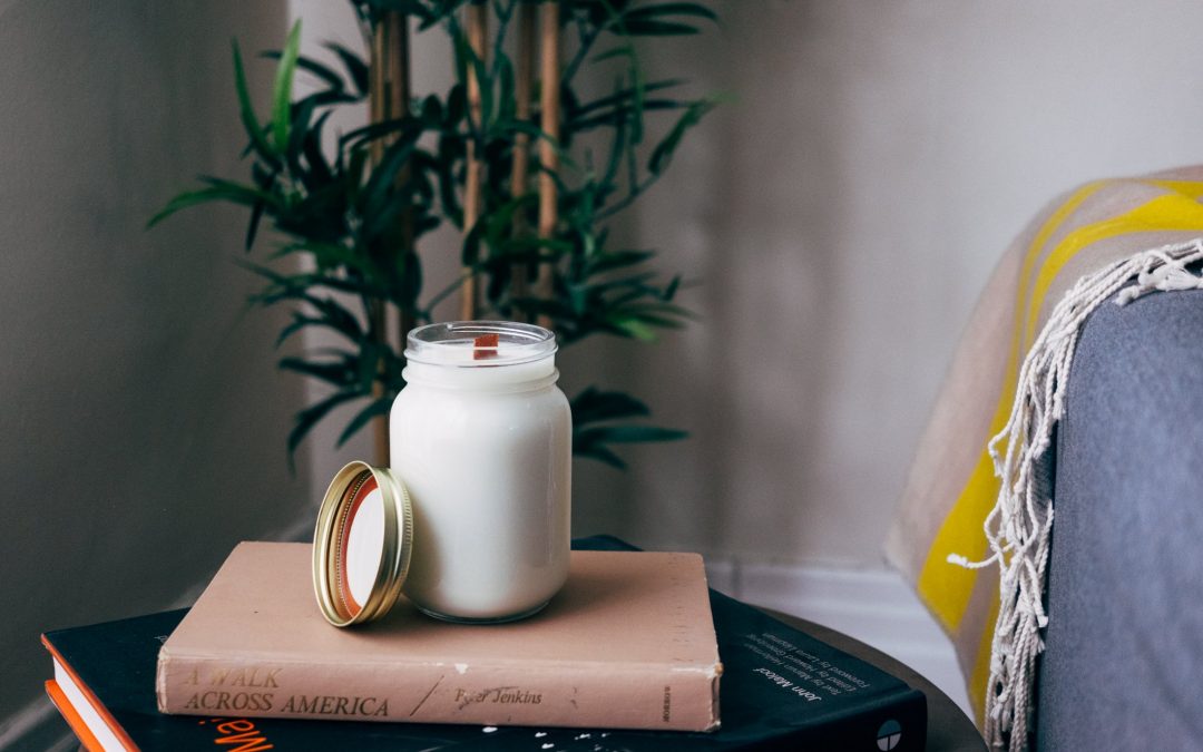
Switching your cold-white lamp bulbs to a warm-yellow bulb makes such a huge difference! Having those hints of yellow can make the space feel similarly to having the sunlight shining through; so for those cool, overcast days this trick works wonders! Nothing screams warm and cosy like some burning candles as well. A personal favourite of mine are woodwick candles that actually make a crackling sound when lit – just like a burning fire!

2. ) Layer different textures – the more, the better!

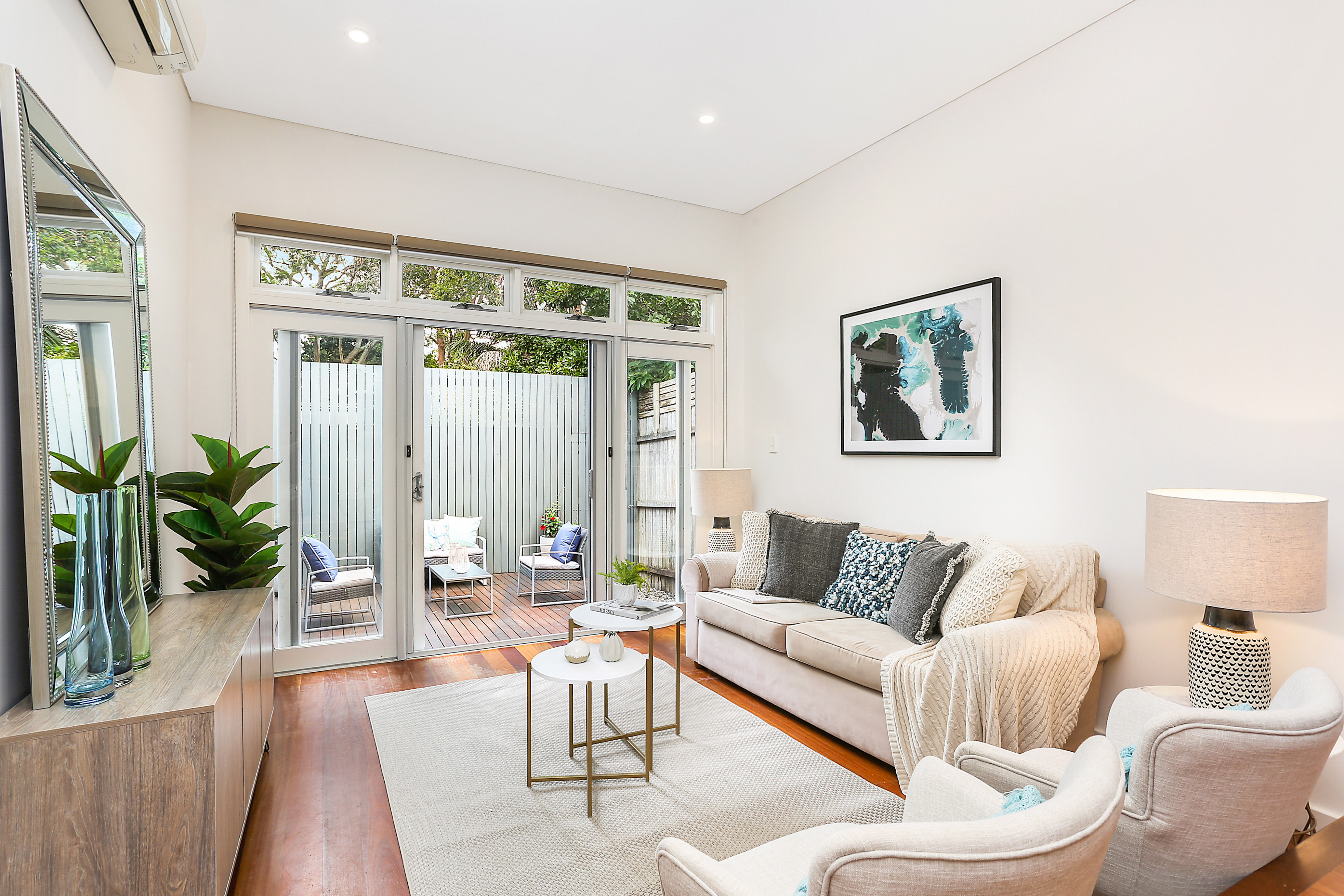
Playing around with different textures is so fun around this time and layering different textures really gives off that sense of warmth and comfort we are all seeking. Flooring is very important to consider and if you have tiles, throwing down a few rugs will not only keep your feet warm, but they are also a great way of zoning out different spaces which can make them feel a lot cosier than having a big open space with no distinction. I encourage you to ignore the ‘less is more’ rule with this one and feel free to add as many cushions, throws and rugs as you’d like!

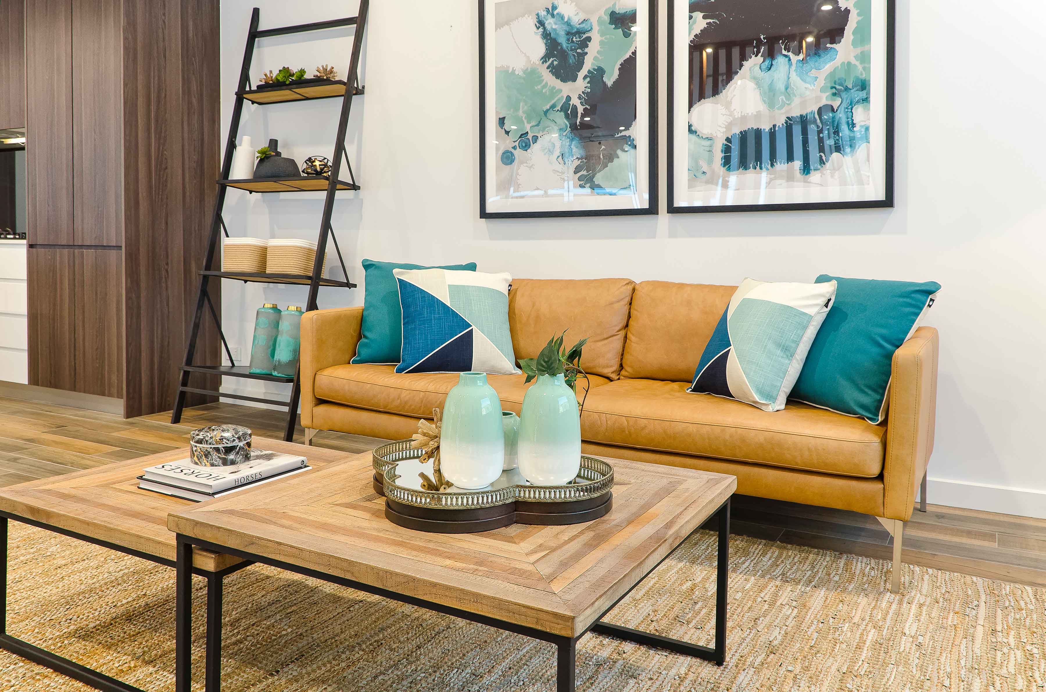
3.) Make sure you’re using warm colours (red/orange/yellow)

There is actually psychology involved with the way that our brains see and react to certain colours, and it is proven that colours such as red, orange and yellow can actually make you feel warmer! During this chilly, winter period it would be best to incorporate these colours in your soft furnishings (eg. rugs, cushions, throws, etc.) and try to avoid some of the cooler colours such as blues, greens and purples.

4.) More timber, less glass and metal!

Using timber in your home is a great way to achieve an added sense of warmth. Not only do the brown and beige tones in timber give a warm feeling, but as it is a natural material, it means you are also able to bring that organic, outdoor element within the home without having to leave! Minimising your use of glass and metal products is also recommended to keep the place feeling warm.

5.) Create a cosier space with a different furniture layout

We are living in an era where big, open spaces are all the rage. However, when winter rolls around we end up seeking cosy nooks! A great, affordable idea is simply to rearrange your furniture by bringing some pieces closer together or sectioning them so that you’ve created a smaller area to get rugged up in. This will give you that cocoon feeling where you don’t feel as exposed to breezes and are able to hibernate until it’s all over!

5 ways to instantly boost your curb appeal!

5 ways to instantly boost your curb appeal!

5 ways to instantly boost your curb appeal!

When it comes to getting your property ready for sale, it is not only the inside that counts. Dressing your property for sale on the outside is just as important as the inside. In this social media age, people have limited attention spans. You therefore only have a couple of seconds to make a great first impression. Here are a couple of tips when preparing your property for sale:

1. Make sure your property stands out

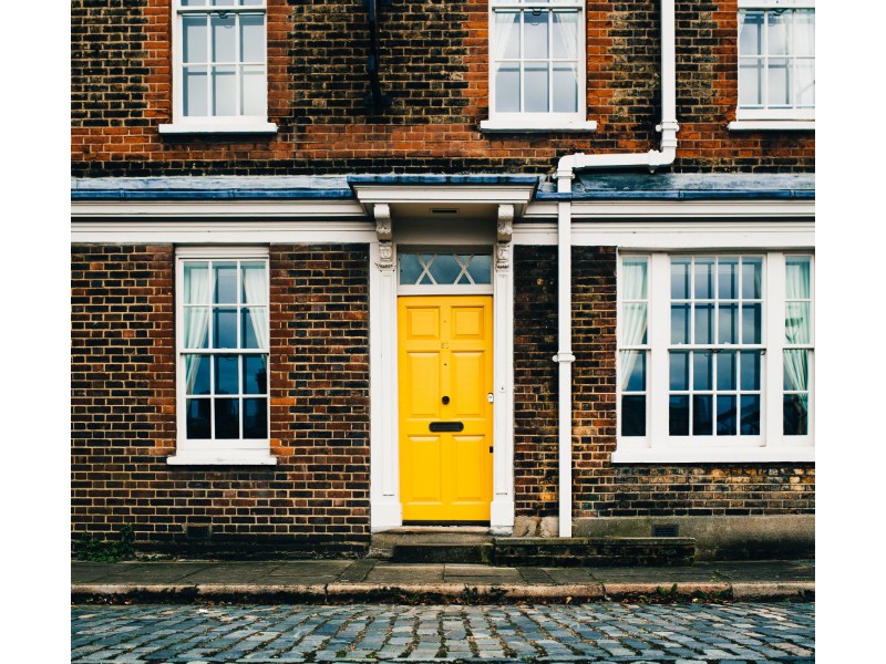
For your property to be competitive in the ever changing market, make sure it is one of the best looking properties in your street. This doesn’t mean go overboard or spend a lot of money renovating the front façade. Something as simple as giving your trims, gutters and front door a fresh lick of paint or putting up a picket fence can do the trick.

2. Access to your front door should be visible!

There is nothing quite as frustrating as having to painfully navigate your way through over growth to find someone’s front door. Most open homes are only scheduled for 30min. It is therefore important to ensure your buyers get into your house as quickly as possible so they can spend most of their time looking at the interior. Ensure that your path and driveway is cleared and that your property looks inviting and welcoming. There should be no confusion as to where the front door is!

 3. Remove any obstacles on the way to your front door!

This is such an easy fix and yet, people still think that having their own cars parked in the driveway, the garden hose sprawled out over the foot pathway or even garden tools lying around like landmines, are acceptable when having an open home. However, not only is it a safety hazard for your buyers, it is also not visually appealing. It is definitely worth spending extra time decluttering your front garden and making it save to move up the pathway!

4. Trim back the unruly Ivy and ferns

There is nothing wrong with a bit of greenery, and in most cases, a beautiful front garden will add value to your property. However, if your walls are overgrown with ivy, it can have the opposite effect on buyers. They might wonder, what is lurking underneath those plants? or the greenery looks very hard to maintain, I’m not sure if it is worth it?  These are not questions you want your potential buyers to entertain. If budget permits, get professionals in to give the front of your house a good clean and trim away any negative questions buyers may have.

5. Pick up loose leaves and branches scattered underneath trees.

No one has time anymore to get the rake out every weekend and gather up all the loose leaves and branches that has fallen down during the week. Therefore, if you have trees in the front yard, ensure they are trimmed back and loose leaves and branches have been picked up before open home. You don’t want potential buyers to be put off by a front yard that looks like it is high maintenance!

Remember, you have one shot at making a great impression. Switch off the telly and get cracking on that front yard of yours!