12 Calming and Stress-Reducing Paint Colours

12 Calming and Stress-Reducing Paint Colours

12 Calming and Stress-Reducing Paint Colours

1. Why does colour affect you?

Unfortunately, stress seems to follow us like our own shadow and with it comes consequences to our health. We don’t go looking for it, it is just there. Many factors contribute to stress and something that’s stressful to you may not bother someone else.

When we talk about how different colours seem to affect you, what is true to you may not be true to another. It is not about the colour per se, it is about personal preference and your inner association and reaction to certain colours. 

Scientific studies have proven that colour does affect our mood.

2. Therefore Let Us Paint a Wall

Being informed empowers you! Next time you feel down and out, take a good hard analytical look at the colours that surround you.

“Certain colours alter mood states and can change patterns of behaviour, for example, bright colours reflect more light, as in the colour of yellow which may over-stimulate the mind, causing strain and irritability” (Dr Linda Mayer and Prof Rashid Bhikha, July 2014)

We may not be able to eliminate all stress contributing factors e.g. Covid-19, but at least we can paint and change the colours in our homes.


3. 12 Calming and Stress-Reducing Paint Colours That You Did Not Know

The following is a list of 12 colours (in no particular order) known for their calming, relaxing and stress-reducing properties.

These would mostly be your lighter colour tones, neutrals, beige colours, greys and pastels and a few surprise colours that you may have thought not to be listed here.

If you are not sure of your colour choice and would like a second opinion or you just need more information, please contact our property stylists and interior decorators. They are experts in their field and provide creative thinking solutions, tips and ideas gained from their experiences as interior decorators and renovators


GREY

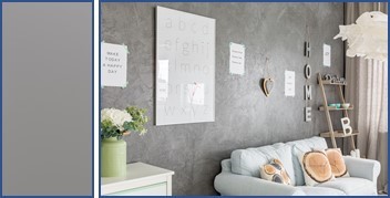
This colour provides a soothing, relaxing, and cool presence. Natural light bounces well off this colour and therefore makes a room painted with grey and tones of grey appear larger.

Grey blends well with other colours. Use dark grey to emphasise a feature wall, door frame or focal point.

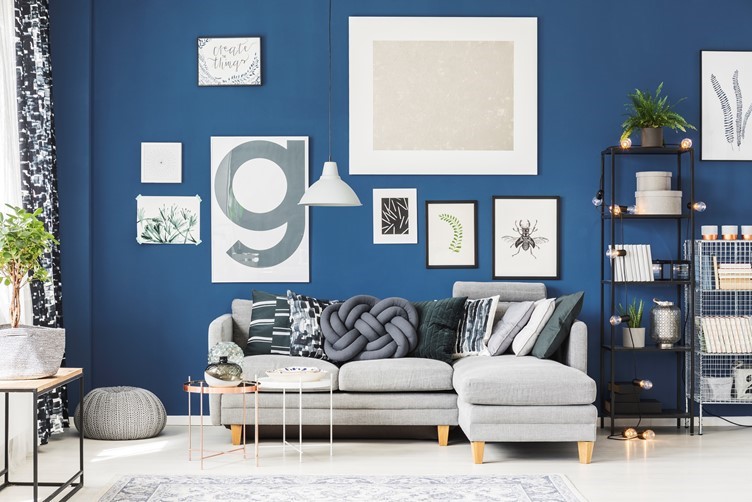
Grey goes well with blue and white elements creating a relaxing atmosphere.

BLUE

Blue is often used on bedroom walls, because of it’s calming and tension reductions qualities. When choosing blue go for softer shades and pastel colours, though the bolder shades of blue work well for accent walls and areas. Classic Blue was nominated as Pantone colour of year 2020 – described as “reassuring blue, full of calm and confidence” – Laurie Pressman, Vice President of the Pantone Color Institute.
PINK

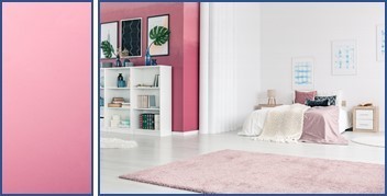
Not your average “girly” colour. Using the right tone can make any room look amazing especially if the colour choice is more your coral pinkish shades. (hex #f88379 known as Coral Pink)

Did you know that Living Coral was Pantone colour of the year in 2019? This colour is best described as a colour of feeling – inviting feelings of being happy, comfort, security, warmth, and socialising.

GREEN

Green symbolic of nature is a soothing restful quiet colour. People are more relaxed in places when surrounded by this colour. Think about how good a walk in the park makes you feel. This colour is easily incorporated into your living area, not just as green paint on the walls but with plants, whether live or artificial. Green plants make excellent focal points in a room.

SKY BLUE

Colours copied from nature are the best de-stressing agents. The serenity of a cloudless day swathed in blue skies calms the mind, spirit, and soul.  Imagine the outcome when painting a room this colour. It will be like taking deep breaths of fresh air, clearing the mind, releasing the body of the toxicity of stress.
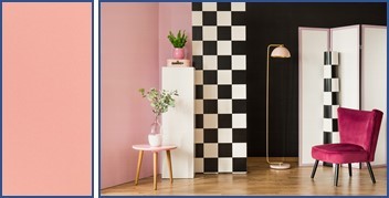
BLUSH

Blush is often used in theatre makeup, and one could, therefore, be forgiven for assuming the colour to fall in the same category as pink and pink tones.
Blush (HEX Code #FE828C) is actually a medium tone of red-violet.

Accessorise a room painted in this colour with plants and décor to create the perfect relaxing atmosphere in which just to chill out and to get lost in a good book.

VIOLET

Did I hear you ask what is the difference between violet and purple? In a nutshell, Violet is more bluish and less saturated. Purple is more reddish and saturated.

Using the right shade of violet brings inner peace, wisdom, and balance for your soul.

Because the darker shades can create a cold and impersonal environment, they are best used for accent areas and features in the room. 
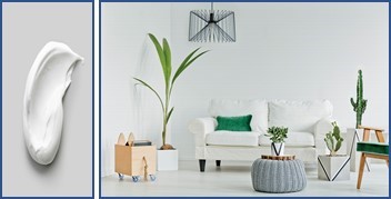
WHITE

Whites are generally thought to be clinical, clean, pristine, sterile, and cold. To the contrary. Whites are calming and symbolise clarity and freshness.  

White reflects natural light creating the illusion of a space being larger.

Choose clean and bright whites. Avoid whites with dark, moody undertones. White walls embellished with bold colour artwork will heighten the calm and restfulness of the room. 

White walls splendidly showcase both bold and neutral coloured furnishings and accessories.

YELLOW

Yellow is an active and positive colour.

Though it may not be a “soothing” colour to enhance de-stressing, it’s positive energy and attributes makes you feel vibrant and energetic and therefore expels the lethargic feeling often associated with stress.
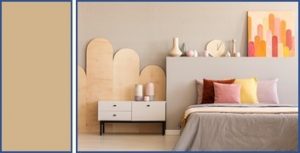
TAN

Tan is an incredibly relaxing warm colour reminiscence of the gentle soft glow of candlelight. An extraordinary colour that works well as a base and for highlighting other colours. Recommended for the dining room or breakfast nook.

BLUE GREEN

Blue green is commonly found in nature. A beautiful calm colour to reduce anxiety and even slows down the heart rate. Soft, quiet shades for the bedroom, living room and other relaxing living areas.


LAVENDER

I’ll admit to being bias. I purposely left lavender till last.

Lavender is such an extraordinary, stunning colour that will never cease to give you options to use in interior decorating.

The lavender plant exhibit healing properties and the colour de-stressing properties.

Lavender is a mixture of white and purple (purple is created by mixing red and blue – blue has a calming effect) and has several shades that go very well with other colours such as white and grey.

The lightest shade of Lavender, namely Lavender Blush can be used as a substitute for white.

Lavender Grey is a pale bluish grey and can be substituted for grey and silver.

How To Identify The Perfect Focal Point In A Room

How To Identify The Perfect Focal Point In A Room

How To Identify The Perfect Focal Point In A Room

 1. What a Focal Point is not?

• Before we talk about identifying the perfect focal point in a room, we must first establish what exactly is meant by focal point.

• A focal point is not necessarily the center point of a room. A center point is a place or point where things are equally distanced from any given a point.

2. Focal Point defined

• A focal point can be anywhere within an area and objects are not necessarily equal distance from another.
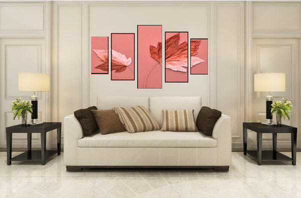
• A focal point is that which instantly attracts the eye, captivates, and holds your attention.

• Sometimes a focal point becomes memorable and quite often involves a matter of opinion and resonates with personal choice.

3. Focal PointFundamental to Interior Decorating and Property Styling

Real Estate Agents, Interior Decorators and Property Stylist will tell you the focal point is fundamental not only to establish a great first impression, but it is the emphasis point around which the rest of the room is styled.

4. Identify the perfect focal point in the room.

As strange as it may sound, by finding and emphasizing the perfect focal point in a room can at times be used to camouflage or distract from view a less than perfect area in the room.

Some rooms may have built-in focal points. Identify and utilise these in deciding how best to layout the room.

5. Built-In Focal Points – are architectural features –  

  • Windows

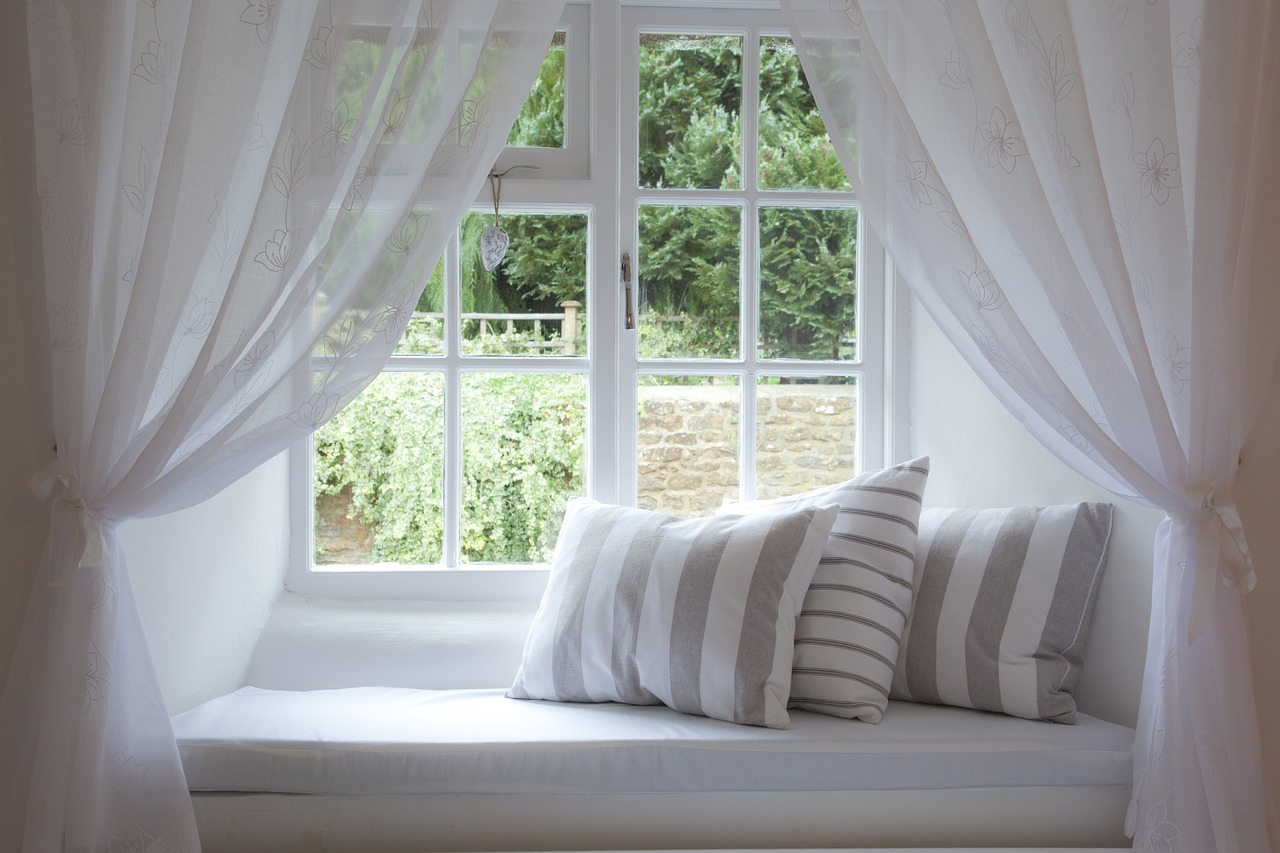
Windows are an easy choice for a focal point. Eyes naturally travel there, especially when they open onto outdoor views. Copiously harness and put to good use what they have to offer. Showcase them as much as possible and make them appear as large as possible.
  • Fireplaces

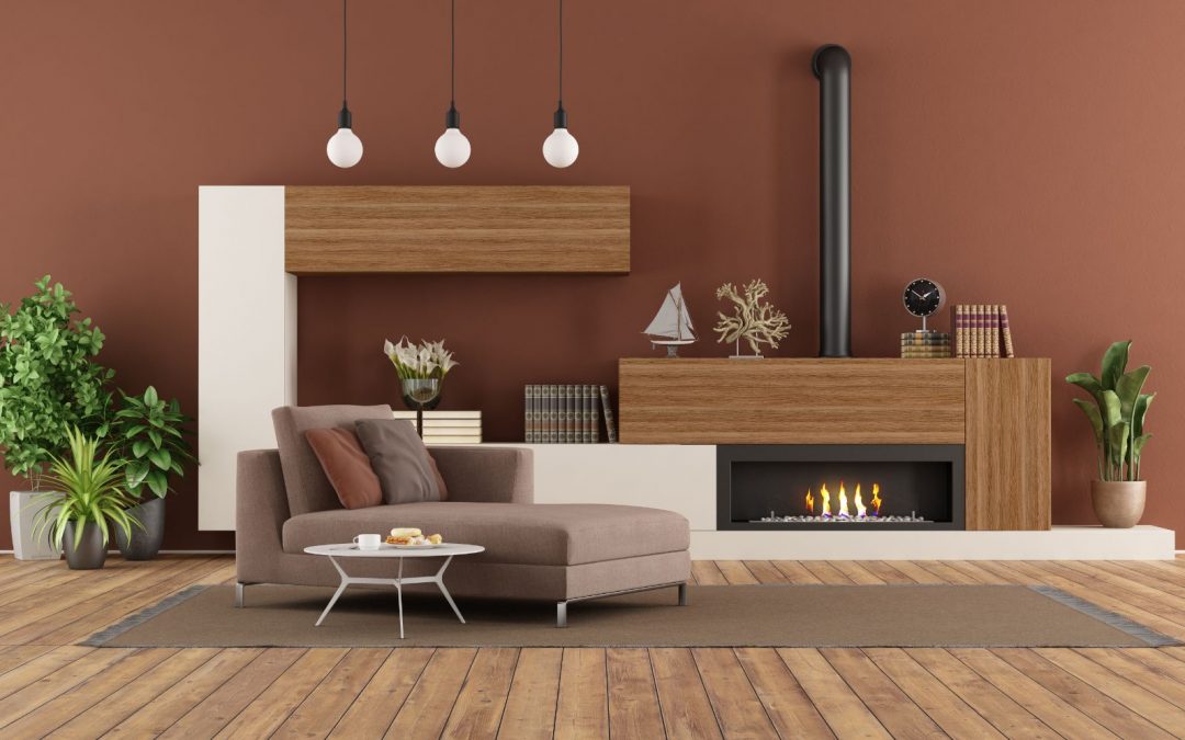
Above the fireplace is a natural focal point for a room. It is the ideal place to hang artwork or a large mirror. If there is a shelf or fireplace mantel, exhibit two or three precious ornaments.

The fireplace itself can boast with custom made design or accent colour.

• Accent Walls

Accent walls are usually those walls furthest away from the entrance into the room. To accentuate the wall paint it a bold colour. Artwork and large mirrors can also be hung on the accent walls, keeping in mind the general guidelines as to how high to hang artwork.

• Ceilings

Draw the eye to higher heights – blessed with a home with high ceilings – emboss this focal point with timber, accent colour, floating or drywall ceiling and lighting.

6. Non-Architectural Focal Point Items

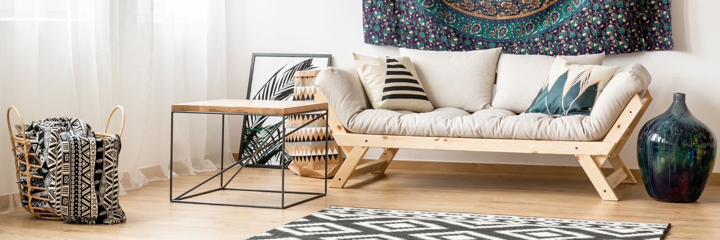
  • Furniture can serve as strong visual features for a focal point. Accessorising with complementary decorative cushions, throws and rugs will help draw the eye to the area,
  • Artwork and Mirrors

Artwork and mirrors can be the focal point in a room too. The reflective attribute of mirrors can make a room look larger and brighter.   

  • Lights/Lighting
    • Lighting accentuates and orchestrates the ambience.


      Use lights to accent the featured focal point. Lights can also be a focal point unto itself, for example, a chandelier.

    6. Do you know?….

    • What to do if there is more than one focal point? – Remember the focus point is the emphasis point around which the rest of the room is styled.
    • It is, therefore, possible to have more than one focal area in a room. In this case, identify the main feature, then allow your eye to travel around the room to the other features or focal points ensuring that all create an even flow.
    • A helpful hint – have no more than three focal points and align the largest focal areas along an imaginary centerline.
    • What to do if the area is an open plan living area – give each area a focal point. If the area is somewhat small, identify one main feature. Define the living area with a rug, which could also be the focal point.

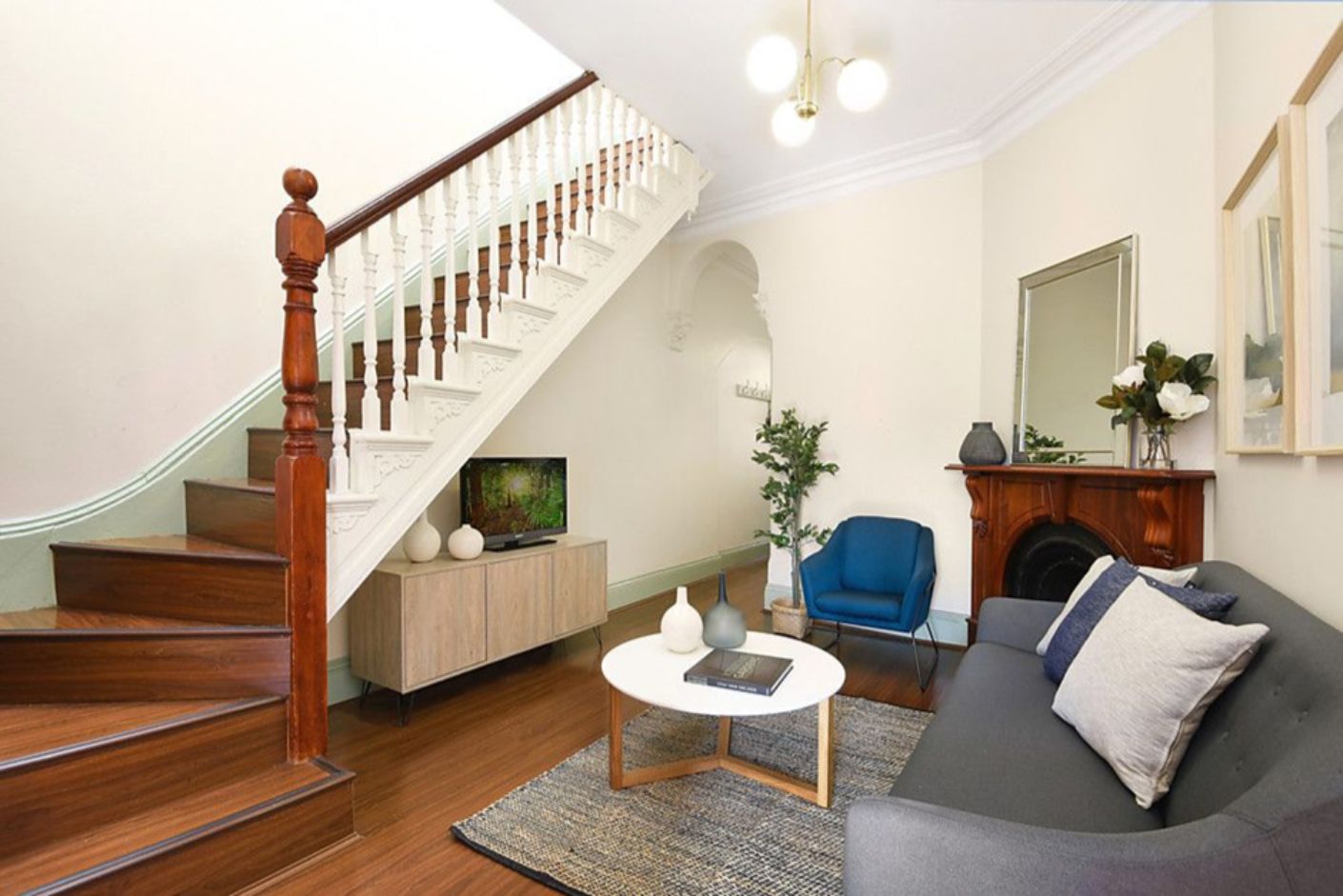
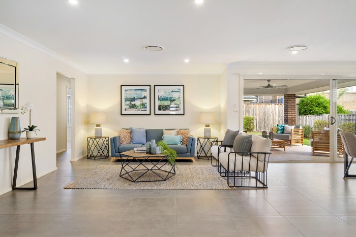
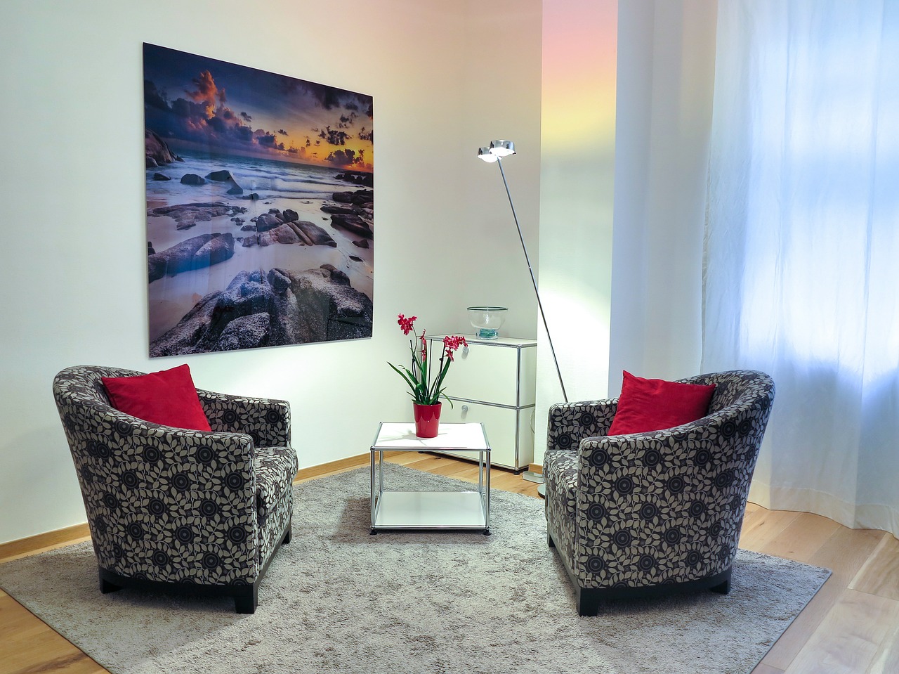
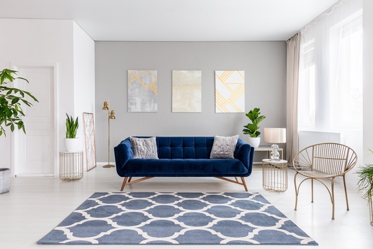
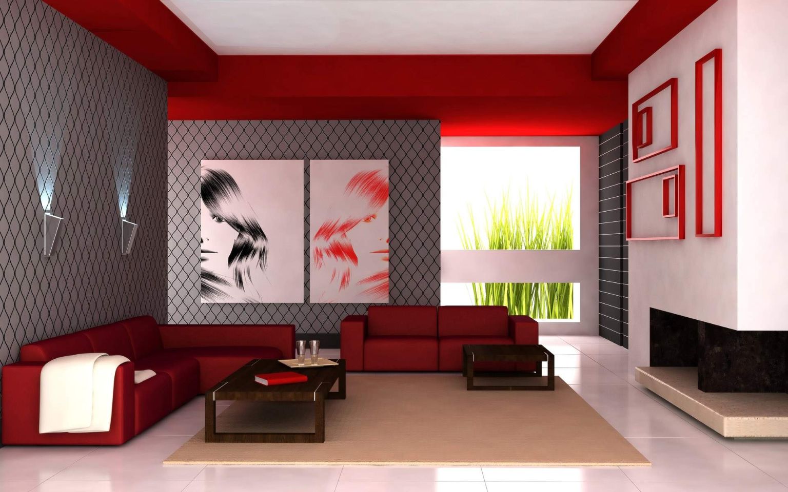
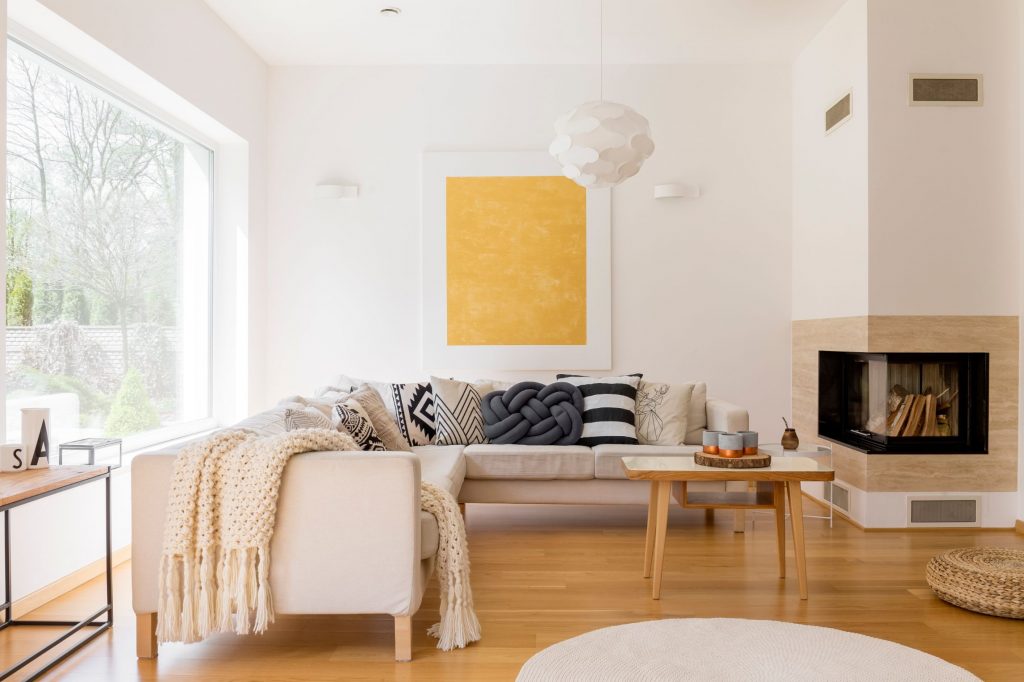
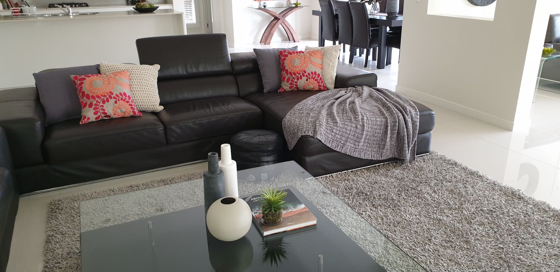
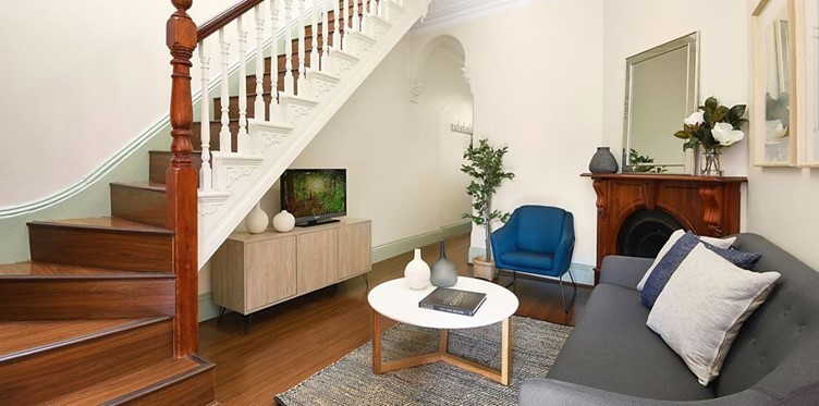
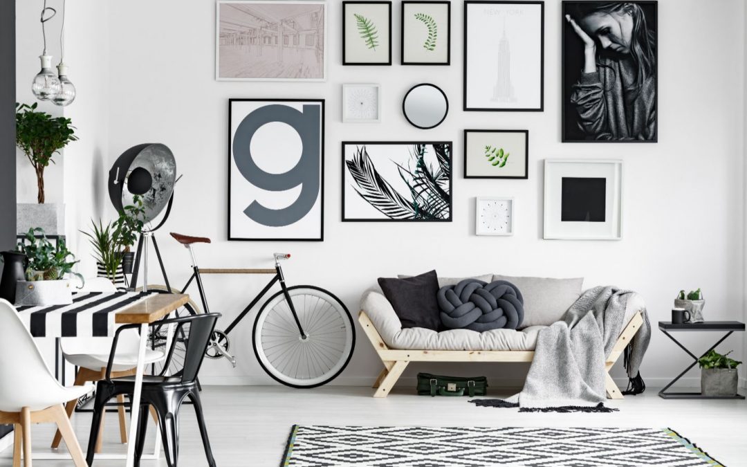
    How many focal points do you see in this image?

    Notice how the rug defines the living area in this open plan living space.


    • What to do when the sun goes down and the sole focal point is the window? Improvise with one or two additional focal points will ensure your room stays interesting when the curtains are drawn.
    • Focal points are also determined by a room’s function.

    We at Let’s Revamp Property Styling and Decorating are passionate about styling and decorating and would love to help you create the most breathtaking focal point in your home. We can assist you virtually too and help you find items that would complete the desired look and ambience in your home. 

    How to Hang Artwork in Your Living Room – Tips, Tricks and Guidelines

    How to Hang Artwork in Your Living Room – Tips, Tricks and Guidelines

    Step 1: Preparation and Planning

    It is important to invest time beforehand to arrange

    and plan the layout of the artwork. If not, you will be

    left with a nail hole scarred wall that will require some

    serious fixing up.

    i. Supplies and Tools you will need

    • Kraft paper/wrapping paper – to trace the outline of the artwork.
    • Hang & Level Picture Hanging Tool (or Water leveller)- to make sure the artwork is hanging level.
    • Stud Finder Sensor Wall Scanner – this nifty handheld device will “scan” behind the wall surface to detect and indicate areas where there are beams, studs, and electrical wires.
    • Whiteboard marker – small dots indicating nail placements can easily be wiped off.
    • 3M multipurpose painters’ tape – easily removable from surfaces after being used as place markers.
    • Hooks/nails/picture hangers specific to the type of brick/gyprock walls.
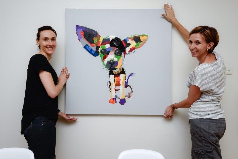
    • Assistance especially when hanging large artwork
    • Scissors
    • Hammer
    • Drill
    • Retractable metal measuring tape
    • Artwork

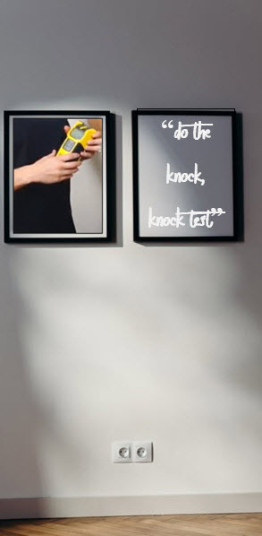
      ii. Do the “Knock-Knock” Test

      On Gyproc walls do the “knock, knock test” to identify where beams and nails are located behind the wall. You will hear a hollow sound where there are no beams or a “thud” sound where there are. Use a Stud Finder Sensor Wall Scanner to locate the beams and studs.

      • Before drilling into a brick wall make sure it is safe to do so

      • Make sure the Stud Finder Sensor Wall Scanner is one that will also detect electrical cables. You can also enlist the services from a reputable electrician.

      iii. Pre-arrange the Layout

      This step could be fun, and you will be glad you did follow through with it.  Pre-arranging the layout of artwork will save you a lot of time, frustration and a wall full of holes.

      At this point, I would strongly recommend you read our blog “How Does Natural Light Influence Your Perception of Colour”.


      Natural light will and does play a significant role in the placement of art. For example, you may have found the ideal spot to hang a beautiful piece of artwork only to find in the late afternoon a shadow is cast over the artwork making it appear dark and uninteresting.

      Here are a few suggestions as to how to pre-arrange artwork before hanging them onto the wall. 

      On a table – use a table approximately the size of the wall area where the artwork is to be hung. Place the artwork on the table and move the artwork pieces around until you have the layout you like. Take a few steps back and review the arrangement.

      • On the floor – you can easily replicate the wall size on the floor with 3M multipurpose painters’ tape. Within the marked area, you can move the artwork around until you have a layout you like. Take a few steps back and review.
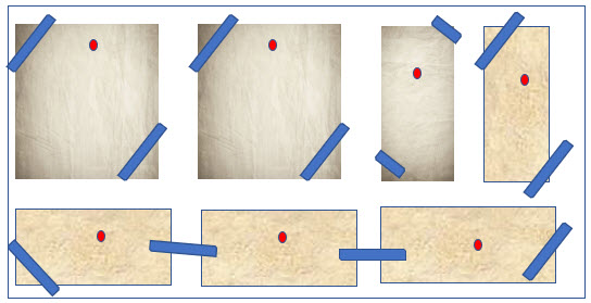
      • On the Wall – First trace the artwork – with the artwork lying face down on a surface, trace the outline of each artwork on a piece of paper. Cut out the template and using 3M multipurpose painters’ tape stick it to the wall. Move the templates around until you have the combination you like. This is especially useful when the artwork pieces are of varying sizes.
        •  

          HINT:  Once you have traced the outline of the artwork, place the template on the back of the artwork and mark the positions of the hanging points. When you are satisfied with the art arrangement/templates, using a nail, gently tap it through the marked point of the template into the wall. This will then leave an indentation or tiny guide hole where the nail is to be hammered into the wall.

        Step 2. How High or How Low to Hang Artwork? – and other Guidelines

        real beauty resides in imperfection –


        There are no hard and fast rules for hanging your artwork. The “rules” are merely guidelines to help you exhibit your artwork and to be visually pleasing.

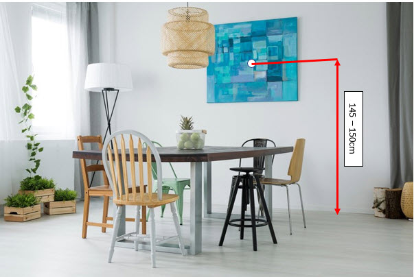
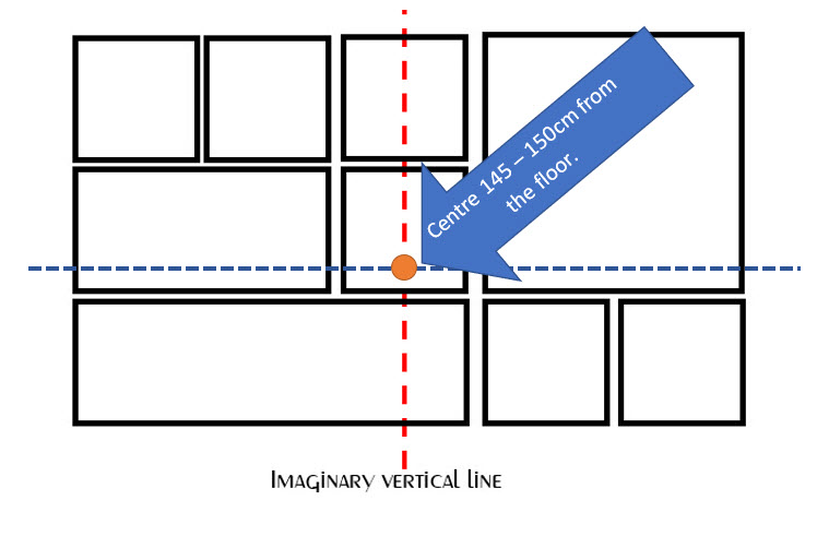
        • Generally, artwork is hung at what is known as “eye-level” – the midpoint of the artwork should be between 145-150cm from the floor. 
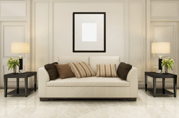
        • There is an exception to this rule when art is hung directly above furniture – for example, a sofa or console table.


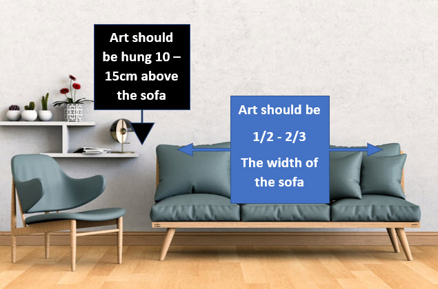
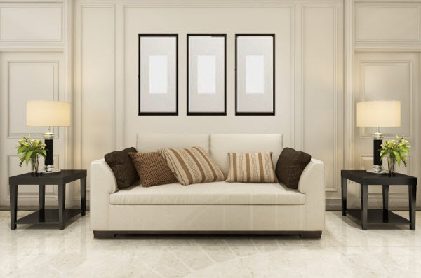
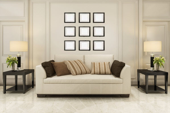
        • When hanging artwork above a sofa or other furniture e.g. console table, leave a space of about 10-15cm (about a hand width) between the top of the furniture and the bottom of the artwork piece.
        • When artwork is above a sofa or console, to keep it proportionate with other items in the room, the artwork should not exceed two-thirds of the width of the sofa or console.
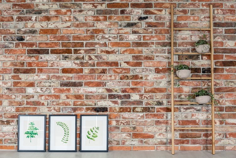
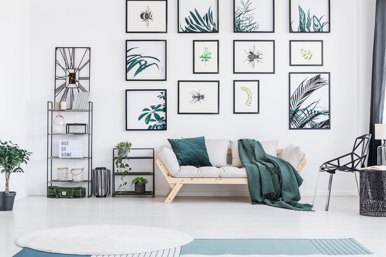
        •  Always consider a collection of art pieces as one art piece – and yes, and you can have an odd number of pieces as one piece.
        • When you are hanging a collection of artwork on a wall with nothing in the foreground i.e. sofa or console table, the “eye-level” rule applies – i.e. find the centre of the piece, about 145 – 150cm up from the floor.
        • It is, therefore, a recommended to first establish how you want the arrangement to appear as explained above.
        • In a collection hang large and medium pieces 5-7cm apart; smaller pieces 4-6cm apart.
        • Identify your showpiece and give it the top spot; then work outwards from there adding more pieces. 
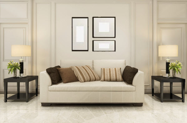
        • When hanging a group of four or more pieces of varying sizes in a non-symmetrical pattern, use the imaginary vertical line method. Art is visually balanced on both sides of the imaginary vertical line. Art on both sides of the line should be similar in colour scheme, frame style and subject matter.

        Step 3. Example Guideline Format for Hanging a Collection of Artwork

        How to Hang Artwork in Your Living Room

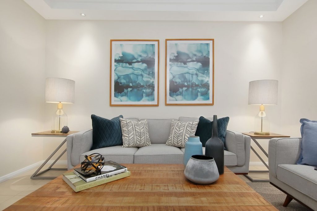
        Hang artwork 10 – 15cm above the sofa

        Always consider a collection of art pieces as one art piece

        ….and few more pointers

        • Not all the artwork hung on the wall need to be von Goch or Picasso.

        • Mixing artwork of various medium creates a more interesting picture. Be careful not to overdo it though. Choose two to three mediums. For example, an oil painting, charcoal drawing, a print, or a watercolour.

        •  Artwork does not always have to be framed. Unframed artwork is more casual.
        •  Use larger artwork and frames rather than many smaller ones to fill a space. It just makes the hanging processes simpler.
        •  Ensure artwork is level using a Hang & Level Picture Hanging Tool or a Water leveller.

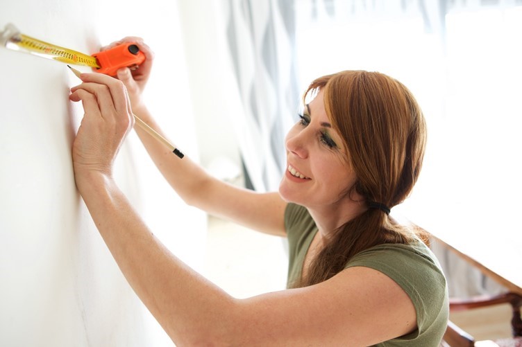
        Armed with a tape measure, hammer, nails, and beautiful artwork you can creatively bring to life the blank wall in your living room. Our property stylists and interior decorators are only a phone call (or email) away to lend a helping hand. They can assist you virtually too.


        How To Style Your Sofa To Look Chic And Glamorous

        How To Style Your Sofa To Look Chic And Glamorous

        How To Style Your Sofa To Look Chic And Glamorous

        Styling your sofa to look chic and glamorous is not as difficult as you may think. It is easy and inexpensive.

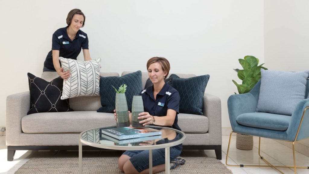
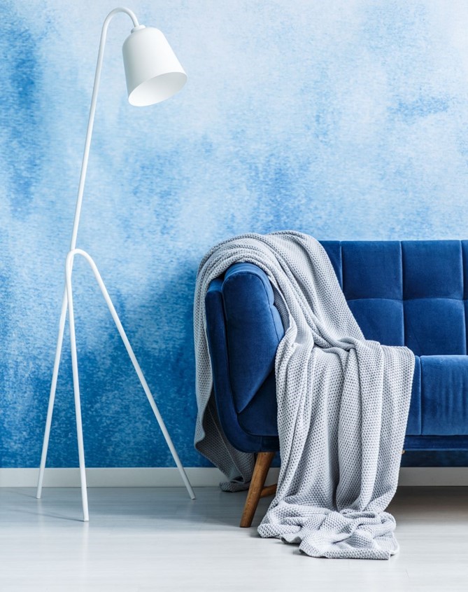
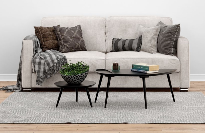
        Simply add decorative cushions and a throw.

        There is an endless choice when it comes to choosing cushions and throws for your living area. They can revive an older sofa, change your style and transform the whole living area.

        And if you are a DIY enthusiast you could create your own stylish cushions.

        Not only are cushions and throws inexpensive, but they are also easily interchangeable with the seasons.

        For more information on cushion colour, texture and sizes please see our blog How to style cushions like a professional home stylist.  

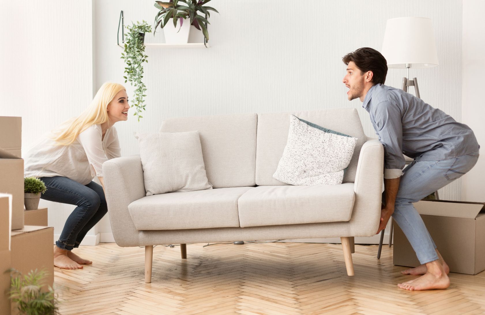
        1. First things First – Move the Sofa.

        • Basically, there is no right or wrong way to position your sofa. The size of the living area will determine the position.
        • If the area is small, placing the sofa against the wall will probably be best.
        • If the area is large position the sofa away from the wall creating an intimate atmosphere.
        • Once you have styled your sofa to look chic and glamourous you would want it to be the focal point of the area, so keep that in mind when moving the sofa.

        2. How Many Cushions and Throws Should You Use?

        • It would depend on the look you want to create, and definitely not too many cushions. You do not want to remove a bunch of cushions before being able to sit down.
        • For a more traditional look, scatter an even number of cushions.
        • For a modern look use an odd number of cushions.
        • Only use one throw.

        3. How to Arrange the Cushions and Throw

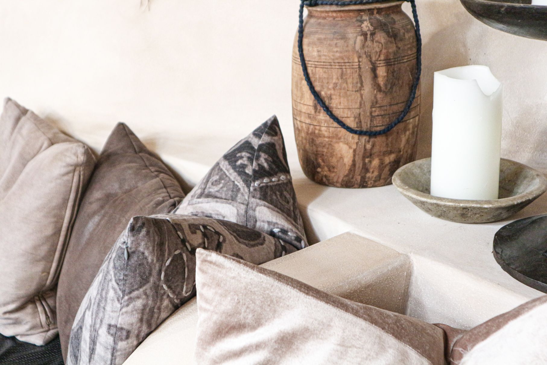
        • Cushion arrangements should be layered, placing the larger cushions behind the smaller ones.   
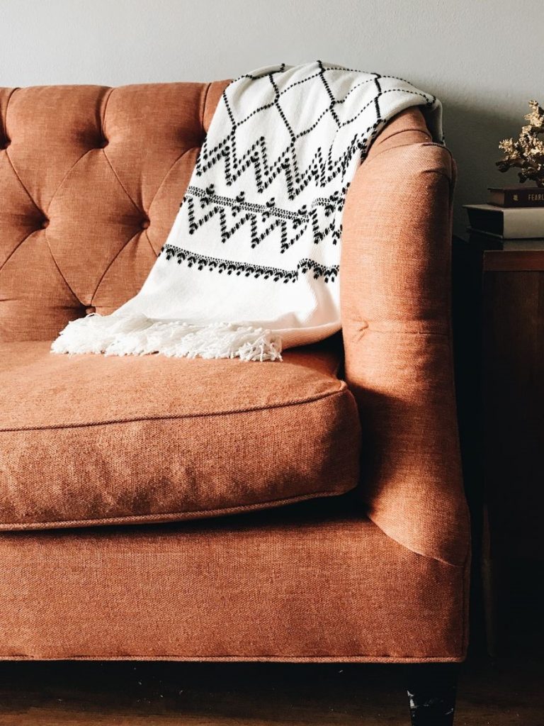
        • Throws are usually draped over the armrests.

        NOTE: Keep cushion cover zippers hidden.

        4. Cushion Arrangements – 

        • The Paired Arrangement

        Two sets of matching cushions are placed at adjacent sides from the centre of the sofa with a proportional gap between them.

        • The Multi-Layered Arrangement

        This kind of arrangement is “free-fall” and all about texture, patterns and style. Be careful not to overdo the arrangement and decide beforehand the style you want it to look – casual, formal, traditional, vibe, edgy or funky.

        • The Balanced Arrangement

        Probably the most visually, harmonizing and pleasing arrangement. Textures, patterns and cushion sizes showcase very well in this arrangement.

        • The Separated Trio Arrangement

        Perhaps the most popular arrangement. Three cushions placed at either side of the sofa.

        • The Central Arrangement

        This style works with even and odd number of cushions. As the name suggests, the cushions are placed towards the centre of the couch. An ideal arrangement for small sofas.

        • The Alternating Pattern Arrangement

        Use plain and patterned cushions. Arrange them alternating on the sofa. Start from both ends of the sofa and work towards the centre.

        • The Different Shapes Arrangement

        Use different shaped cushions, offsetting them against each other.

        • The Individual Formal Arrangement

        This style is best used in professional areas such as a formal living room, an office and lobby. Cushions are placed upright and are usually of the same size and shape and not more than two or three colours.

        • The Throw Arrangement

        Adding a throw to complete the style will enhance and complement the cushion arrangements. Usually, only one throw is required and is draped over either end of the sofa, or in the center.  Use a throw in texture according to the season. For example, a lightweight throw in summer and a thick wool throw in the winter. Depending on the cushion arrangement, it is always best to use a throw of neutral colours. 

        If you need assistance or advice about styling your living area with cushions and throws, or any other property styling questions be sure to give our property stylists/interior decorators a call at Let’s Revamp Property Styling – 02 9659 2556 info@letsrevamp.com.au

        Our stylists are also able to assist you by means of virtual consultation.

        Over 10 Bathroom Updates to Increase Your Home’s Value

        Over 10 Bathroom Updates to Increase Your Home’s Value

        Small Changes to Your Bathrooms Can Add Value

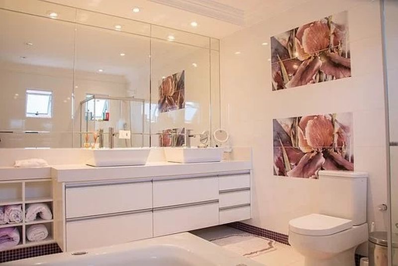
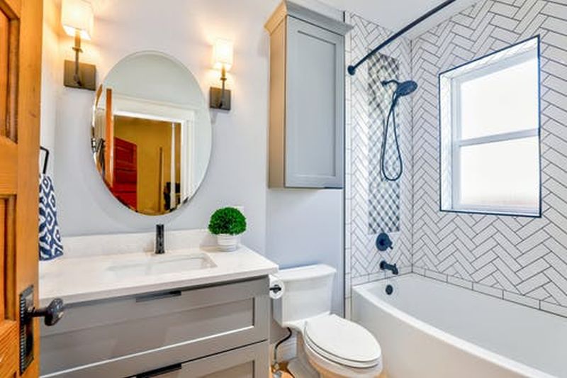
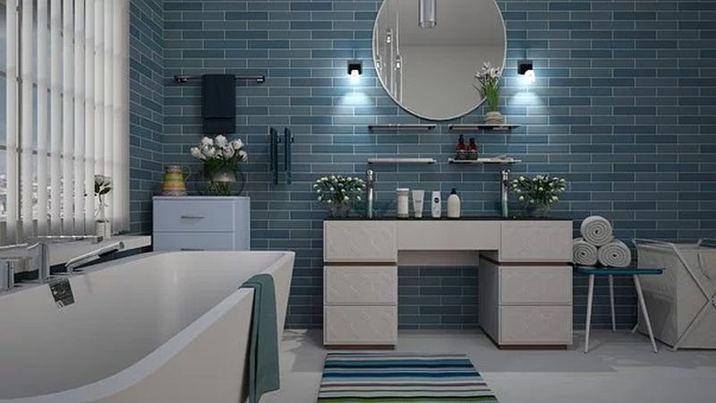
        Having bathrooms in good condition and up to date adds value to your property.

        Updating bathroom spaces to sell

        You can help increase the appeal to potential purchasers who will feel they can move in and not have to make any changes for a period of time.

        Updating bathroom spaces as a homeowner

        When you think about it, given the frequency and amount of time spent in the bathroom (that goes for both men and women here) investing in improving the feel and functionality of this space for use as a homeowner while also adding value to your property can also be worthwhile.

        You may not have to spend as much on updating your bathroom as you think. First, apart from budget, think about whether the main or second bathroom, ensuite or powder room is to be in a similar style as the rest of the home. 

        You may like to go for a completely different style. Consider the size and location of the space, age or needs and number of users.

        You’ll need to bear in mind aspects such as shapes working well together from tapware to toilets and the end result translating into both a functional and appealing space.

        Some ways to update and change the feel of your bathroom space:

        • With changing rends, new tapware will give a modern look.
        • New cabinet handles can provide a different or updated look.
        • Replacing the shower head old for new or as an update also improving water efficiency.
        • Replace the vanity e.g. a floating vanity unit or with legs also allows easier cleaning.
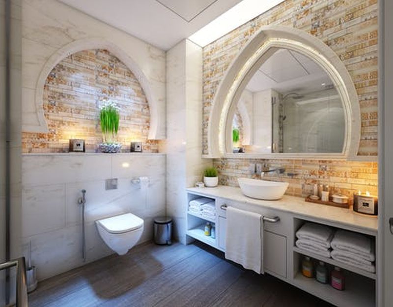
        • Decide on a more modern style of sink e.g. counter top vanity basin or from one to two basins can add value.
        • Add or replace a mirror with suitable lighting for applying makeup or shaving. A heated bathroom mirror to avoid ‘fogging’. A bathroom mirror cabinet provides easy access to your necessities
        • For those cooler months, a heated towel rail.
        • A bath in good shape is a priority if you have young children or many potential purchasers are likely young families in your area.
        • Adding a pendant light or other shaped light over the bath for example for more character or feeling of luxury.
        • Install waterproof speakers so you can listen to your style of music.
        • Window treatments e.g. new blinds or shutters in white is a great neutral choice.
        • Would a sliding door improve space limitations?
        • Colour – for a change or to add more colour by painting walls or tiles, new feature or coloured tiles. The use of accessories and towels contrast a white clean look
        • Storage – installing storage, particularly in smaller ensuites or powder rooms, above or beside your toilet or unused corner can maximise the use of space, whether that’s shelves, cubes or cabinets.

        Thinking of up-stying your bathroom? Contact our professional property stylists at Let’s Revamp Property Styling and Decorating for more bathroom decorating ideas and assistance.