Identifying your Style

Identifying your Style

From Contemporary to Mid-Century Modern to Scandinavian, there are so many different styles of Interior Design out there and identifying which one resonates with your personal taste is important in order to achieve the vision you have for your home. You may need to convey your taste to your Designer, or if you’re working on your own, having a clear understanding of your personal style will help you to narrow down the correct suppliers in order to help you find the most suitable items for your space.

Step 1: Write down a list of colours, textures and patterns you like

This is a great starting point to come back to later, after you’ve done more research on which materials correlate with which styles. For example, if you are leaning towards pastels, light/oak wood and abstract patterns you may be describing Scandinavian without even realising!

Step 2: Use Pinterest to find common themes in your pinned images

Pinterest is one of the best ways to develop a better sense of your style. Often we will see things that we like, but not realise that there is a common theme until we see them all side by side. I would recommend pinning any images you love for whatever reason and seeing if there are any resemblances between the images afterwards.

Step 3: Research different interior styles


Scandinavian
Mid-Century Modern
Modern/Contemporary
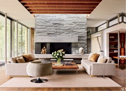
Industrial
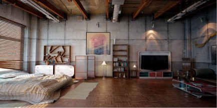
Hamptons
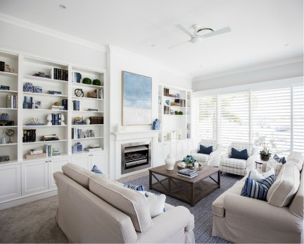
Other popular styles:

  • French Country
  • French Provincial
  • Rustic
  • Bohemian
  • Minimalist
  • Traditional
  • Farmhouse
  • Hollywood Regency


Step 4: Take another look through what you did in Steps 1 & 2

At this stage after researching your own preferences and the different styles out there you should be able to find a correlation or pattern of some sort. Of course it is still very general and you may not like every piece used in an image but it is definitely a great starting point in identifying what you are drawn to and gather a stronger idea of how you’d like your home to look. Happy Styling!

 

Style and Interior Decorate Your Rental Apartment

Style and Interior Decorate Your Rental Apartment

Style and Interior Decorate Your Rental Apartment

 1. The Rental Agreement

 A lease agreement, is property that is leased for a period of six to twelve months or longer. The lease period and monthly rent documented cannot be changed prior to the end date of the agreement.

 A rental agreement on the other hand is on a month to month basis, with no long term requirements. Any changes can therefore be made after one month.

                                                                                                                                                   (Photo by rawpixel on Unsplash)

2.  Make It Your Own, Make It Your Home, And Get Creative!

Your boxes are packed and you’re are ready to move in. You have signed all the legal documents, understood the terms of agreement and have the keys to your place.

Moving into a place that you do not own, the agreed upon terms and conditions determine the changes you are able to make to the rented property.

You also do not want to spend too much money on something that does not belong to you, knowing too that you will not be living there permanently.

Yet, until such time you need to live there and call it home.

The good news is, that you can actually make huge changes without breaking your budget or the terms of agreement, to give it a well-deserved personal touch and make over.


Our home styling professionals look forward to assist you with your professional interior styling or home staging needs in the Sydney area.

3.  Decorate/Style Your Rental Home.

(The possibilities are endless)

Please note:

  • Before making any changes ensure that you are within the parameters of the legal signed Terms and Conditions.

Apartment therapy

Scenario – bland, poor light, dull rental beige walls.

The floor – laminated flooring. Some areas were too well worn, and not in a very good condition. The landlord felt they were still good enough. So I was faced with “blah” flooring.

This called for definite non-invasive apartment therapy.

Image Source

Armed with a bucket of warm water, a cloth, with a few drops of dishwashing liquid soap, I proceeded to wash the walls from the top to bottom. With a damp cloth I cleaned the laminated flooring, a few times over. What a complete workout (ha ha) and difference this had made to the visual of the apartment.

Entrance – the Lounge

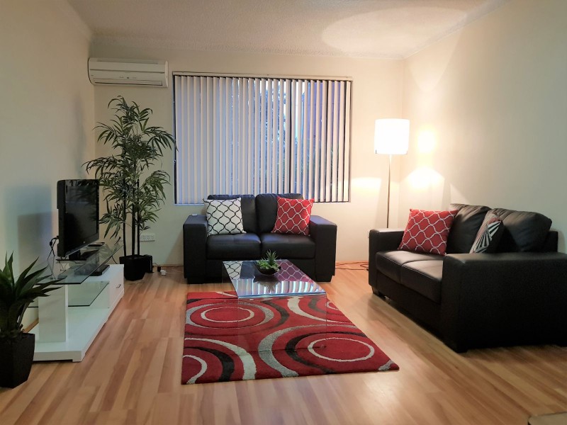
 Entrance to my one bedroom apartment – the lounge!

After washing the walls and floors, the rental beige walls were more accommodating, and the golden brown hues of the laminated floor really added a richness and natural flair to the space.

Imagine this area without the artificial plants – artificial pants are just such a plus factor to bring balance and nature to a living space.

The vertical blinds were drab, so I replaced them. These are easy to purchase from your hardware store, or on line.

To lend balance to the wall with the window, I placed at one end a large artificial plant and at the other, a floor lamp with a beige lamp shade.

Centred is the claret or maroon rug, graced by rings of grey, black and ivory.

The one sheet glass coffee table presents sophistication, stylishness and renders spaciousness. A good choice for small areas.

The low line and chic entertainment unit in high gloss white, with a glass tabletop and glass middle shelf combines elegance and functionality.

The welcoming comfort and classiness of the two black two seaters sofas, certainly adds splendour to the living space.

The display cushions completed the look of welcoming and home and stylishness.

You have just got to love your bedroom

I started by changing the door knobs of the cupboards. I kept the replaced ones in a safe place to as to screw them back on when I vacated the apartment. I chose quite large round black doorknobs. They immediately added boldness to the room.

I strategically placed my black faux leather double bed over the damaged area of the floor. I suppose I could have made use of a carpet, but the laminated flooring (the good areas) was a beautiful blend of rich golden-browns, I decided against it, and wanted to make use of the natural feel that they exhibited. With the badly worn part successfully hidden under the bed, I was able to do just that.

Because grey is a colour without a colour, it just blends in with the surroundings. Hence the use of matt grey curtains for the patio door. This blended well with the beige wall, and actually made the wall quite unnoticeable, and made the room seem larger than what it really was.

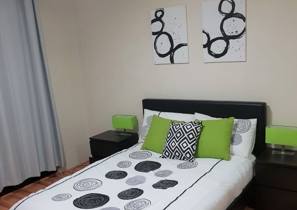
I bought canvases and painted my own circular abstracted wall art, with a few splashes of black. A job well done, even if I do have to say so myself.

The white duvet cover, with varying circles of grey and black simply looked stunning. So we now have large black circular door knobs (I do apologise for them not being in the photo) abstract circular art work and circles reproduced on the duvet cover and pillows. Modern and picture perfect.

Adding modern appeal to my bedroom, I added stylish contemporary black, two drawer bedside tables, featuring bedside table lamps, with bright green rectangular lampshades on chrome stands. This created quite a remarkable stylish look.

The green colour of the lamp shades are replicated in the mono green display cushions.

To finish off my picture perfect bedroom, I added a black and white square patterned display cushion. This defiantly enhances and simultaneously brings distraction from what could have been an overdose on circular patterns.

Rental Space my Home

Though this rental apartment was not exactly pristine, though it ticked all the boxes I required for accommodation close to work, I was able to transform the otherwise drab, lifeless and dull place into a sunny and welcoming home.

Colour Schemes – Part 6 of 6 – Grey on Grey

Colour Schemes – Part 6 of 6 – Grey on Grey

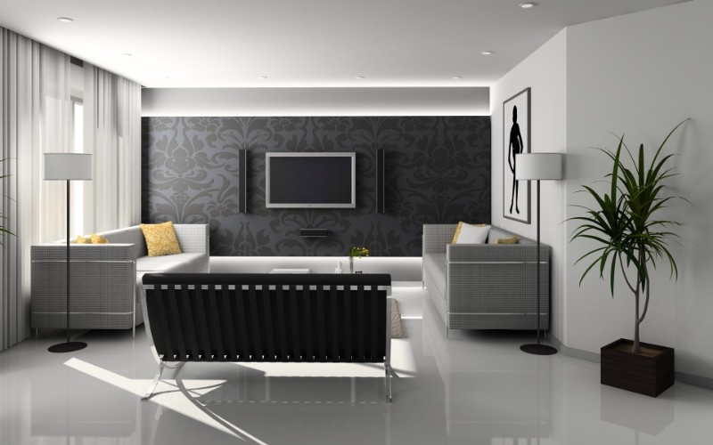
https://www.pexels.com/photo/apartment-chair-clean-contemporary-279719/

Grey, is said to be a colour without colour; an achromatic colour, meaning there is no hue or saturation, but lightness. Our lounge (image above) is considered to be an Achromatic Colour Scheme. Simply a colourless scheme, possessing no hue, only black, white and grey – Just neutral.

The versatile attributes of grey makes it popular in home decorating, especially those opting for a Scandinavian style. Greys blend well with all colours, even with itself. Hence the grey on grey title to my blog.

Photo by Federica Campanaro on Unsplash


  1. Grey Is ….Well Gray …. or is it?

“Long live the grey!” Grey is timeless. Grey is emotionless. Grey is grey, or is it?

It is said that grey as a colour name in the English language was first used AD700. Grey was a fashion statement in the 18th century. Oh and did I forget to mention – grey is found in nature too. In clouds. In gravel. In rock. Even in our hair – hair without pigment, turns grey.

To create the colour grey, mix black and white. Add a little red to the mix and you have a warmer grey colour. Add a little blue to the mix and you have a cooler grey colour.

Grey reaches its apotheosis when used in its palest and deepest light to create a contrasting look that harmonises and coordinates.

2. Grey Reaches It Apotheosis

Photo by Alexandra Gorn on Unsplash

Epitome of grey diversity.

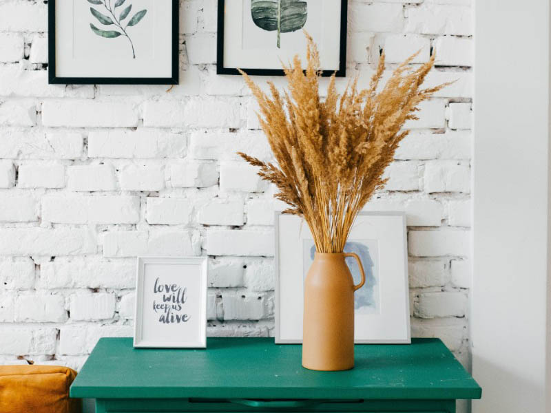
The beauty of the emerald green chest of drawers, is accented by the imperfect finishing of the chalk-white washed brick wall. The irregular lapses and gaps in the cementing of the bricks, create a mesmerising and contrasting look. The gold colour sofa to the left, is brought into balance by the display of gold earthen colours of the wheat like sheaves in the pottery jar vase.

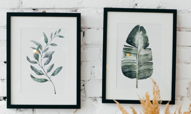
In these two artwork pieces, grey reaches its apotheosis? The variation of the grey-green and black dark green colour and the varied brush strokes create a contrast of pale and deep light that harmonise and coordinates. The black wooden frames accentuate the artwork against the almost white brick wall.

3.  Bright Yellow and Grey

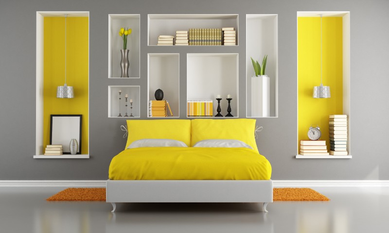
Quite the wow factor! Beautifully styled main bedroom or even second bedroom.

Any other colour wall would not do justice to the bright yellow Continental Cushions and Duvet.

The grey-white double bed adds sophistication and elegance to the bedroom.

The contrast of the rusty orange rug on the grey floor is appealing to the eye.

The grey wall is majestic and stately and the yellow and white alcoves adds warmth to the room.

The subtle use of the black frame, candle holder and egg-shaped accessory provide a calming distraction.

The metallic vase and lampshades blend well with the grey wall.

This now concludes our current series. Thank you for joining me. I hope this will inspire the interior decorator in you.

Colour Schemes – Part 5 of 6 – Think Pink

Colour Schemes – Part 5 of 6 – Think Pink

Did you know, different colours have an impact on our feelings, moods and behaviours? This is what is referred to as colour psychology. You want to present a certain “feel” or mood to a room, and you want others to experience that same “feel” when in the room.

For example a child’s room. You want this to be a happy place.


  1. Delightfully Pink

 Paint and Accessories

So you would perhaps paint the ceiling grape arbor, the walls a light yellow, and add a few accessories – sunburnt orange umbrella (pink and sunburnt orange go very well together), a white bedside lamp with cerise colour shade, round white bedside table and bright pink artificial flowers in a galvanized planter/pot. Metallic colours and pink partner well.

The Bedding

As for the bedding, the choices are endless, so too are the colour combinations. Here we have many colour variations of pink. The valance sheet (also known as bed skirt or dust ruffle) is horizontal strips of candy pink and white. The two-sided duvet (or doona) cover, is versatile and quite pretty. Delicious bright red cherries with their delicate green stems are abundantly scattered on a background of marshmallow pink.  The flip side of the duvet is light yellow, (matching the colour of the wall) with bold dark pink flowers with light green stems.

Display Cushions and Continental Pillow

Beautifully orchestrated. The display cushions and continental pillow, simply bring all the colours and feel of this room together in one crescendo. I love the cuteness of the display cushion to the left of the bed. A very interesting feature. This small cushion, captivates the ambience and colours of the whole room, not in a floral arrangement, but in criss-cross strips.

 …and as for the brown wooden tea tray – a statement that the owner of this room is truly spoilt.

       2. Pink The New White

Did you know that the colour psychology of pink is a sign of hope? It is a positive colour that inspires warm and comforting feelings.

All the more reason to incorporate pink and pink hues into your home. Pink definitely is not just clouds of pink soft marshmallows, pink petal flowers and for little girl bedrooms.

Shades of pink mellow from the generous softness of colours to the bold and darker shades of rosewood and spice.

Pink, the new white, masterfully blends with other colours and textures.

3.  Pink Sophisticated

  • Combine pink with darker colours such as dark blue, dark green, black or grey. Combining pink with these colours will make it more appealing and pleasing to the adult eye, and at the same time make this colour strong and more sophisticated.

IMAGE FROM PEXEL:  https://bit.ly/2MUcLsX


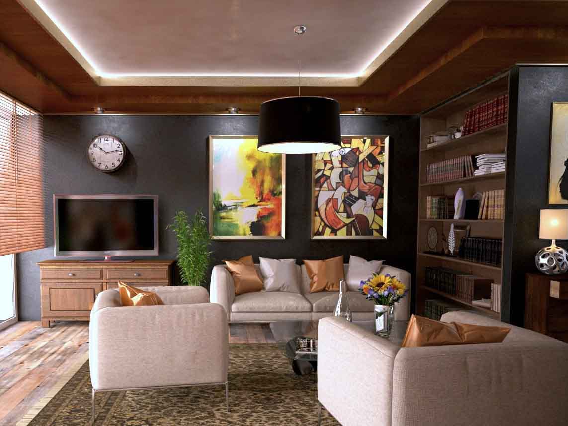
Just stunning. I invite you to walk with me through this well presented pink lounge area.

As we enter the living room space, our eyes are drawn to the richness and grandeur of the room. We experience comfort, warmth and wellbeing. Sophistication par excellence.

The magnetism of this room is amazing. You just seem to take it all in, in one 360 degree focal sweep. The focal points luring your eyes from one to the other – floor, window, back wall, room divider, ceiling, chairs, accessories, rug and then back to the floor.  The feelings of warmth, comfort and sophistication certainly has been achieved.

The natural rustic beauty of wide board timber flooring immediately catches the eye. The statue then lures your eyes from the floor to the timber window blinds.

The wall clock now gets the attention.  Note, the television does not invade the space. Your eyes drop to the beautiful wooden television cabinet.

The dark charcoal colour of the back wall, serves well as depth of field.

Like sunshine breaking forth from dark skies, the gorgeous autumn colour abstract artwork adds warmth to the scene in front of you.

From the corner of your eye, to the right something catches your attention. To reach this “attention getter” one’s eye seem to glide over the dark wooden bookcase/room divider, to come to rest upon the abstract ball-shaped chrome table lamp upon the dark wood chest of drawers.

From here our eyes are drawn to the centre of the room. The “dirty pink” – or “dusty rose” coloured fabric textured lounge suite comprises of two chairs and a two seater sofa on chrome legs. As mentioned previously, metal and pink colours go very well together.

Inadvertently our eyes seem to move from the lounge suite to the stunning and captivating hues of the dirty pink/dusty rose tray ceiling, framed by a soft light and dark brown ceiling.

Our eyes then drop back to the floor, pass the black lamp shade to the rug.  The rug is exceptional beautiful. The darker contouring colours show off the “dirty pink” – or “dusty rose” background colours of the rug, and enhances the colour of the floorboards, whilst captivating the appeal of the lounge suite.

The coffee table is rectangular tempered glass on chrome legs. Chrome is also featured in the vase containing artificial sunflowers.

The gold display cushions certainly add panache. The shiny dusty rose coloured display cushions blend in perfectly.

And so we are nearing the end of our current series on colour schemes. Our last and final one in this series is grey on grey.

5 Reasons to Hire a Property Stylist

5 Reasons to Hire a Property Stylist

Property Styling involves the use of a wide range of presentation and design techniques to improve the appeal of your home and help it ‘put on its best face’ for potential buyers. It has proven to increase buyer interest, maximise sale price, and reduce the time spent on the market.


1.  To show space and concept

Contrary to the assumed belief, empty spaces actually make a space appear much smaller. This is because it is hard to visualise the sizing of furniture and how it could work within a space. It is estimated that only 10% of home-buyers can visualise the potential of a home. That means that you could potentially be missing out on a whopping 90% of potential buyers! Property Styling is a great way of showing space and concept as it gives potential buyers an idea of not only how many items can fit in the space, but also how the space can be used.

 2.   Boost online presence

According to a study by the National Association of Realtors (NAR), at least 90% of buyers are looking at properties on the Internet, which means that it is essential that your home makes a strong first impression. Our Property Stylists at Let’s Revamp work closely with photographers to ensure that the selling-features of a property are highlighted and that any flaws are subdued in the most attractive way possible.

3.  Fresh, objective perspective

Some people feel comfortable doing the styling on their own, and while it can be effective, the knowledge, experience, efficiency and attention to detail that a Professional Stylist can bring to your property is invaluable. We work closely with agents to ensure that our styling is specific to the target demographic and will generate strong interest from potential buyers. In addition, Property Stylists also don’t have an emotional attachment to the property and are looking at it objectively in order to create the most effective result.  

4.  Maximise sales price

Property Styling has been proven to maximise the overall sales price significantly so it is definitely an investment worth making. This is due to both the increased interest that Property Styling brings to the property (which in turn, produces more offers), and the perceived value of the home that the styling creates. Having the right pieces within a space and arranged in the right way can make a huge difference as it displays the ultimate potential of the home

5.  Time Efficient

Property Stylists understand the urgency of needing a property to sell quickly and accommodate by delivering a service that is not only highly effective and rewarding but also very time efficient. From initial contact with a client to completion of the styling is sometimes a matter of just a few days! As Property Stylists will have everything ready to go, it is a great way to get started on the sales process as quickly as possible.


How much does it cost?

At Let’s Revamp, we have developed an online tool that allows you to simply input a few quick details about your home, which then generates a quote for you within seconds. The quote is obligation-free and can be adjusted to suit your specific requirements and budget. For an instant quote, please visit www.letsrevamp.com.au/quote.

Colour Schemes – Part 4 of 6 – Incredible and Unusual Mates – Blue and Green.

Colour Schemes – Part 4 of 6 – Incredible and Unusual Mates – Blue and Green.

(Photo by Vittorio Zamboni on Unsplash)


Imagine, bringing the tones of ocean inspired greens and aquas and rich petrol blues right into your home. Filling your senses with the very essence of nature.

Exceptionally inspirational. On the Colour Wheel (http://letsrevamp.com.au/what-a-wonderful-colourful-world-we-live-in) you will find though neighbours, blue and green are not complementary colours. Yet, these two colours are so well harmoniously represented in nature and in aqua environments.

Put these two colours together; the results are amazing. They do not oppose each other, but blend perfectly in creating your aqua, cyan, teal and turquoise. Actually the list is endless.

You can literally bring the outside indoors. In a manner of speaking mirror what you see through the window, and reflect it inside your living areas.

  1. The Blue And The Green As In Nature Can Be Seen

We recently staged a home for sale. Our canvas was luring, upon a background of natural light, drawing the outside indoors, enabled us to present this house in a luxuriousness of comfort and feel of relaxation.

2.  The Living Room

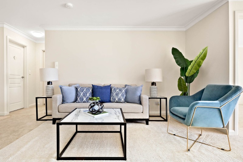
The wooden fence and trees outside, duplicated by the wooden coffee table, buffet and floor lamp.The natural textures of the ottomans and rug blend perfectly with the coffee table and buffet.The group of deep blue glass vases, duplicates and complements the blue skies outside. So too do the velvet steel blue colour fabric of the Milan Arm Chair. The gold metal legs of the arm chair gently reflects the light streaming through the windows.By liberally making use of accessories such as the display cushions, wall art, vases and artificial branches in the varying tones of blue and of green creates a living area that extends beyond the wall, into the garden.

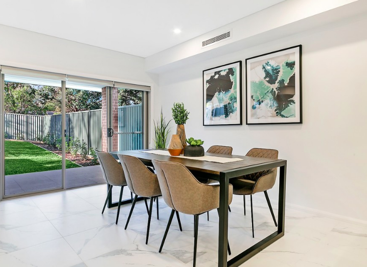
3.  The Dining Room

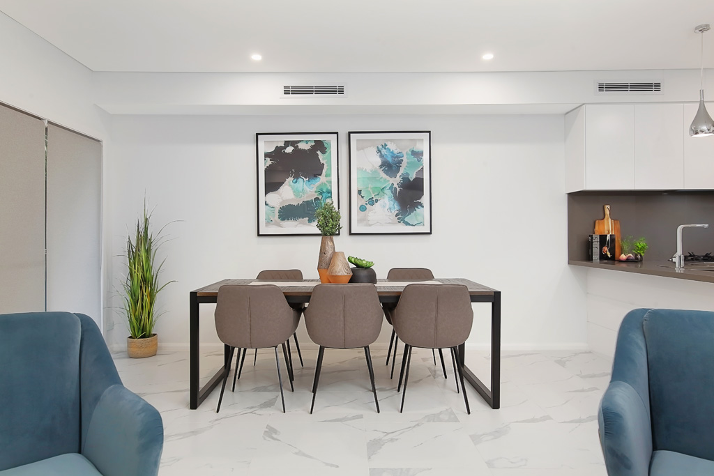
The earthy colours of the high back dining chairs complement the ambiance of bringing the outdoors, indoors. The variations of the blue colours of the wall art, noticeably duplicates the skies outside. Adding a light coloured table runner and earthen ware tall vases and artificial green plant simply completes the picture.

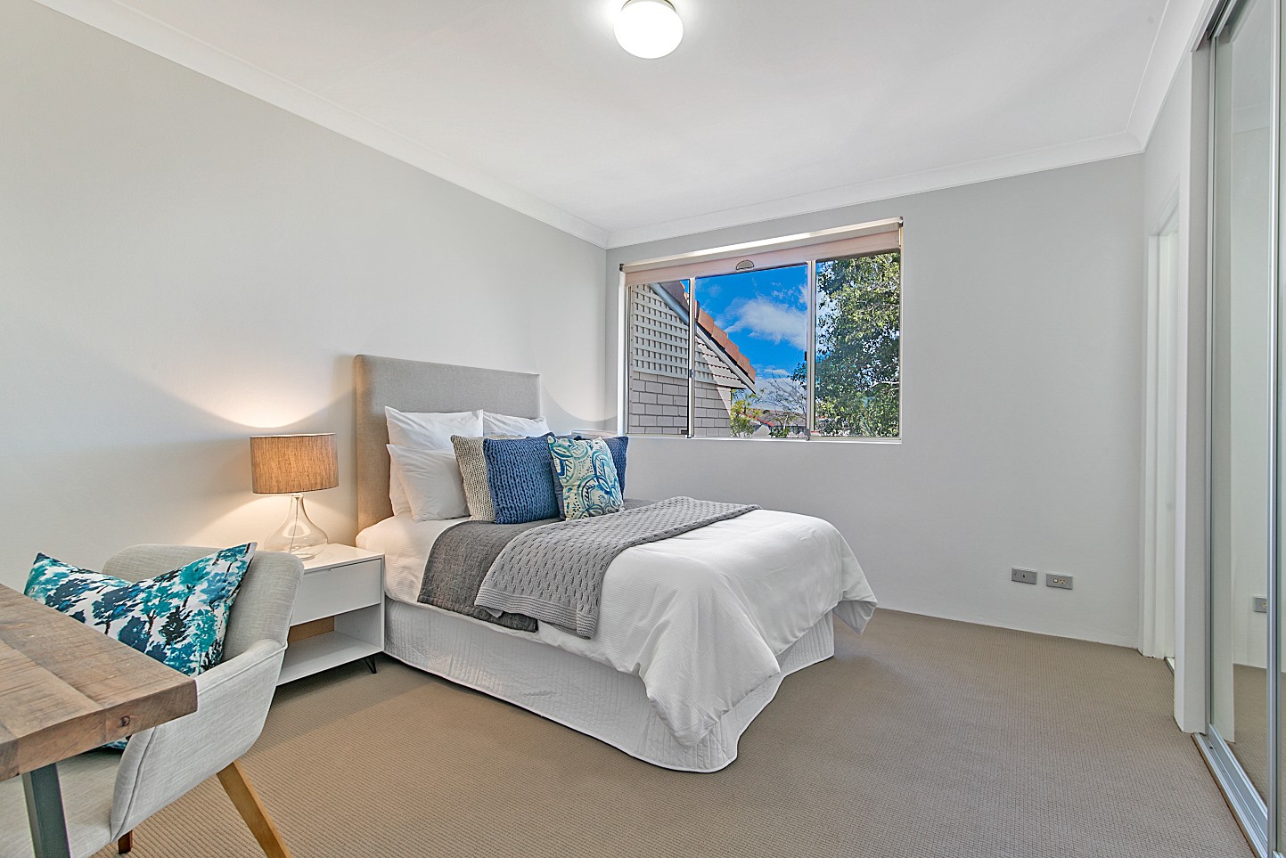
4.  The Bed Room: 

Imagine, after a hard day, walking into your bedroom, and perceiving the welcoming notes of the outside. The stunning white quilt, edged by a cloud of white soft pillows beckons the weary head. Like a wave the featured sea blue display cushions crests the bed, splashing out hues of blue from the centre display cushion, only to settle upon the dark and light grey throws.

The arm chair embraces the extraordinary trees shaped patterned display pillow. The hues of blue generously displayed.

The wooden desk and wood resembling beside lamp shade completes the picture.

Now, you may be wondering where in the perfect world of blues and greens the green may be. It is there, see, right outside the window. The tree wearing her coat of extraordinary variants of leaves of green.

In the fifth of our six part series on colour, we will rethink PINK!