Featured Clients – Laura & Laurie

Featured Clients – Laura & Laurie

Featured Clients – Laura & Laurie

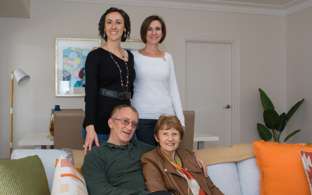
We had the absolute pleasure of working with clients, Laura and Laurie, on numerous projects and want to share their story.

After residing in their property for 27 years, Laura and Laurie felt a bit lost on where to start with the sales process. An accumulation of items over the years left them feeling quite overwhelmed. After their daughter suggested having the property styled, Laura and Laurie considered it would be the best move for them to hire Property Stylists and contacted Let’s Revamp for assistance.

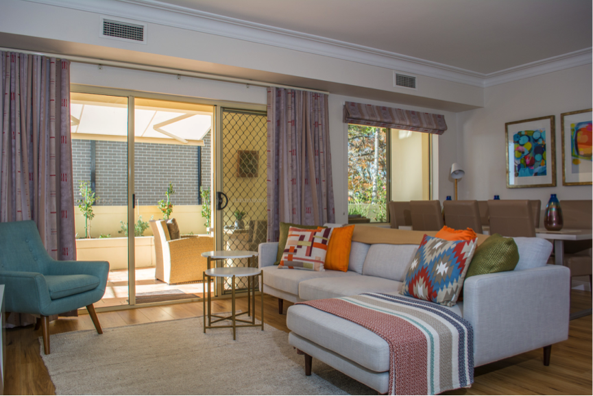
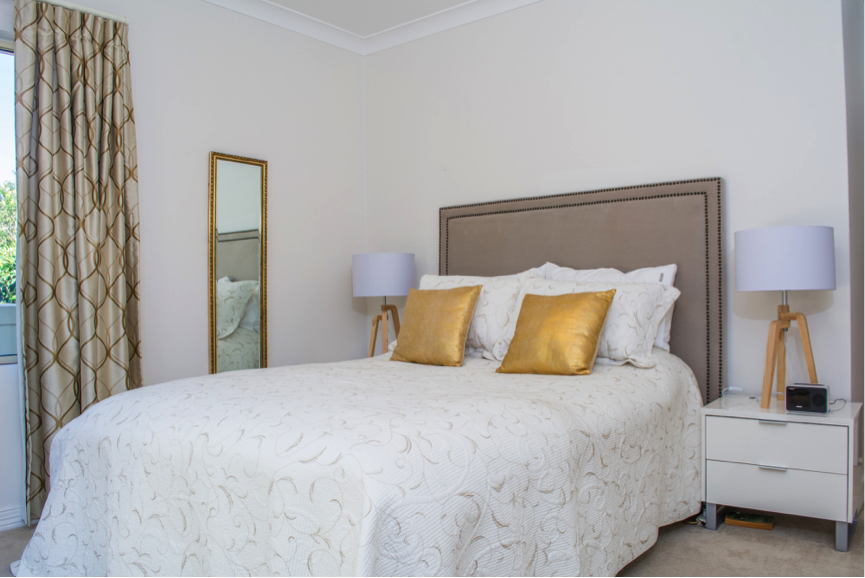
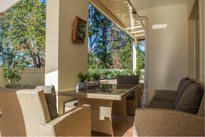
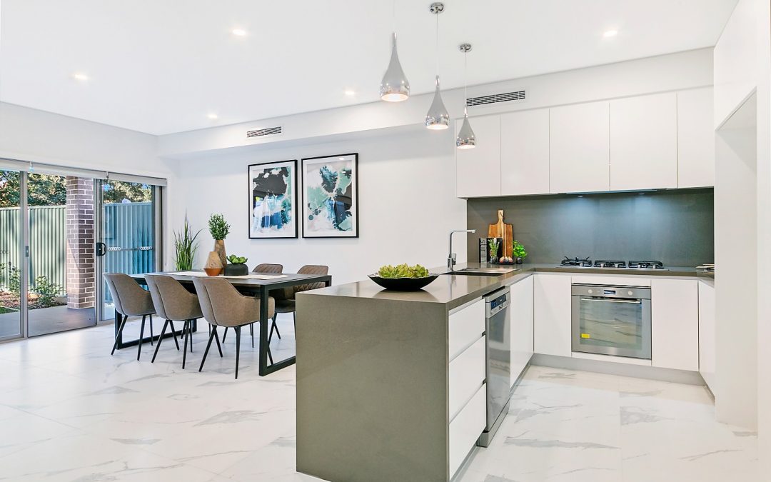
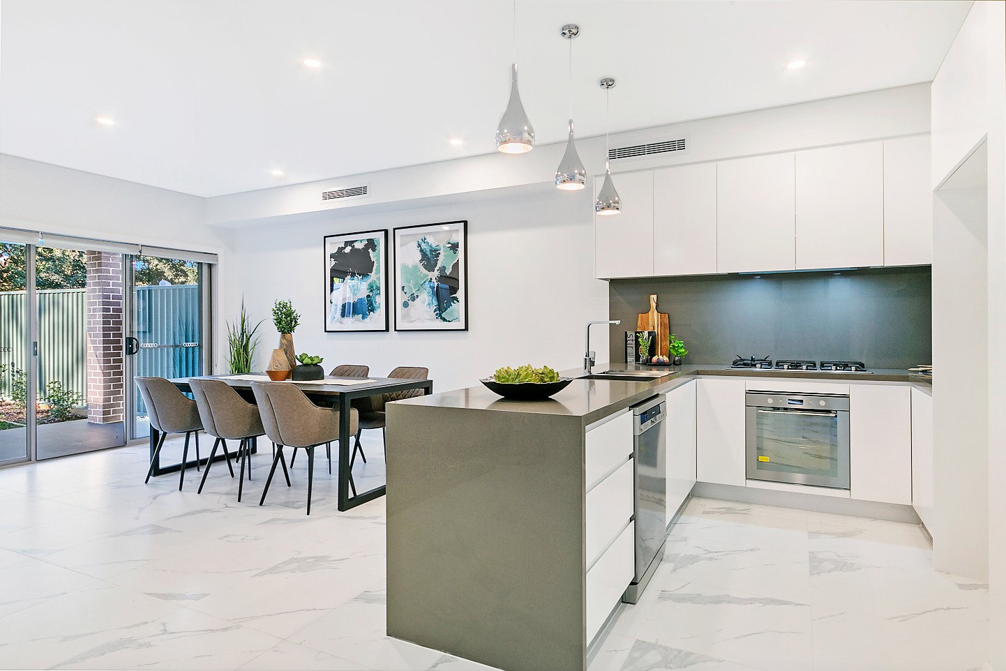
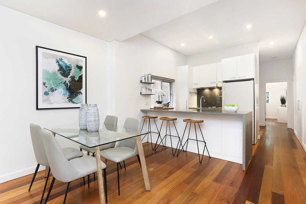
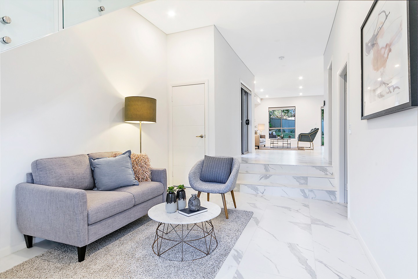
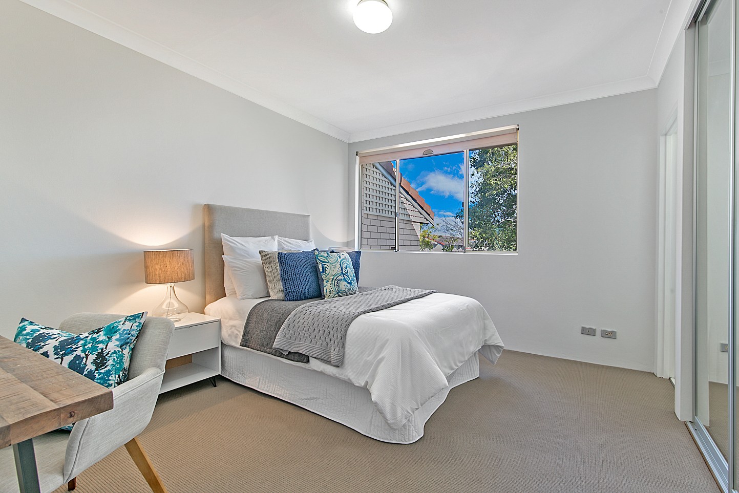
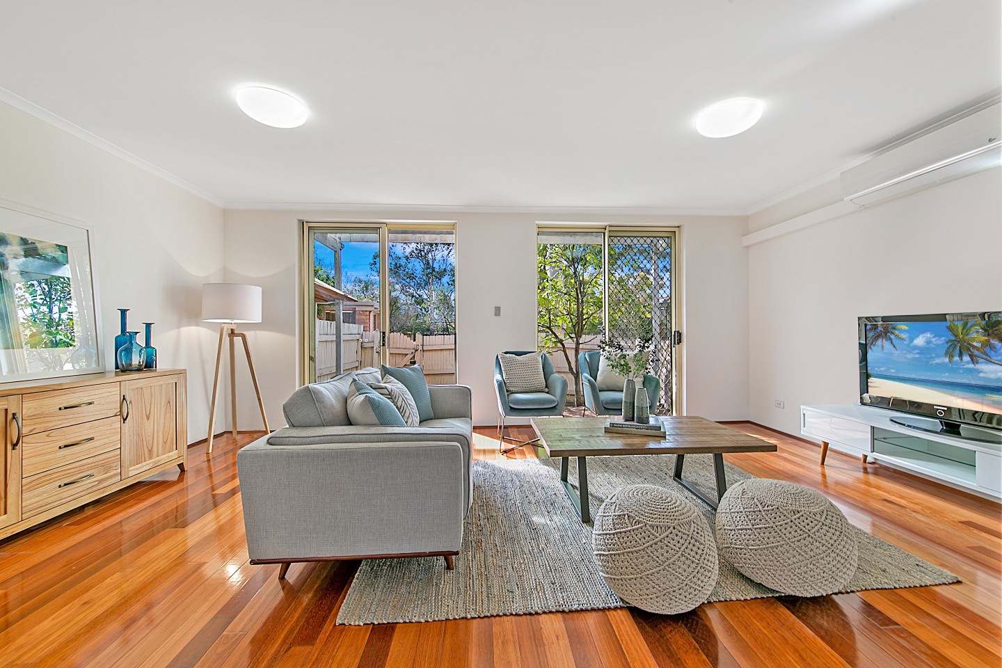
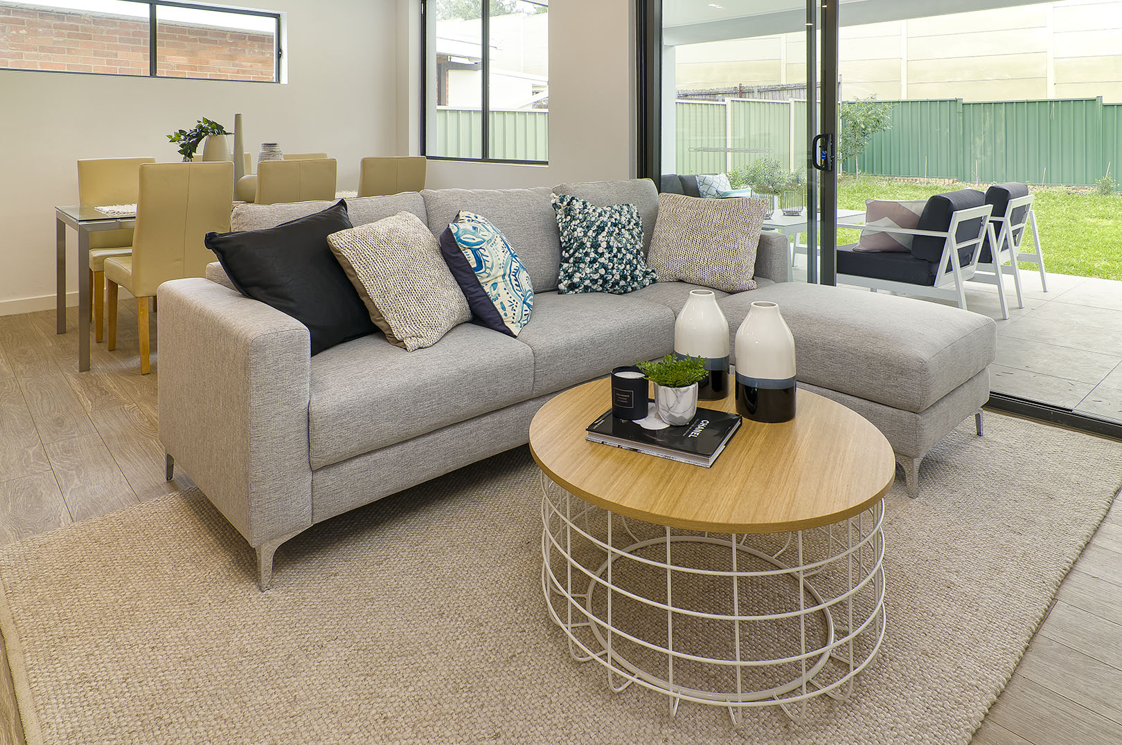
 Let’s Revamp suggested a de-cluttering of items and fresh paint throughout the bedrooms. The Formal Living Room was given a complete make-over with all new furniture and accessories supplied by Let’s Revamp. The Informal Living area, Dining Room and Outdoor area also underwent a massive transformation and resulted in an all-new Contemporary and Modern look to enhance the features of the property.

We were totally blown away with the transformation

Laura and Laurie were so pleased with the transformation of their home and they mentioned that their family even saw pictures of the place post-styling and asked them if they had moved already – not realising that it was the same property! The property went to Auction and sold for around $200,000 over their reserve price! Shortly after moving into their new property, we were contacted by Laura and Laurie again for assistance.

Our family love it! They were amazed. All our friends and family are very happy for us – and we are too

 Im really happy with the arrangement that weve got with this place. It is so hard to imagine what it was like before

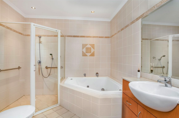
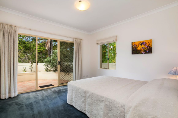
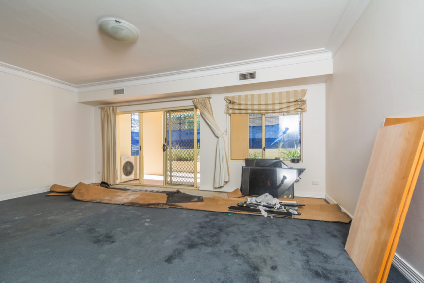
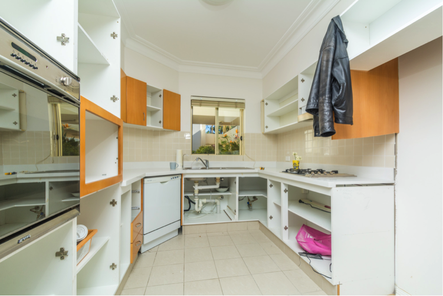
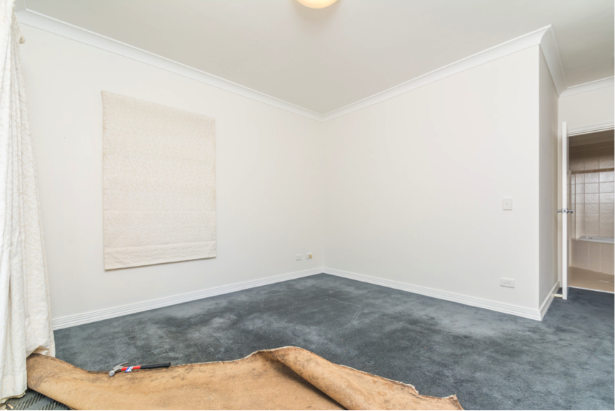
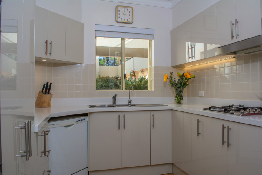
When they initially moved in to the new property, Laura mentioned that they found the dark blue carpet and black granite benchtop with dark brown cabinetry a bit of a challenge – so called us in to help. We provided suitable suggestions for them regarding cosmetic renovations and helped with the styling of their new place.

Overall, it was such a pleasure working with these wonderful clients and we thoroughly appreciated and enjoyed the amazing opportunity to create their dream home for them.

“Every day we wake up in our new resort”

Before:

Renovation:

After:


The 7 Elements to Consider in Interior Design

The 7 Elements to Consider in Interior Design

The 7 Elements to Consider in Interior Design

When designing a space, there are several elements to consider that all work together and affect the overall outcome of the space. Understanding these elements is important in order to establish harmony, balance, interest and practicality within the area you’re working on.

1. Space

In regards to design, there are two types of space: Positive (area containing objects) and Negative (vacant area between objects). It is important to create a balance of these to achieve an ease of movement within the area. When considering the element of space, it is also important to consider height. We often tend to focus on the length and width of a space but using items and artworks at different heights is a great way to draw the eyes up.
2. Line

Lines can often assist in creating illusions within a space. The use of horizontal lines will make a room appear wider, whereas using vertical lines will make a room appear taller. Curved lines are a way of creating movement and energy within a space. It is important to establish a balance of these lines in order for it not to be too overpowering.

3. Shape

In design, we identify shape into two categories; Organic, which refers to those that seem to be created by nature and are often irregular, and Geometric, which refers to those that generally have sharp edges and symmetry. It is good to keep in mind that having too many organic shapes within the space can make it feel quite busy and chaotic, whereas having too many geometric shapes in a space can make it feel quite rigid and boxy. Balance is key.

4. Light

The element of light is crucial in determining the overall mood and ambience of the space. This can be either from natural sunlight coming in, or artificial lighting. It is important to determine where the lighting is needed most within the space, and also the tones and angles of the light being used.

5. Colour

When choosing colours for your space, it is important to understand the psychology behind colour and using that to your advantage by selecting colours that will evoke certain moods and reactions relative to the space. For example, generally-speaking, using cooler colours such as blues and greens for a bedroom is recommended as they produce calming effects.

6. Texture

Designers will often play with a mix of different textures to create more interest and comfort within the space. This texture can be in the visual sense or in the physical sense. Using woods, metals, different fabrics/materials are all great ways to achieve this.

7. Texture

Designers will often play with a mix of different textures to create more interest and comfort within the space. This texture can be in the visual sense or in the physical sense. Using woods, metals, different fabrics/materials are all great ways to achieve this.

Now that you understand these elements, have a play around with it and see what you come up with! The design process often involves a lot of modification and adjustments so don’t be too worried if it doesn’t look right on your first go! Happy styling.

Tips for Preparing your Home for Sale

Tips for Preparing your Home for Sale

Tips for Preparing your Home for Sale

Preparing your home for sale is usually not as simple as just giving it a quick vacuum. Our Property Styling jobs often involve a range of different requirements specific to the home in order to make it presentable for open day. However, there are a few general things that we’ve picked up on that can be applied to pretty much every home and it can be a great starting point for anyone wishing to style on their own.

  1. Remove personal items – No matter how long you have owned your home for, there is bound to be a collection of pieces on display that are very specific to you/your family. This can include photo frames, a sentimental cushion embroidered by grandma, wedding photos, collections from your travels, etc. Understandably, these personal items have enabled your house to feel like your own. However, a big part of Property Styling is being able to create a space that the buyer can visualise themselves living in. For this reason, I would highly recommend that these items be kept in a safe storage space out of the house during your campaign.

2. Stick to neutrals – Different colours evoke different moods, and you’ll often find people that are very passionate about certain colours that they dislike. In order to appeal to as many buyers as possible, you’ll want to stick to quite a neutral palette. This doesn’t mean that the property has to be completely white and minimal. However, you can play around with different materials, textures and tones to create interest – even adding pops of colour here and there is great, as long as you are using colours that complement features within the home. A fresh coat of paint in an off-white, grey or light beige will not only make the home appear fresh and updated, but will also make it appear bright, clean, and often a lot larger than it is.


3. Declutter – When buyers are coming through your property they want to see the space. Having your house cluttered with furniture not only inhibits the buyers from seeing the space, but it also gives off the impression that the house has not been taken care of. Keeping the essential furniture items to show space and concept is extremely important, but in a Property Styling perspective, in particularly with smaller properties, less is always more!

4. Improve curb appeal – As this is the very first thing that buyers will see, it is highly important that you make sure that the exterior of your house presents just as nicely as the interiors. It is important to keep the landscaping neat and tidy, remove of any weeds/dead plants and make sure that the driveway and front patio has been swept and is clean and presentable. Adding a small outdoor set to go on the front verandah is also a great way to make the property instantly feel homey and inviting before even stepping inside.

5. Consider all senses – We often style purely to make it visually appealing but it kind of becomes a waste if there is an odour, commonly from a fresh coat of paint. Make sure to light some candles and put out some fresh flowers on open day to help set the mood you want to create. Open homes are all about first impressions and you will want your property to put on its best face for buyers in any and every way that you can.

Colour Schemes – Part 3 of 6 – Pastel Delights

Colour Schemes – Part 3 of 6 – Pastel Delights

Colour Schemes – Part 3 of 6 – Pastel Delights

Our exciting journey in the world of colour has lead us through the hallways of the dynamics, functionality, influence, application, harmonious and spectacular results of colour in our everyday life and living space.

We have discovered colour is alive, communicates, sets a mood and attracts attention. (http://letsrevamp.com.au/what-a-wonderful-colourful-world-we-live-in)

Pastels are colours mixed with white to bring forth those soft, welcoming, embracing, pale, gentle and soothing colours.

Surprisingly, after the winter months one would expect that the bold, vibrant and spectacular colours would be embraced. Yet, as it appears, not so.

Advertisers target our springtime emotions through pastel colors. Pastels have a calming effect, and everywhere you look companies are using them to feed our desire to feel a bit of spring.

Pastels are less saturated than primary colours, making them feel light, soft, and calming. For spring, they work well with neutral colours to create a feeling of earthiness and sophistication.

(https://www.xrite.com/blog/spring-color-update-psychology-of-pastels)

Though attention is given to pastel colours especially at spring, these colours are actually great to make your living space feel light, cosy and airy all year round.

1. Pastels in the bedroom

Pastel colours in the bedroom are not just for little girls and baby rooms; these colours are in fact stylish with a sense of being all grown-up.

Pastels combine well with bolder and brighter accent colours,


2. Pastels Look Great On Walls.

They make small rooms look spacious.

3. Pastels when staging your home for sale.

Image courtesy of [ Idea go] at FreeDigitalPhotos.net

http://www.freedigitalphotos.net/images/Property_g196-Sales_Home_In_Color_p18406.html

Perhaps you are thinking of selling your home. Are the walls currently pastel in colour? Do you feel the need to repaint although the paint is still in excellent condition?

No need. As it turns out, pastels do very well when a property is in the market for sale. Pastels present a soothing clean feel and fresh look, and need to be the background and secondary colours in the room.

  • Should the new home owner decide to paint the walls another colour, pastel colours are easy to repaint, and more than likely would only need one coat of paint.
  • Pastels colours are complementary and do not overwhelm. The comforting and relaxing atmosphere encourage potential buyers to slow down, linger, assess and visualize living there.
  • Pastels are cheerfully toned colours. They tend to initiate reminiscences of happy moments like birthdays, family and friend visits, Christmases and other celebrations.

I hope you have been inspired. We continue our journey, and will spend time at Incredible and Unusual Mates – Blue and Green.

See you next time (image from https://photos.icons8.com/)


Colour Schemes – Part 2 of 6

Colour Schemes – Part 2 of 6

Colour Schemes – Part 2 of 6

1. Colour Scheme – Grey and Yellow

As we continue on our journey of colour so wonderful in our world, our next stop is the winning combination of Grey and Yellow. This paradisiacal colour combination is lively, fun, daring and very characteristic.

Yellow spells sunshine, warmth, happiness and joy. Often used in kitchens, bathrooms, dining rooms, entries, hallways and small spaces. Yellow is sweeping, expansive, sociable and welcoming.

Grey, the decorator’s magic wand. As a neutral colour the possibilities in the use of grey in styling are limitless.  You will be surprised at how many different shades of grey there are. Grey promotes its use on walls to create style and relaxation.

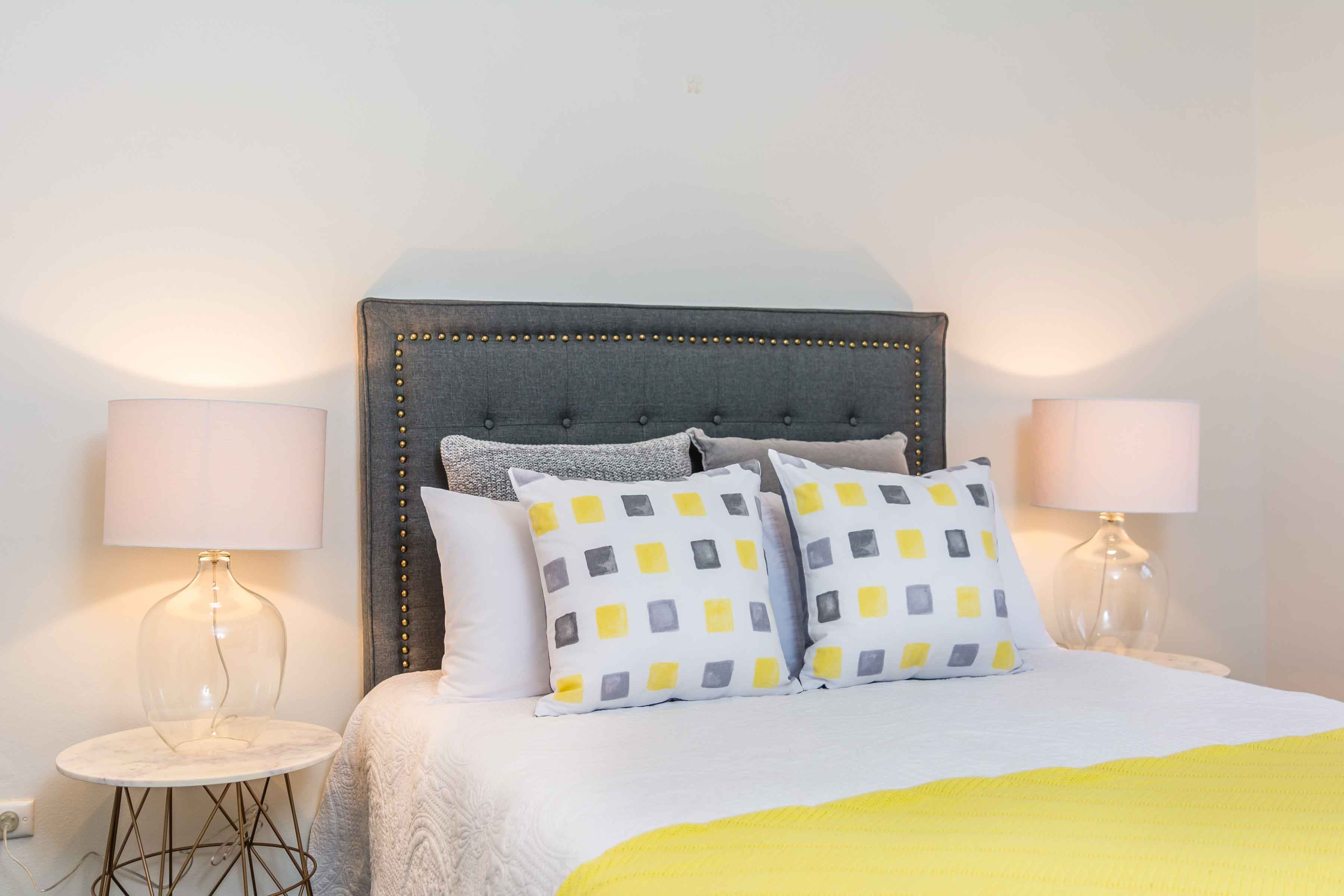
The owners of this house wanted the property to be staged for sale. This specific bedroom was of medium size, and natural light was not in abundance. Using the white wall as canvas, the property stylist added a charcoal headboard to create the peaceful space.  The beautiful white quilted bedcover graced the bed. Against the headboard, nested decorative cushions of grey, and yellow and grey. These colours were generously accented by the bright yellow throw. This completed the look of serenity. The glass bedside lamps added a feel of space. The beige lamp shades provide solidarity to the mood as a whole.

2. Our next Colour Scheme will be Faded Pastels

Yellow is the colour between orange and green on the spectrum of visible light. Yellow is quite biological too – carotenoids, organic pigments that are produced by plants and algae, give the characteristic colour to carrots, canaries, daffodils, eggs, bananas etc.

Yellow was one of the fist colours used in art. In a cave in France, there is a painting of a yellow horse said to be 17,000 years old.

In China and many Asian countries, yellow is the colour of happiness, glory, harmony and wisdom.

(https://en.wikipedia.org/wiki/Yellow)

Grey

Grey the colour of granite, rock, gravel – symbolising strength, longevity, confidence and calm. Grey is the perfect colour for a backdrop to let other colours shine. Grey produces a monochrome colour too. As with all other colour, there a many shades of grey. Which grey to use will depend on the space that it will be used in and the mood you want to set.

Charcoal grey will work well to create a sumptuous and peaceful space. Instead of white use a light grey. Popular Dapple Grey, works wonderful with yellow, copper etc. and serves as the perfect backdrop.

Colour Schemes – Part 1 of 6

Colour Schemes – Part 1 of 6

Colour Schemes – Part 1 of 6

In one of our recent blogs (http://letsrevamp.com.au/what-a-wonderful-colourful-world-we-live-in) we discussed the dynamic functionality of colour and how to apply it in creating harmonious spectacular results in our living space.

We are going on an exciting journey in discovering the most effective way of changing the mood, style and look of a room with colour schemes that work well.

Though the decision in deciding a colour scheme and look, may be confusing at times, your property stylist/interior decorator would be a source of sound advice in getting it right.

  • Colour Scheme – Black and White

Opposites attract. Remember the Complementary Colour Scheme from our previous blog? Colours opposite each other on the Colour Wheel are considered complementary colours.

Black and white are such colours. They blend well with other colours, to create that feel, that message, that ambiance of timelessness, practicality, strikingness and sophistication.

Be daring or not, but do try to introduce some monochromatic colour too:

(Monochromatic colour schemes are derived from a single base hue and extended using its shades, tones and tints. Tints are achieved by adding white and shades and tones are achieved by adding a darker colour, grey or black. (https://en.wikipedia.org/wiki/Monochromatic_color))

The simplicity of it all – and a little goes a long way.

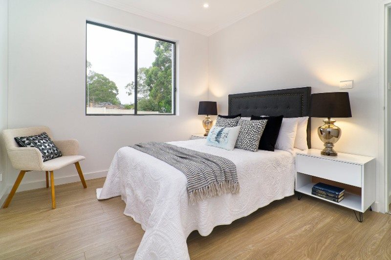
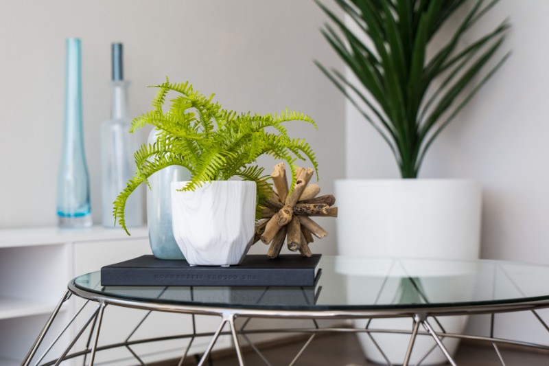
Here our stylist, used a large white planter, as background focal point. On the coffee table, a black cover book, which acts a place holder for (do I note some boldness here ☺ ?) textured accessories (wood) and marble vase with streaks of grey. Against the wall a white TV cabinet, with some blue tall bottle shaped vases. Note the colour pick up with the blue stained vase on the coffee table.

Black and White Sophistication

Don’t you just want to kick off your shoes and fall into bed?

The white painted walls welcome in the natural light, and serenely reflect it around the room.

Don’t you just love the beautiful textured pure white quilt? This serves as a canvas for atmosphere.

The black and white throw, complements the black and white decorative cushions.

The black decorative cushions, nestle snuggly against pure white pillows.

The black studded headboard, towers majestically above the bed, flanked on both sides, like guards, by bedside lamps.

The lamp shades are fabric, and black. The bedside lamps are chrome. (Remember the monochrome bit mentioned earlier?). Tall and handsome they stand on white rectangular shaped bedside tables. The only accessory here, are the three books. They do not dominate the scene – yet bring about the feel of relaxation – remember a little goes a long way.

In the corner, appearing alone, yet being so much part of the whole scenario, is a beige colour armchair, adorned by a silver and black decorative cushion. Notice how striking the pattern of this cushion seem capture the essence of sophistication in the room.

  • Next up will be Colour Scheme – Grey and Yellow.

Should you have questions about this article, or seek more advice, please do not hesitate to contact our property stylists.

They are exceptional experienced stylists who artfully rearrange and creatively utilise the interior of your home to transform it into a stylish, revitalising and inviting space which reflects your personal style and taste. This includes refreshing and enhancing areas with the understanding of its purpose and function. They can also help you find items that would complete the desired look and feel in your home.

If you have just bought a new property or moved to another home and you need advice on decorating, you are welcome to give us a call.

Maybe you are planning on selling your home, as property stylists we also style homes for sale.

You are welcome to visit our website too. I am sure you will find some inspirational ideas here.

Bye for now.

Let’s Revamp Property Styling and Decorating

http://letsrevamp.com.au

Call us on 02 9659 2556

Or email us – info@letsrevamp.com.au