Why Buyers Find It Easier To Visualise Property As Their Future Home When It Is Staged?

Why Buyers Find It Easier To Visualise Property As Their Future Home When It Is Staged?

WHY DO BUYERS FIND IT EASIER TO VISUALISE A PROPERTY AS THEIR FUTURE HOME WHEN IT IS STAGED?

Buyers visualise staged property easier as their new home

Over 81% of buyers find it “easier to visualise the property as their future home” when it is staged.

Buyers visualise staged property easier as their new home

So why do Buyers find it easier to visualise a property as their future home when it is staged?

Simply because we are visual and emotional human beings.

Emotions propel us and play an important role when it comes to decision making.

Our emotions and senses are tightly intertwined, and we experience the world through our senses.

Buyers visualise staged property easier as their new home

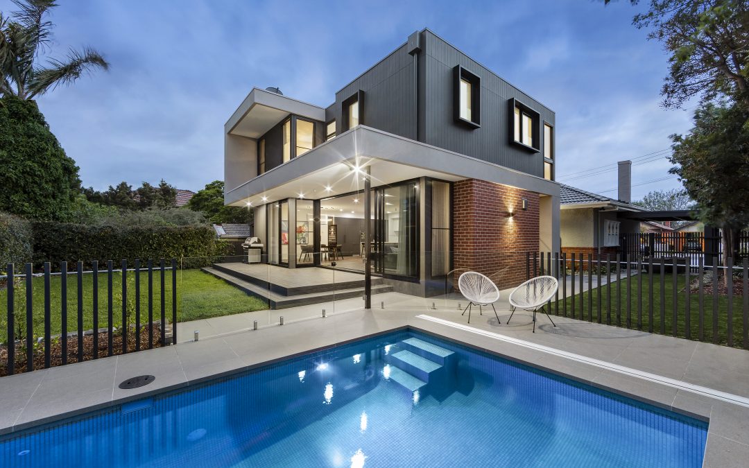
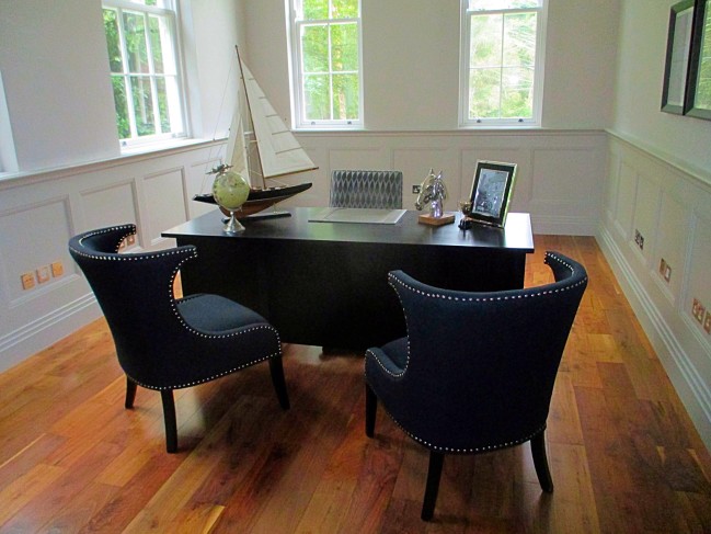
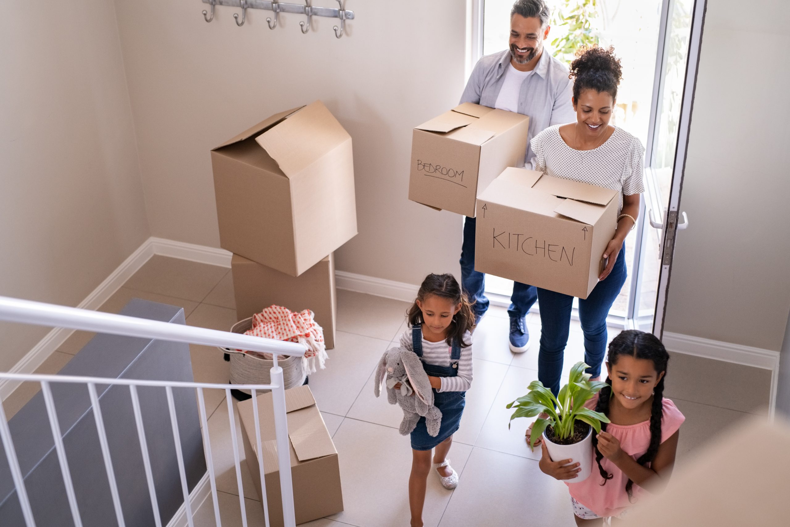
So, when it comes to selling your property you want to present a lifestyle that would be appealing to the emotions and senses of potential buyers. A good example of this would be yourself. Can you remember what triggered your interest when purchasing your current home, or the new one you are now buying?

Buyers visualise staged property easier as their new home

Flush the Toilet and Put the Lid Down

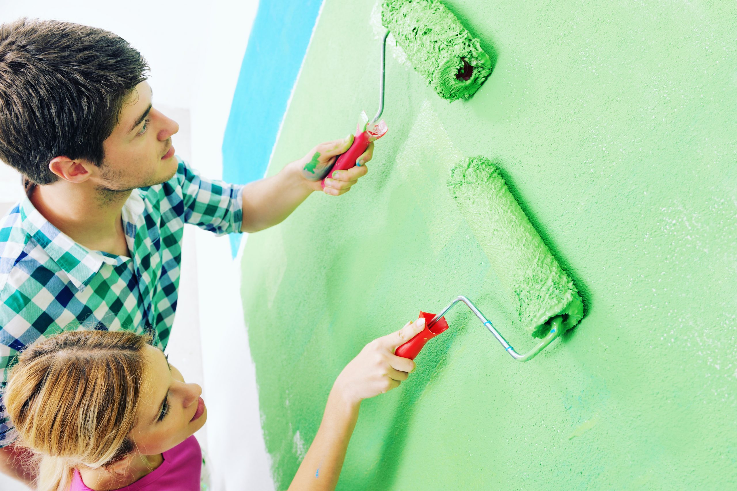
Homeowners often decide to prepare their homes for sale themselves. Is this a good option, and can it be done? Yes, most certainly it can with a little help and advice from experienced Property Stylists.

Getting a Property Stylist involved in invaluable, simply because they are in the know and know exactly which boxes are to be “ticked” to help buyers visualise a property as their future home.

Buyers visualise staged property easier as their new home

Homeowners can overlook the simplest of things which could be detrimental to the overall presentation and a probable sale. The visual presentation is so important that an unflushed and up toilet seat can deter a potential buyer.
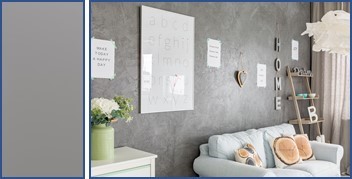
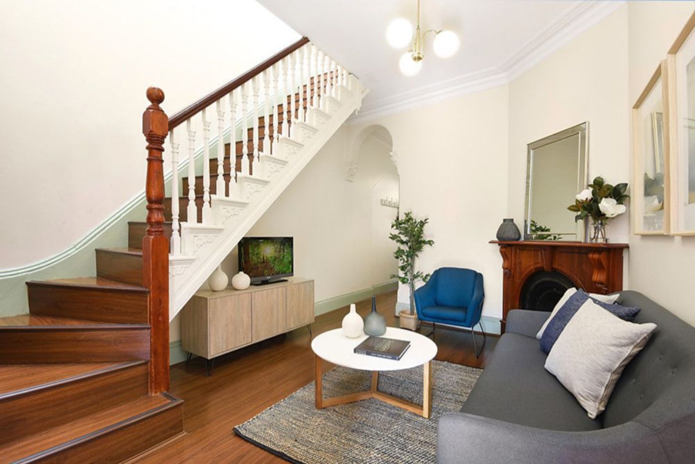
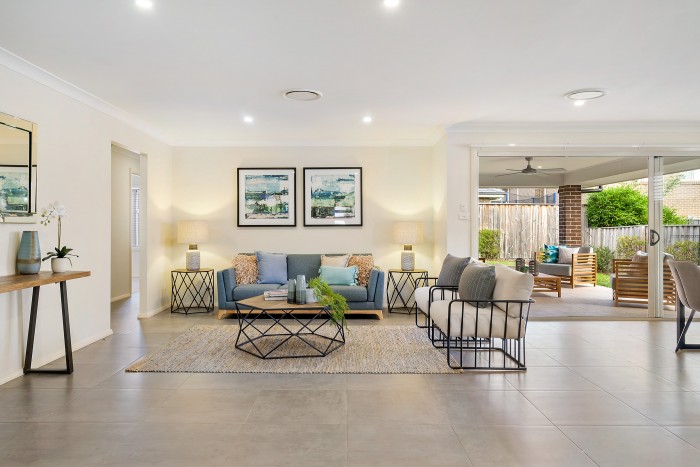
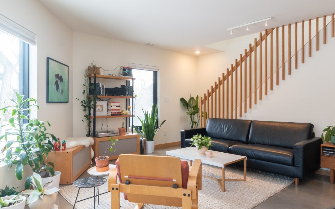
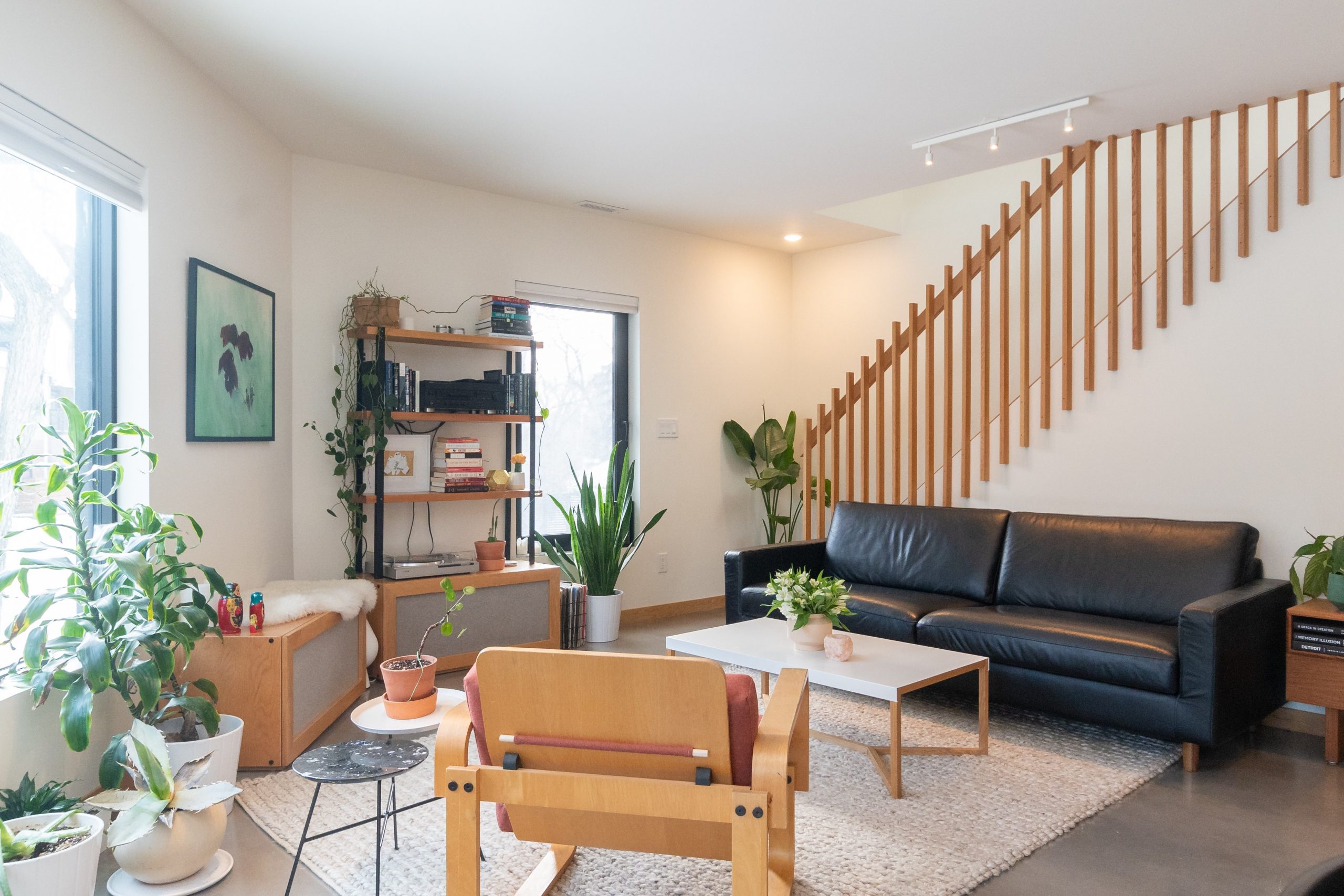
Buyers visualise staged property easier as their new home

Declutter

Declutter is an all-important step and cannot be skipped. The buyer though an emotional being has no connection with your family photos and award-winning trophies. These need to be removed. What he wants to “see” is where he could hang up his family portraits and award-winning trophies.

Buyers visualise staged property easier as their new home

Decluttering is as much a process as it is preparing the house for sale. For the seller, this can be an emotional time too – having to let go and being overwhelmed by the task. Again, a Property Stylist can be of great worth and support during this exercise.
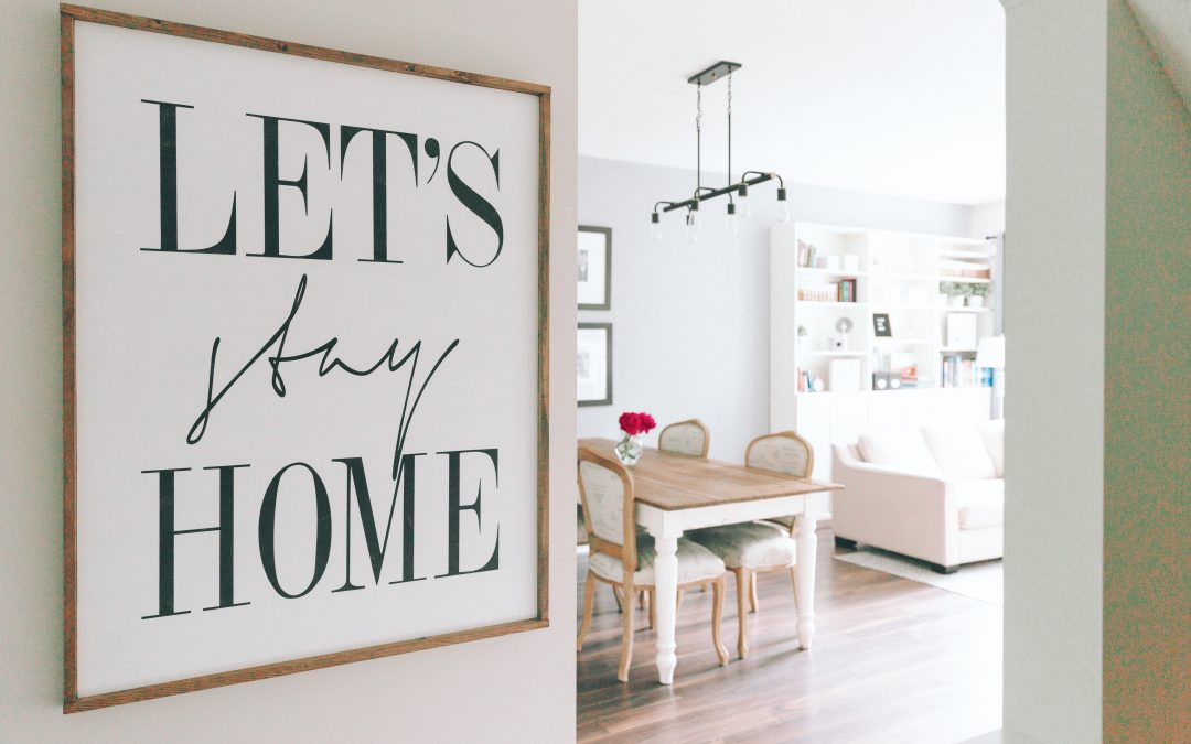
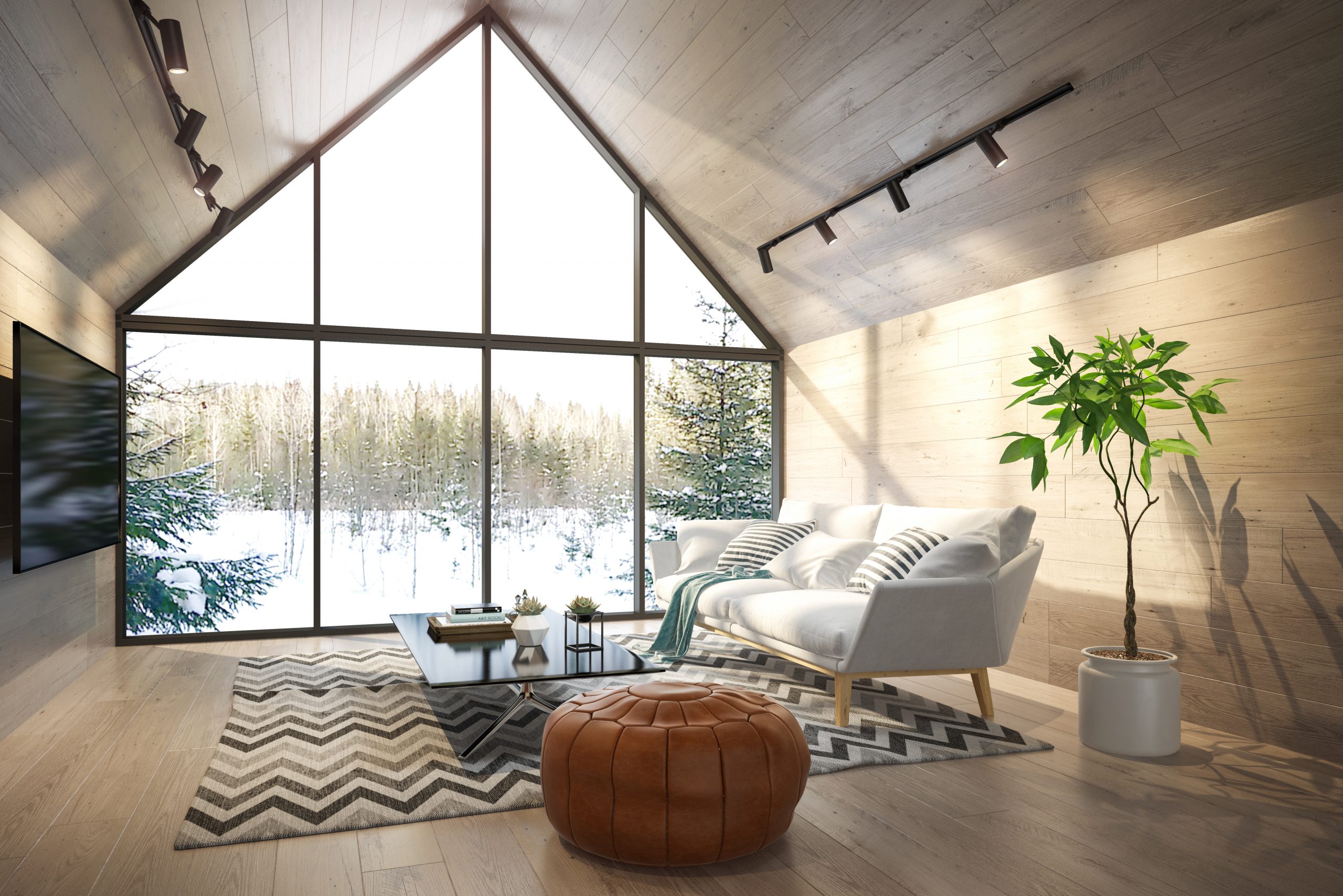
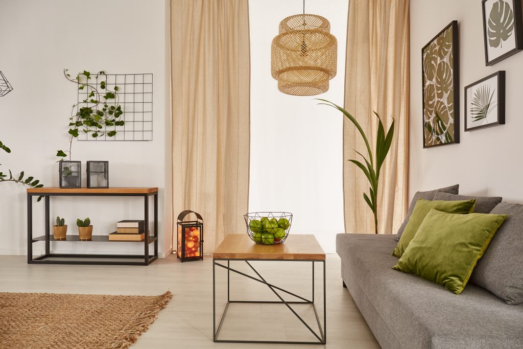
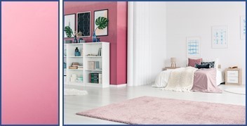
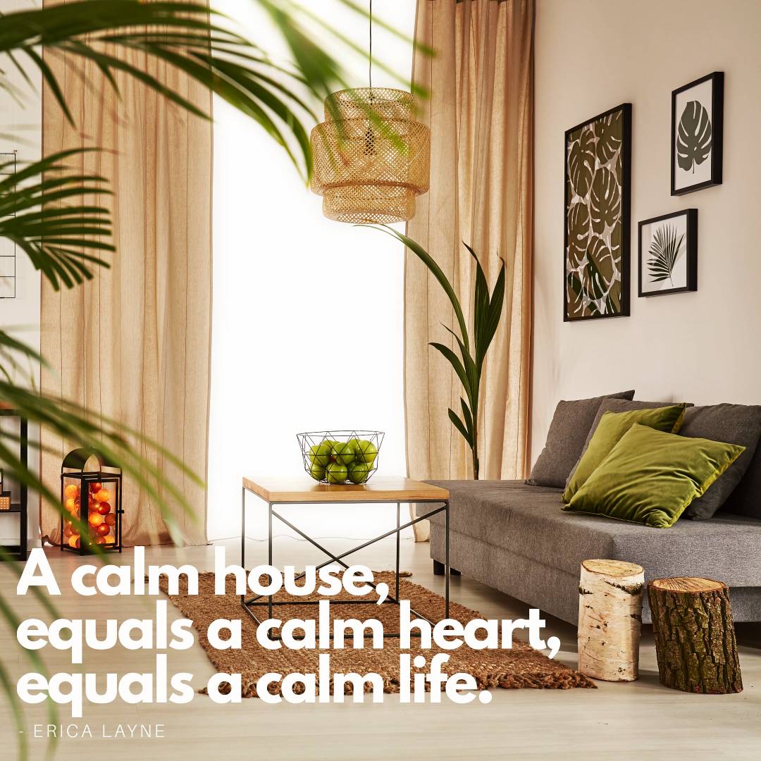
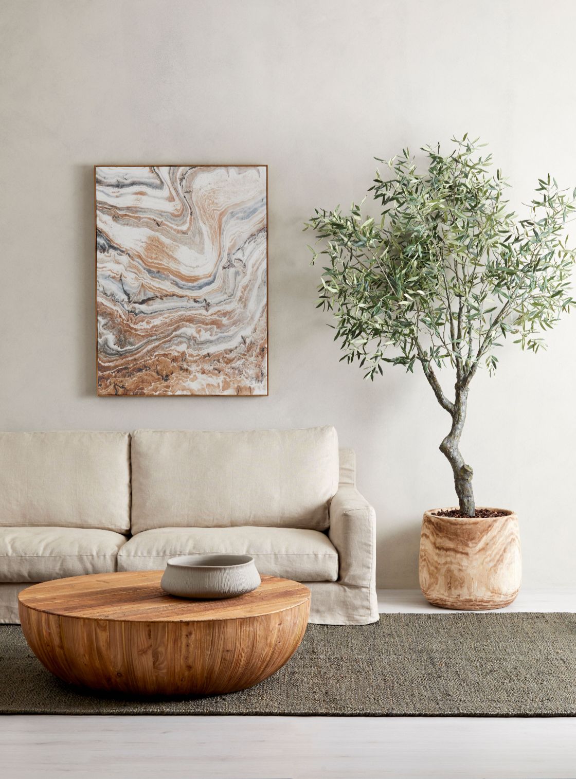
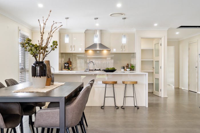
Buyers visualise staged property easier as their new home

Less is Best

Remember the question at the beginning – “Why do Buyers find it easier to visualise a property as their future home when it is staged?” – because they can then “see” themselves living there.

Buyers visualise staged property easier as their new home

Do not overindulge the presentation with an overload of decorative items and accessories. Keep it simple, spacious yet inviting.  Leave enough space so that the buyer can envision where his furniture could go.

Buyers visualise staged property easier as their new home

For more information and assistance on preparing your property for sale, whether you want DIY, or prefer us to do it for you please contact our Property Stylists for an appointment.

Want to Renovate Your Home But Don’t Know Where To Start

Want to Renovate Your Home But Don’t Know Where To Start

Want to Renovate Your Home But Don’t Know Where To Start

When it comes to home renovations the first question homeowners ask is – “where do I start?”

Renovating your home need not be an overwhelming thought. 

The best way to accomplish something big is to approach it in smaller pieces.

St Francis of Assisi had these wise words – “Start by doing what’s necessary; then do what’s possible; and suddenly you are doing the impossible.”  

When deciding to make changes to your home, serious considerations are involved because your home is perhaps one of the biggest financial and emotional investments you have.

It is therefore important to know what you want to achieve and why.


“Some people look for a beautiful place, others make a place beautiful” – 

Hazrat Inayat Khan

So, Where Do You Start?

STEP 1 – BEFORE YOU START

  • Be final about your decisions BEFORE you start planning –  changes during the renovation process will cause delays and may have financial implications.
  • Decide if you are going to do the renovation yourself or hire someone to do it for you.
  • Clarify local regulations and/or get council approval. This is especially true for structural changes. 

STEP 2 – START WITH A PLAN AND STICK TO IT

Desmond Tutu once said, “there is only one way to eat an elephant: a bite at a time” and as such emphasising goal settings. 

Start with a plan and stick to it. Working from a plan stipulates the sequence of work to be done, overall efficiency and project flow.

Prepare and implement a filing system (cloud-based/hard copy/electronic) to keep all receipts, signed contracts and paperwork.

Budget for the renovation

STEP 3 – BUDGET

  • Do not overcapitalize – it is important to know what alterations/renovations will add value to your property and what won’t.
  • Create a detailed budget plan – do your homework on prices and stick to it. 
  • If you have more that one renovation project going – budget for each one. This will avoid overcapitalising on one project and not having enough left to see the other project through.
  • Set reserved funds aside to cover unexpected costs. 

Budget for the renovation

STEP 4 – GO SHOPPING

  • Purchase or order fittings and fixtures before you start, this will reduce delays.
  • This would be a good time to get some paint samples and test them on the walls. This will avoid regretting the colour of choice later.
  • Keep/file all receipt dockets. You may require more of the same items purchased or may need to exchange them. 
Low cost improvements

STEP 5 – LOOK FOR LOW-COST IMPROVEMENTS

  • Not all home improvements or renovations have to be on a large scale. Sometimes just a new coat of paint, new door handles or a little interior decorating can make a world of difference.
  • Decluttering.  When renovating, areas are to be cleared out; why not declutter at the same time? 
  • The possibilities are endless.

Low cost improvements

STEP 6 – GET HELP

  • If the job is too big contact a renovation company. Do some research and look at examples of work done by the company.
  • Ask around – word of mouth is always a good reference.
  • Should you enter into a contract for the renovation work to be done, read the contract and make sure all liability points are covered, understood and clarified, signed and dated by all parties concerned.
  • HOUZZ is a good website with loads of images, ideas and reviews.


Outdoor Renovation

STEP 7 – OUTDOOR AREAS

  • Do not forget the outdoor areas when renovating. People sometimes overlook the outdoor area when doing interior renovations and regret this afterwards.


Outdoor Renovation
  • Whatever your reason and ultimate goal to renovate your home, if you have done your homework thoroughly and spent much time in project preparation you will reach your goal with great success.


7 Top Tips Before Painting the Exterior Walls of Your House

7 Top Tips Before Painting the Exterior Walls of Your House

7 Top Tips BEFORE Painting the Exterior Walls of Your House

Is your house looking a bit drab? Are you thinking a new coat of paint will do the job? What about a whole new colour?

Painting the exterior of your house is a popular home improvement option, even when you are thinking of selling your property. Following these 7 top tips before painting the outside of your house will save you money and time in the long run.

1. Firstly, get a Sample of each Paint Colour 

Honestly, we are inundated for choice of colour. Unfortunately, the colour you like may or may not be the best colour for the exterior of your house.

There are a few factors to consider, such as the texture of the wall and in which direction as opposed to the sun the house is facing and the undertone of a colour.

Paint supply companies usually have sample colours for testing. Investing in a few samples would save you time and money in the long run. Paint samples side by side on all sides of the house. Colours appear differently in natural light areas than they do in shadow areas.

If painting the colours side by side on the wall is somewhat overwhelming leave some space between the colours.

.

2. Light Affects How We See Colour

Colour does not look the same 24 hours a day. Light does affect colour, therefore, evaluate the colours at different times during the day. Switch on the garden lighting to see how the sample colours appear at night.

This image of the living room space is a fine example of how light affects the colour that we see. All the walls were painted with a beige colour, however, the wall to the right seems to have a slight pinkish colour. This pinkish undertone is typically found in beige – To quote Randy Humphries, Painting and General Contractor, Landscape Paintner (1972 present) “Getting them to understand that the quality of the light striking the painted surface will result in many variations that may or may not be what they are looking for”.

Is this a beige or light grey coloured wall?

3. Use Primer BEFORE Painting the Samples

One of the most important top tips before painting the exterior walls of your house is to prepare the area where you want to paint the colour samples.

Keep in mind the existing paint colour will affect how the paint samples look. Colours will appear darker against a light painted wall, and lighter against a dark painted wall.

Therefore, do yourself a favour and prime the sample areas before painting it. This will give you a realistic evaluation of the colour.

4. When not to Prime the Sample Areas

When the exiting paint colour is adjacent to the new colour, priming may not be necessary.

5. Paint Two Coats

Washing when wet looks darker because of the moisture in them. Once dry the items appear their usual colour.

The same scenario applies to paint. When applied to a surface wet paint colour appear more glossy and brighter due to the solvent added to it to keep it in liquid form whilst in a container. 

Once the solvent has dried off, the colour has a less gloss appearance and the true colour appears.

It is recommended therefore that you wait for the paint samples to dry thoroughly before deciding upon your colour of choice. 

Important too is to apply a second coat of paint once the first has dried should an existing colour bleed through the first coat and thereby making a difference to the newly applied colour.

6. Know the undertone of the Paint Colour

  • All colour, except pure white and the true primary colours, red, yellow, and blue has an undertone.
  • The undertone colour is the underlying colour in a colour which has been mixed from two or more colours. For example, the colour teal is derived by mixing blue and green. The undertone could, therefore, be either blue or green.
  • Keep in mind that surrounding colours could influence a colour too.

7. Know your colours

Your three primary colours are red, yellow and blue. Any colour you see on the paint colour wheel can have an undertone from one or two of its neighbouring colours.

For example, when you mix equal parts red and blue, you get purple. But if you mix more or less of either one of the two colours you will get a purple with the undertone of the colour which quantity is the most in the mix.

As Property Stylist and Interior Decorators, we have assisted many clients in redecorating their homes.

We do know how daunting choosing the right paint and decor colours can be.

We love to guide, inform, and help our clients in making the right choices when it comes to refreshing and redecorate their homes.

Now is a good time as any for change; to repaint and redecorate – and in keeping with social distancing, we can actually come into your home virtually and help you. Give us a call today to find out more or send us an email – 

info@letsramp.com.au

Tel: 02 9659 2556

You are welcome to visit us at https://letsrevamp.com.au/

12 Calming and Stress-Reducing Paint Colours

12 Calming and Stress-Reducing Paint Colours

12 Calming and Stress-Reducing Paint Colours

1. Why does colour affect you?

Unfortunately, stress seems to follow us like our own shadow and with it comes consequences to our health. We don’t go looking for it, it is just there. Many factors contribute to stress and something that’s stressful to you may not bother someone else.

When we talk about how different colours seem to affect you, what is true to you may not be true to another. It is not about the colour per se, it is about personal preference and your inner association and reaction to certain colours. 

Scientific studies have proven that colour does affect our mood.

2. Therefore Let Us Paint a Wall

Being informed empowers you! Next time you feel down and out, take a good hard analytical look at the colours that surround you.

“Certain colours alter mood states and can change patterns of behaviour, for example, bright colours reflect more light, as in the colour of yellow which may over-stimulate the mind, causing strain and irritability” (Dr Linda Mayer and Prof Rashid Bhikha, July 2014)

We may not be able to eliminate all stress contributing factors e.g. Covid-19, but at least we can paint and change the colours in our homes.


3. 12 Calming and Stress-Reducing Paint Colours That You Did Not Know

The following is a list of 12 colours (in no particular order) known for their calming, relaxing and stress-reducing properties.

These would mostly be your lighter colour tones, neutrals, beige colours, greys and pastels and a few surprise colours that you may have thought not to be listed here.

If you are not sure of your colour choice and would like a second opinion or you just need more information, please contact our property stylists and interior decorators. They are experts in their field and provide creative thinking solutions, tips and ideas gained from their experiences as interior decorators and renovators


GREY

This colour provides a soothing, relaxing, and cool presence. Natural light bounces well off this colour and therefore makes a room painted with grey and tones of grey appear larger.

Grey blends well with other colours. Use dark grey to emphasise a feature wall, door frame or focal point.

Grey goes well with blue and white elements creating a relaxing atmosphere.

BLUE

Blue is often used on bedroom walls, because of it’s calming and tension reductions qualities. When choosing blue go for softer shades and pastel colours, though the bolder shades of blue work well for accent walls and areas. Classic Blue was nominated as Pantone colour of year 2020 – described as “reassuring blue, full of calm and confidence” – Laurie Pressman, Vice President of the Pantone Color Institute.

PINK

Not your average “girly” colour. Using the right tone can make any room look amazing especially if the colour choice is more your coral pinkish shades. (hex #f88379 known as Coral Pink)

Did you know that Living Coral was Pantone colour of the year in 2019? This colour is best described as a colour of feeling – inviting feelings of being happy, comfort, security, warmth, and socialising.

GREEN

Green symbolic of nature is a soothing restful quiet colour. People are more relaxed in places when surrounded by this colour. Think about how good a walk in the park makes you feel. This colour is easily incorporated into your living area, not just as green paint on the walls but with plants, whether live or artificial. Green plants make excellent focal points in a room.

SKY BLUE

Colours copied from nature are the best de-stressing agents. The serenity of a cloudless day swathed in blue skies calms the mind, spirit, and soul.  Imagine the outcome when painting a room this colour. It will be like taking deep breaths of fresh air, clearing the mind, releasing the body of the toxicity of stress.

BLUSH

Blush is often used in theatre makeup, and one could, therefore, be forgiven for assuming the colour to fall in the same category as pink and pink tones.
Blush (HEX Code #FE828C) is actually a medium tone of red-violet.

Accessorise a room painted in this colour with plants and décor to create the perfect relaxing atmosphere in which just to chill out and to get lost in a good book.

VIOLET

Did I hear you ask what is the difference between violet and purple? In a nutshell, Violet is more bluish and less saturated. Purple is more reddish and saturated.

Using the right shade of violet brings inner peace, wisdom, and balance for your soul.

Because the darker shades can create a cold and impersonal environment, they are best used for accent areas and features in the room. 

WHITE

Whites are generally thought to be clinical, clean, pristine, sterile, and cold. To the contrary. Whites are calming and symbolise clarity and freshness.  

White reflects natural light creating the illusion of a space being larger.

Choose clean and bright whites. Avoid whites with dark, moody undertones. White walls embellished with bold colour artwork will heighten the calm and restfulness of the room. 

White walls splendidly showcase both bold and neutral coloured furnishings and accessories.

YELLOW

Yellow is an active and positive colour.

Though it may not be a “soothing” colour to enhance de-stressing, it’s positive energy and attributes makes you feel vibrant and energetic and therefore expels the lethargic feeling often associated with stress.

TAN

Tan is an incredibly relaxing warm colour reminiscence of the gentle soft glow of candlelight. An extraordinary colour that works well as a base and for highlighting other colours. Recommended for the dining room or breakfast nook.

BLUE GREEN

Blue green is commonly found in nature. A beautiful calm colour to reduce anxiety and even slows down the heart rate. Soft, quiet shades for the bedroom, living room and other relaxing living areas.


LAVENDER

I’ll admit to being bias. I purposely left lavender till last.

Lavender is such an extraordinary, stunning colour that will never cease to give you options to use in interior decorating.

The lavender plant exhibit healing properties and the colour de-stressing properties.

Lavender is a mixture of white and purple (purple is created by mixing red and blue – blue has a calming effect) and has several shades that go very well with other colours such as white and grey.

The lightest shade of Lavender, namely Lavender Blush can be used as a substitute for white.

Lavender Grey is a pale bluish grey and can be substituted for grey and silver.

How To Identify The Perfect Focal Point In A Room

How To Identify The Perfect Focal Point In A Room

How To Identify The Perfect Focal Point In A Room

 1. What a Focal Point is not?

• Before we talk about identifying the perfect focal point in a room, we must first establish what exactly is meant by focal point.

• A focal point is not necessarily the center point of a room. A center point is a place or point where things are equally distanced from any given a point.

2. Focal Point defined

• A focal point can be anywhere within an area and objects are not necessarily equal distance from another.

• A focal point is that which instantly attracts the eye, captivates, and holds your attention.

• Sometimes a focal point becomes memorable and quite often involves a matter of opinion and resonates with personal choice.

3. Focal PointFundamental to Interior Decorating and Property Styling

Real Estate Agents, Interior Decorators and Property Stylist will tell you the focal point is fundamental not only to establish a great first impression, but it is the emphasis point around which the rest of the room is styled.

4. Identify the perfect focal point in the room.

As strange as it may sound, by finding and emphasizing the perfect focal point in a room can at times be used to camouflage or distract from view a less than perfect area in the room.

Some rooms may have built-in focal points. Identify and utilise these in deciding how best to layout the room.

5. Built-In Focal Points – are architectural features –  

  • Windows

Windows are an easy choice for a focal point. Eyes naturally travel there, especially when they open onto outdoor views. Copiously harness and put to good use what they have to offer. Showcase them as much as possible and make them appear as large as possible.

  • Fireplaces

Above the fireplace is a natural focal point for a room. It is the ideal place to hang artwork or a large mirror. If there is a shelf or fireplace mantel, exhibit two or three precious ornaments.

The fireplace itself can boast with custom made design or accent colour.

• Accent Walls

Accent walls are usually those walls furthest away from the entrance into the room. To accentuate the wall paint it a bold colour. Artwork and large mirrors can also be hung on the accent walls, keeping in mind the general guidelines as to how high to hang artwork.

• Ceilings

Draw the eye to higher heights – blessed with a home with high ceilings – emboss this focal point with timber, accent colour, floating or drywall ceiling and lighting.

6. Non-Architectural Focal Point Items

  • Furniture can serve as strong visual features for a focal point. Accessorising with complementary decorative cushions, throws and rugs will help draw the eye to the area,
  • Artwork and Mirrors

Artwork and mirrors can be the focal point in a room too. The reflective attribute of mirrors can make a room look larger and brighter.   

  • Lights/Lighting
    • Lighting accentuates and orchestrates the ambience.


      Use lights to accent the featured focal point. Lights can also be a focal point unto itself, for example, a chandelier.

    6. Do you know?….

    • What to do if there is more than one focal point? – Remember the focus point is the emphasis point around which the rest of the room is styled.
    • It is, therefore, possible to have more than one focal area in a room. In this case, identify the main feature, then allow your eye to travel around the room to the other features or focal points ensuring that all create an even flow.
    • A helpful hint – have no more than three focal points and align the largest focal areas along an imaginary centerline.
    • What to do if the area is an open plan living area – give each area a focal point. If the area is somewhat small, identify one main feature. Define the living area with a rug, which could also be the focal point.

    How many focal points do you see in this image?

    Notice how the rug defines the living area in this open plan living space.


    • What to do when the sun goes down and the sole focal point is the window? Improvise with one or two additional focal points will ensure your room stays interesting when the curtains are drawn.
    • Focal points are also determined by a room’s function.

    We at Let’s Revamp Property Styling and Decorating are passionate about styling and decorating and would love to help you create the most breathtaking focal point in your home. We can assist you virtually too and help you find items that would complete the desired look and ambience in your home.