What Is The Correct Size for Front Door Lights?

What Is The Correct Size for Front Door Lights?
Building a new home? Just bought a new home? Preparing to sell your home?

If you have just answered “yes” to one of these questions, then this is for you?
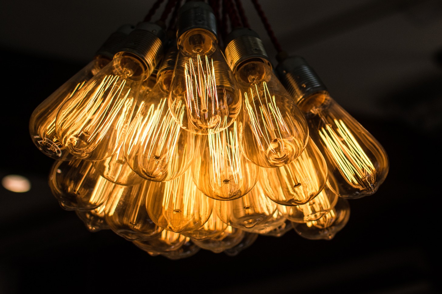
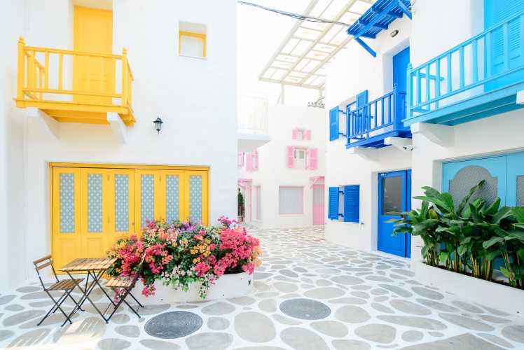
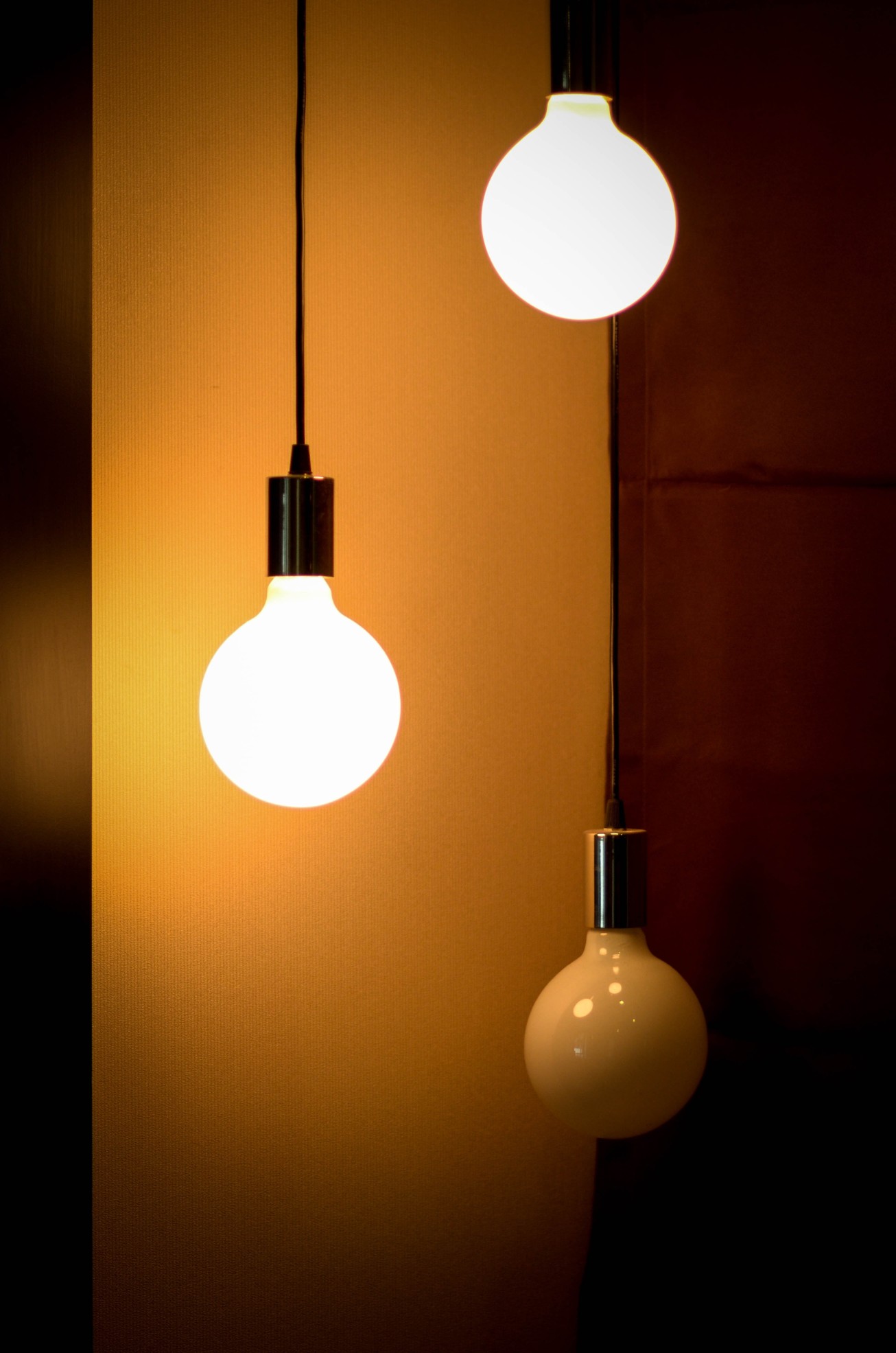
Photo by Tomas Williams on Unsplash

Front door lights are noticeable (especially at night when they are on) and present an attractive and inviting display to the front door and overall curb appeal.

When shopping for front door lights, we tend to choose items mainly for their visual appeal, style and finish. However, as important as this may be, and that which is often overlooked, is that the size of the fixture should be in proportion to the size and ambience of the front door.

A few pointers to keep in mind when buying lights for the front door:

  • Fixtures may appear large in a showroom but may appear dwarfed when mounted next to the front door.
  • Though visually appealing in the showroom, the style and finish may not be complementary to the door.
  • Front door lights are there to add and not overwhelm the appeal.
  • What Is The Correct Size for Front Door Lights?
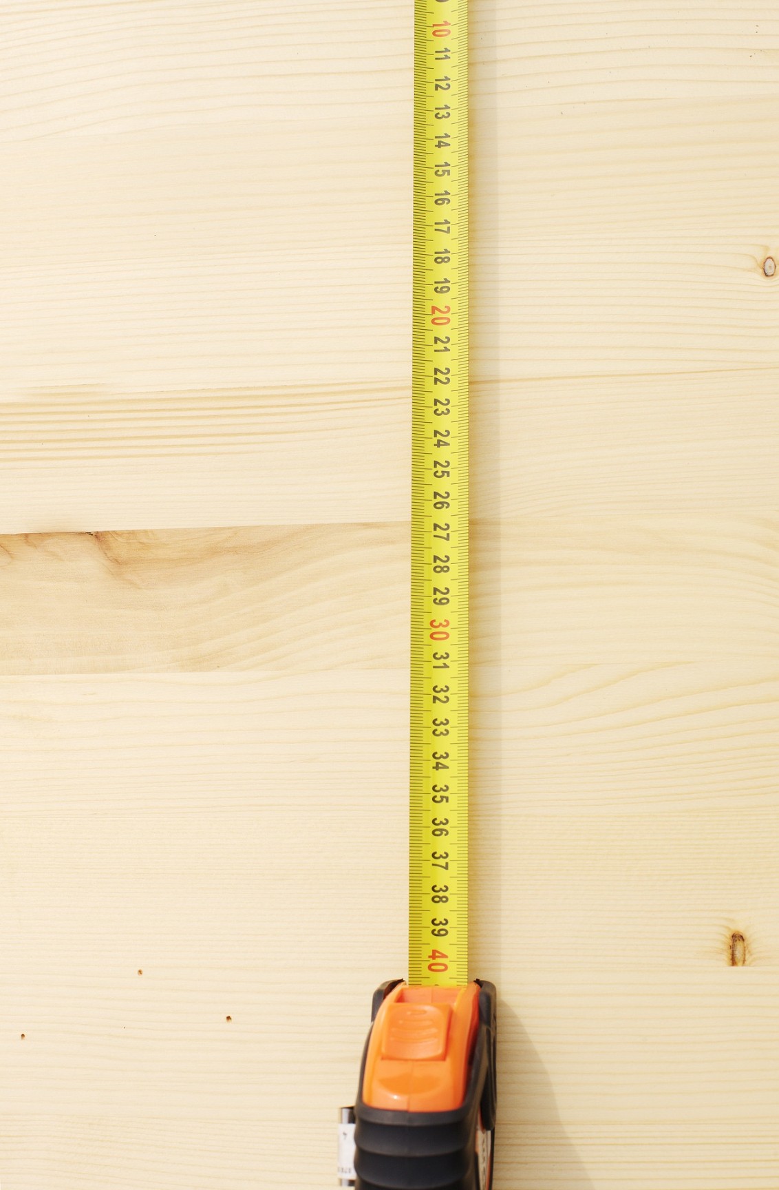
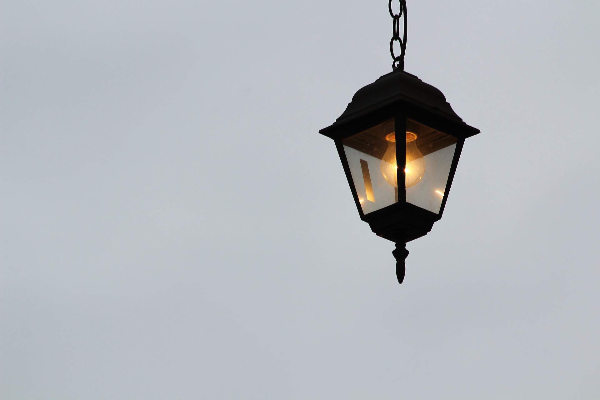
Image by andreas160578 on Pixabay

I.     Before rushing out to go and buy front door light/s, measure the height of the door FIRST.

II.    The size of the light should measure 1/4 to 1/3 the height of the door.

III.  If you decide on two lights, i.e. one on either side of the door, their size should be 1/4 the

height of the door.


  • Tips and Ideas

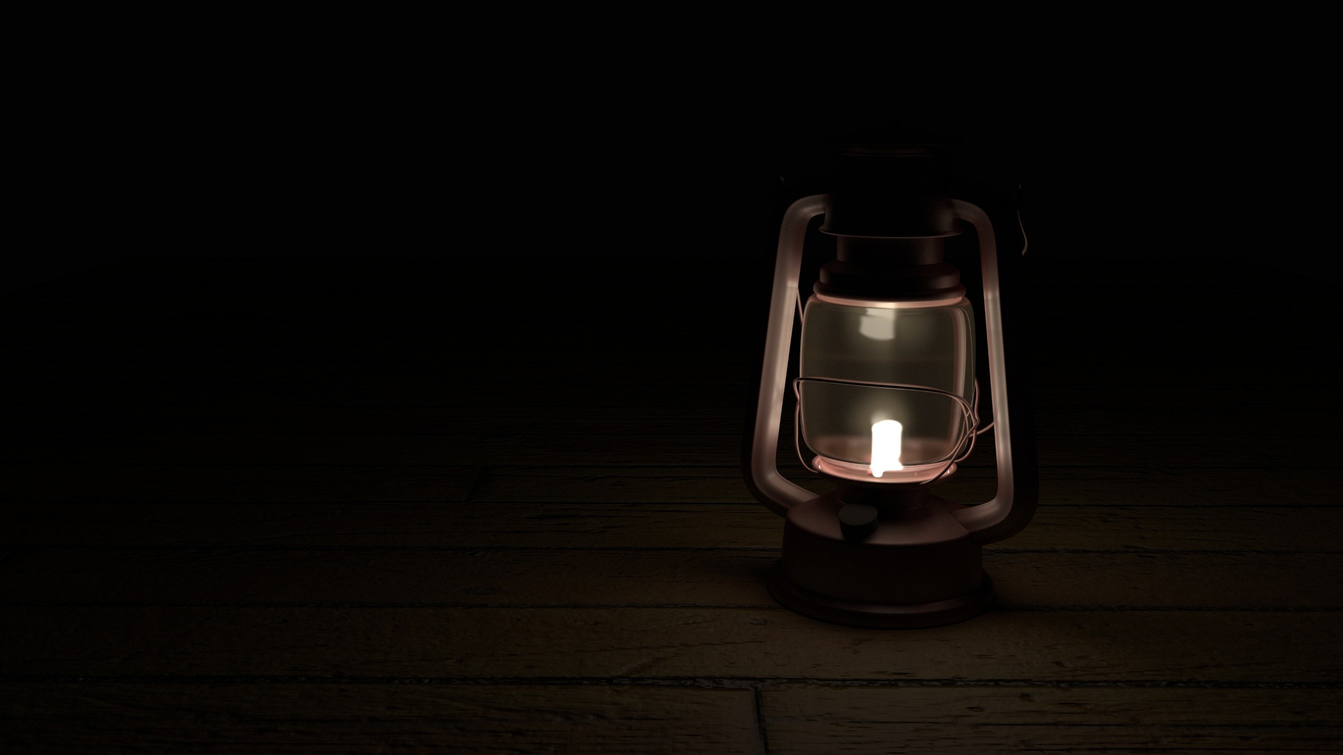
Image by 1465301 on Pixabay

  • You have found the perfect light, but the size is not quite right? It will be perfectly okay to purchase a size somewhat larger, but definitely not smaller. The reason being, that the further the distance away from the door the smaller the light visually becomes.
  • Cut out from a piece of cardboard a piece representing the size of the light. Have someone hold it for you in the position where the light would be attached. Walk away from the front door, about 5 meters, or to the curb. From here you would be able to visualise how the size of the light would appear from a distance.
  • Another method to visualise the light as it would appear from the curb is to fill a smallish bag with paper, and “mould” it into the size and shape of the light you are thinking of buying. You would be able to “mould” the shape into a ball, representing a round light, or rectangle or square.


For more information simply click on https://letsrevamp.com.au/blog where you can follow more on curb appeal and wise words from a Real Estate Agent.

8 Ways to Revamp Your Front Door Appeal

8 Ways to Revamp Your Front Door Appeal

Photo by Tirachard Kumtanom from Pexels

The Importance Of Front Door Appeal When Selling Your Home

Whether the home you are selling is a house, townhouse, apartment or unit, the front door is a component of the general curb appeal. Interested buyers will definitely take serious notice of the front door.

It will evoke either a positive or negative interest, depending on the appearance of the front door, and front door area.

Therefore, do not underestimate the value and importance of front door appeal – “it has the power to attract more buyers and help sell your home.”

 Here to help you are 8 Ways to Revamp Your Front Door Appeal


  1. Ensure the Pathway Leading To The Front Door Has Had A Good High-Pressure Wash
  • Who knows what beautiful tiles or natural slate will be revealed, once all the grime has been washed off?
  • As this is the path leading up to the front door, it too needs to exhibit appeal.

2. Light Up the Pathway to The Front Door

Image by sasint on Pixabay

  •  Ensure all garden path lights are working.
  • If there are currently no lights, invest in a few, to light the way to the front door.
  • Placing the lighting strategically and eloquently to subtly draw attention to the surrounds. Only a few lights will, therefore, be necessary.
  • Good solar lights will cast soft light and will present well too.
  • Keep pathway swept and debris free.

3. The Front Door Appeal

The front door needs to be stately and fit in with the theme of the home.

Photo by Sarah Eaton from Pexels

  • Paint the front door with an inviting and welcoming colour. A colour which will complement the walls and area.
  • Should you have an oak door and decide to revarnish or stain, use a varnish or stain that will emphasise the grain.
  • Or you could opt for a brand-new front door instead.
  • Ensure the doorbell is working.
  • If there is a door knocker, ensure that it is shiny and clean. Rather replace it, if it does not do justice to the new door appeal.
  • Change the door handle to add panache. This will complement and show off the door.
  • Adding a new doormat will make an inexpensive nice addition to the welcoming appeal.
  • Ensure the property number is in plain sight, clean and appealing. If necessary, replace with new numbers, that will be seen clearly, and add to the front door appeal.

4. Paint Window frames and Door Architrave

Photo by Andrew Neel on Unsplash

  • Replace broken windows.
  • Remove old paint from the frames and repaint.
  • All glass panelling and windows are to be sparkling clean.
  • Remove dead insects lying on the window sill inside and outside.
  • Remove all cobwebs.
  • Pack away all window ornaments.
  • Remove plants from the window sill.
  • Ensure the architrave is clean and cobweb free.
  • Does the current architrave colour complement the new/repainted door? If not, repaint.

5. Light up the Front Door Appeal

Image by GoranH on Pixabay


  • For that dramatic effect and defining look at the front door, change the exterior lighting fixtures to flatter the front door appeal.
  • Choosing the right fixture and how to hang or place it, may involve some planning and a bit of maths. Here your property stylist, interior decorator, real estate agent or in-house outdoor lighting expert should be able to advise you or point you in the right direction.
  • Remember to switch the lights on at dusk. You never know when a potential buyer may be going past your property and be captivated by the appealing view.

6.   Add a Plant or Two

Image by hangela on Pixabay

  • Adding plants to your door appeal will not only compliment but add colour, diversity and interest.
  • If you do not have plants, use artificial ones. Artificial plants look so much like the real thing these days.
  • Word of warning though. Do not overdo it on plants.
  • Keep plants and area cobweb
  • Sweep regularly.

7.   The Mail Box

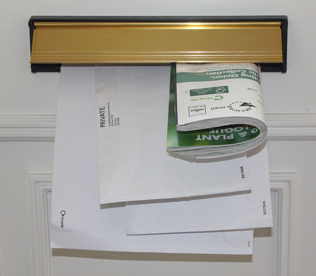
Image by bluebudgie on Pixabay

  • Whether the post box is at the front door or at the curb, it too will need a makeover, repair, or to be replaced.
  • Remove mail, newspaper and advertisement paraphernalia daily.

8. DIY –  Need a little guidance?

Would you like to do most of the styling, staging or decorating yourself, but need some guidance or ideas to help you during this process?  At Let’s Revamp our consulting services are designed to help you get your property ready for sale and ultimately achieve the best possible price in the shortest amount of time.


To receive 5 free property styling tips, or subscribe to our free monthly newsletter, please follow the link to our web site https://letsrevamp.com.au/
The Secret to Attract Home Buyers – Curb Appeal

The Secret to Attract Home Buyers – Curb Appeal

It may surprise you to know that one of the most important secrets to attract home buyers to your house is found outside – namely curb appeal.

Source: pixabay.com; Free photo 1143925 © Steve Holsderfield – Dreamstime.com

What is Curb Appeal?


  • Curb appeal is that which potential buyers see first and foremost of your property.
  • It has the power to draw more buyers to your property and help you sell your house.
  • It reflects the expectation of what your home may look like inside, and ultimately bring more buyers through the door.
  • Curb appeal is the “billboard” message how well the house and yard are cared for and maintained.
  • Apart from being the first visual experience, a potential buyer may have of your home, it also reflects the ambience of the neighbourhood.

Three Levels of Curb Appeal

Keeping regular maintenance on the exterior of your house and garden up to date will certainly save you a lot of work when the time comes to selling your house.

Source: pixabay.com

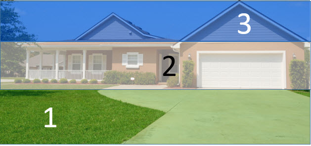
First Level – generally the whole garden area consisting of plants, flower beds, grass areas and pathways.


  •  Replant “bald” patches of grass and keep the grass areas mowed and the edges neatly trimmed.
  • Trim hedges, trees and shrubs.
  • Ensure pathways are clean and litter free.
  • Remove dead plants and weeds.
  • Your Property Stylist or Real Estate Agent will be able to best advise you on landscaping your property or be able to refer a landscaper to you.

Second Level – sidings, the porch, windows, shutters, front door and entryway.

Repair, replace, repaint, clean and maintain –

  • Replace dead light bulbs.
  • Ensure the windows are clean. Inside and out.
  • No cobwebs are to be seen.
  • Dust and sweep.
  • Do not over accessorize the porch area.
  • Trim back overhanging plants and climbers.

Third Level – the roof, the gutters and fascia boards


  • Standing at the curb, scan your house from the bottom up. Assess, what else needs to be done to add curb appeal?
  • Repaint or replace fascia boards.
  • Ensure there are no overhanging branches.
  • Clean, repaint or replace guttering.
  • Ensure the roof is clean and maintained.
  • Give all areas a good wash using a pressure washer or hiring a professional to do the job for you.

Footnote

Improve the curb before listing your home for sale.
A well landscaped and maintained home will fetch you more sale value.
Let’s Revamp Director and Property Stylist interviewed Real Estate Owner Morris Short.
Here is what he has to say about curb appeal – let’s take a listen –


Using Texture in Interior Design

Using Texture in Interior Design

Photo by Sarah Jane from Pexels

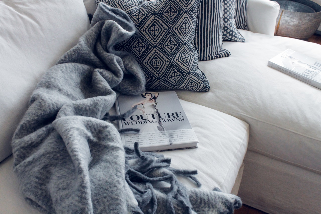
Texture is an important, and often underrated element to consider in Interior Design. The versatility of this element can enable you to still use a neutral colour palette without it seeming too dull as the materials help to create interest and variety within the space.

Some frequently-used textures include:

  1. Timber – Provides the space with warmth, contrast, and an earthy/rustic feel. 


The grains of the timber are so varied that different types of wood can create completely different settings to the space. E.g. Oak is often used in Scandinavian designs, whereas the warmer-toned Walnut brings about more of an industrial feel to the space.


2. Fabrics such as wool, cotton and linen provide a space with comfort and relaxation.


Photo by Isabelle Taylor from Pexels


These can be swapped around depending on the season. E.g. Wool for keeping warm in winter and linen for keeping cool in summer.


3. Metal – Brass, steel, copper, etc. provide elegance and cooling qualities


Photo by Jean van der Meulen from Pexels

If you are designing a space that feels quite warm (due to either the timber, sunlight getting in and/or paint colour) you can use different metals to contrast these tones and make the space feel a lot cooler.

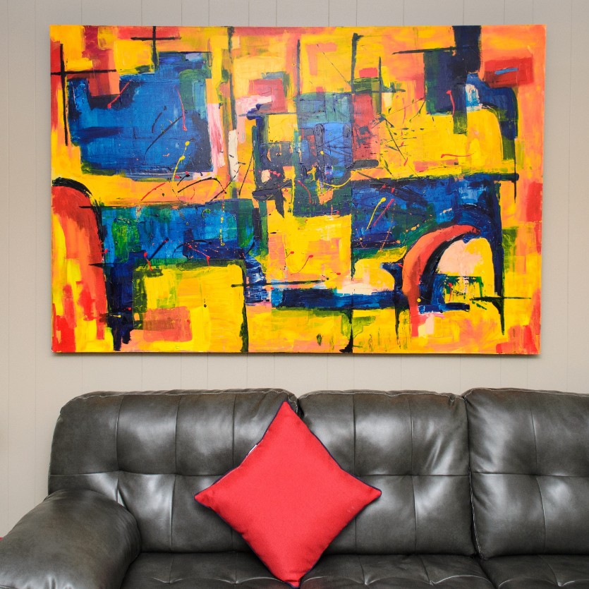
4. Artwork provides colour, interest, patterns and movement.


Photo by NeONBRAND on Unsplash


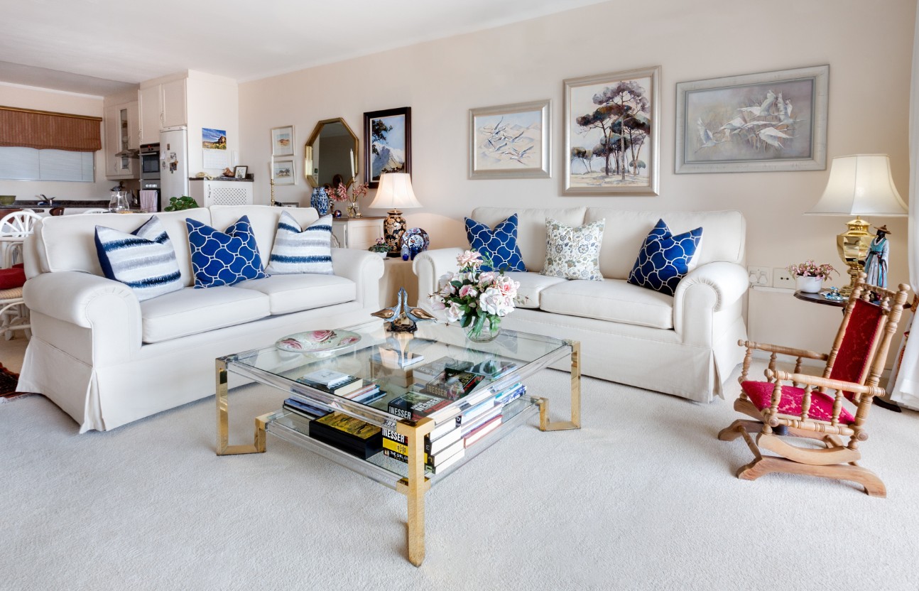
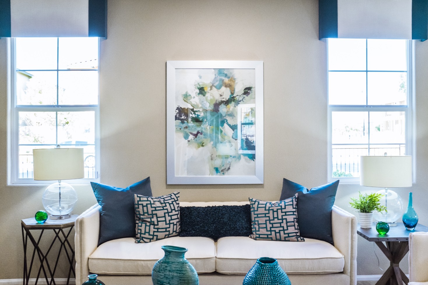
When selecting artwork, it is important to think about the rest of the space and how it can complement the other pieces in the room. Using texture through artwork can be very effective as it is often the focal point of the space and the first thing people see when entering a room.


Visit https://letsrevamp.com.au/gallery/ to see how we’ve played around with texture in some of our recent projects!


To Paint Or Not To Paint Before Moving In

To Paint Or Not To Paint Before Moving In

You have the keys to your new home.

You may be contemplating whether to paint or not to paint before moving in.

STOP! Don’t Paint – Yet

Though it may seem to be the perfect time to do so, it is not ideal.

Let’s find out why?

Same Colours Vary

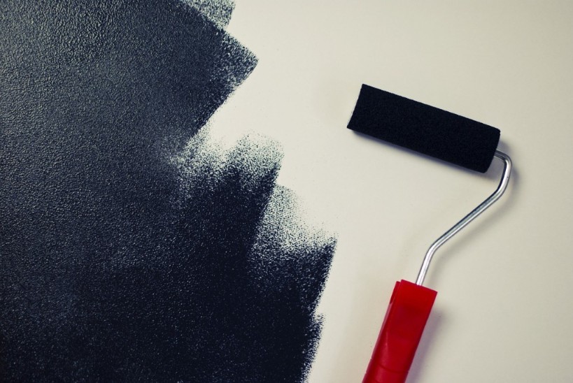
Photo by rawpixel on Unsplash

There are literally thousands of paint colours, tints, tones and shades.

Colours remain the same. Yet, they will vary, from house to house and room to room, according to the light source of the room or area.

You may have seen a colour that you absolutely love; but will it work in your new home?

Moving In

Let’s assume you have painted the walls, while your new home was empty.

By this time you would pretty much have a good idea what is to go where once the movers arrive.

At last the big day arrives.

….and you move in.

This could well be the moment you realise that the colour of your lounge suite does not go well with the favoured (new) colour on the wall.

The rug in the bedroom somehow does not look quite right. It now makes the room seem darker, even smaller. At your previous home, it had quite the opposite effect.

You did measure the entrance area. All items will and do fit in with room to spare, and yet it looks small, overcrowded and uninviting.

So what went wrong?

STOP! Before You Paint

Your previous home was styled and decorated according to the features, colours, ambient light and designs present.

In your new home, with its fresh coat of paint, you could have assumed all will be amazing, good and new.

Now that you have moved in, it does not quite have the look or appeal you had in mind.

Why?

The answer is found on the newly painted walls.

Moved In – Now Paint Those Walls

Only once you have moved into your new home, will you be able to ascertain what colour/s on the walls would actually work best to complement your artworks, rugs, lounge suites, dining room suites, accessories etc.

Picking the wall colour/s once all your things are inside your home, though you may feel is not ideal, would be the best course of action to take.

4 Super Size Tricks for Small Living Spaces

4 Super Size Tricks for Small Living Spaces


Why do we assume that everything in your small living space has to be tiny too?

Let us think outside the small space and step away from the norm to bold, daring and inspiring.


#1 Let’s Add a Room-Sized Rug

  • Adding a room-sized rug to a room will actually define how much floor space there really is.
  • You could go for darker colours, but neutrals and softer lighter colours will make the room feel more spacious.
  • Yes, you can choose a rug with patterns. But preferably choose a rug with subtle patterns. Overwhelming patterns will create “busy” and you do not want that.
  • Stay away from rugs with borders. It will make the floor seem smaller, and hinder visual transition from rug to floor and vice versa.
  • Stripes would be good:
    • Horizontal stripes make the room look bigger.
    • Vertical stripes make the room look longer.

#2 Let’s Add a Super-Size Mirror

“Mirror, mirror on the wall” you are the smartest illusionist of them all.” Mirrors create the illusion of “more”.
  • They give the impression of infinity and space.
  • They give the impression of more furniture and accessories.
  • Mirrors reflect light.
  • Add a mirror as the backsplash in a kitchen.
  • Use mirrors against a bathroom wall.
  • When decorating with mirrors ensure what is reflected is great to look at.
  • Mirrors can be installed in the back of built-ins, to create depth.
  • Mirrors can be put onto cupboard sliding doors.
  • Do not just put a mirror up for the sake of putting up a mirror. Give it careful thought as to why you are putting it up and what you want to achieve.

#3 Let’s Add Oversized Wall Art

 No more “hundred and one” small framed pictures on the wall.
  • Go for oversized statement-making art pieces.
  • Go for funky modern even abstract prints. Not too “busy” though.
  • Try your hand at DIY artwork.
  • Oversized wall art will make a space seem bigger.

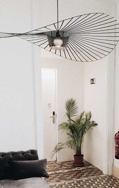
#4 Let’s Go Big on the Lights 

  • Lights hang above your living area and do not take up floor space.
  • Given this fact it is the perfect reason to add extraordinary expressiveness to lights.
  • Change current shades to exotic ones.
  • Pendants lights give height to a room.
  • Lights are focal points and catch the eye when walking into the room.