Colour Combinations That Never Go Out of Style

Colour Combinations That Never Go Out of Style

Colour Combinations That Work and Never Go Out of Style


Fail Safe Colour Combinations

If you want to transform your interiors and make them look stunning, you have to nail colour combinations. If the tones in your room don’t work together, then the room will look awkward and unattractive – and you don’t want that!

Fortunately, getting colours right is a breeze. Here are some fail-safe colour combinations that will enable you to equal the results of a professional property stylist or decorator.

Neutrals…

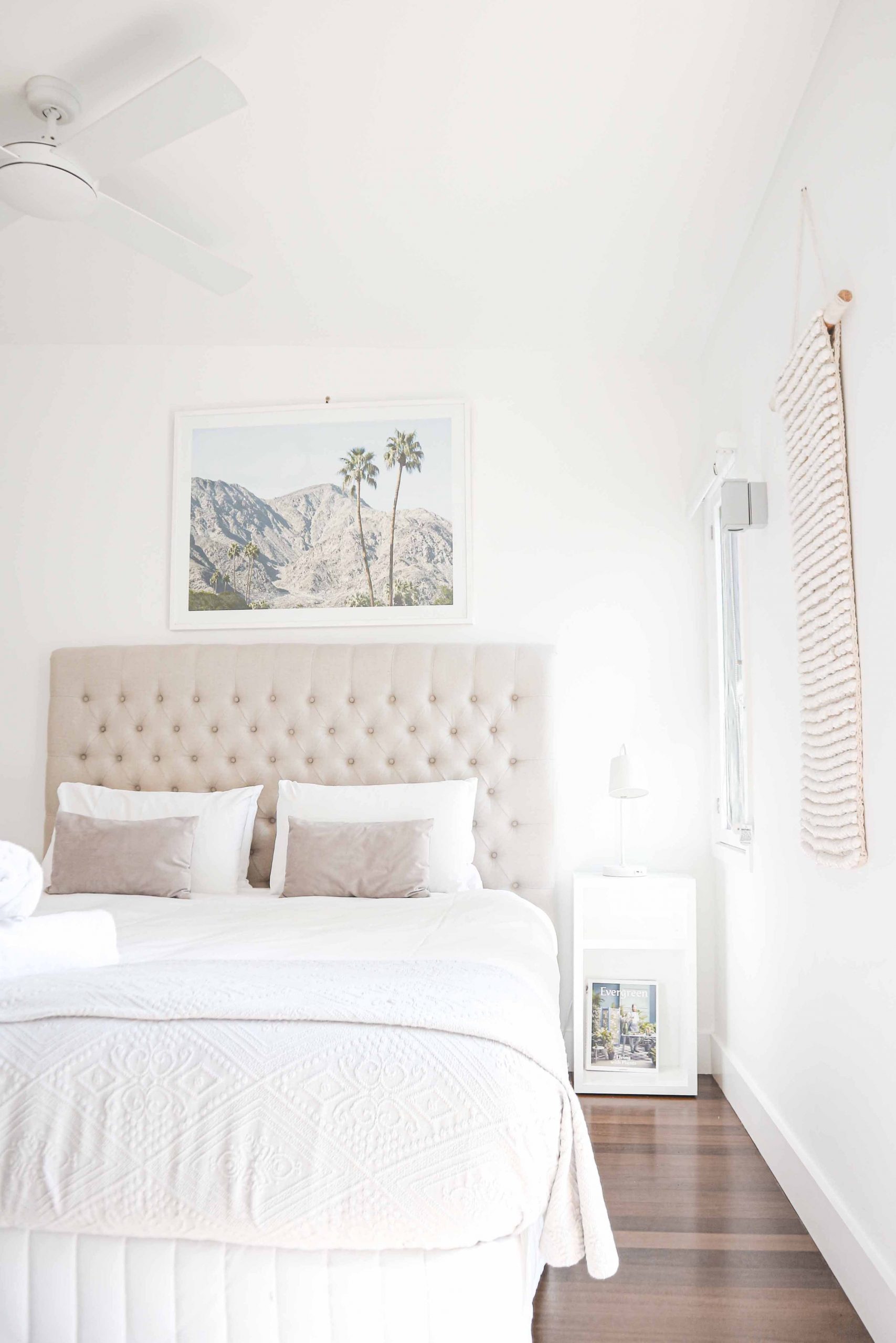
Neutrals are the most sought after colours as they are versatile and can be combined with almost any other colour.

Neutrals bounce light and make areas appear larger.

Neutrals are calming and sophisticated.

Neutral – Grey


Greys of all tones and shades are extremely popular. They coordinate well with other colours and are a superb backdrop for furnishings.

Note:
Always consider paint undertones and do sample spot painting before choosing your colour.

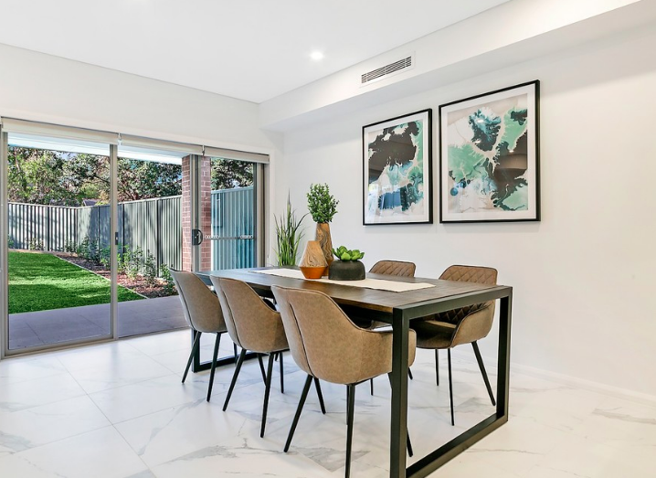
Neutral grey is the ideal colour combination for anyone who wants to create a delicate living room or entryway. 

Here are the four colours you should use:

● Snow White (Pantone: 11-0602)
● Alloy (Pantone: 16-3915)
● Black onyx (Pantone: 19-4003)
● Glazed ginger (Pantone: 18-1154)

This combination of colours allow you to create a suave and sophisticated look in your lounge, without having to worry about clashing. The scheme is ideal for any 21st century home and interacts beautifully with natural light.

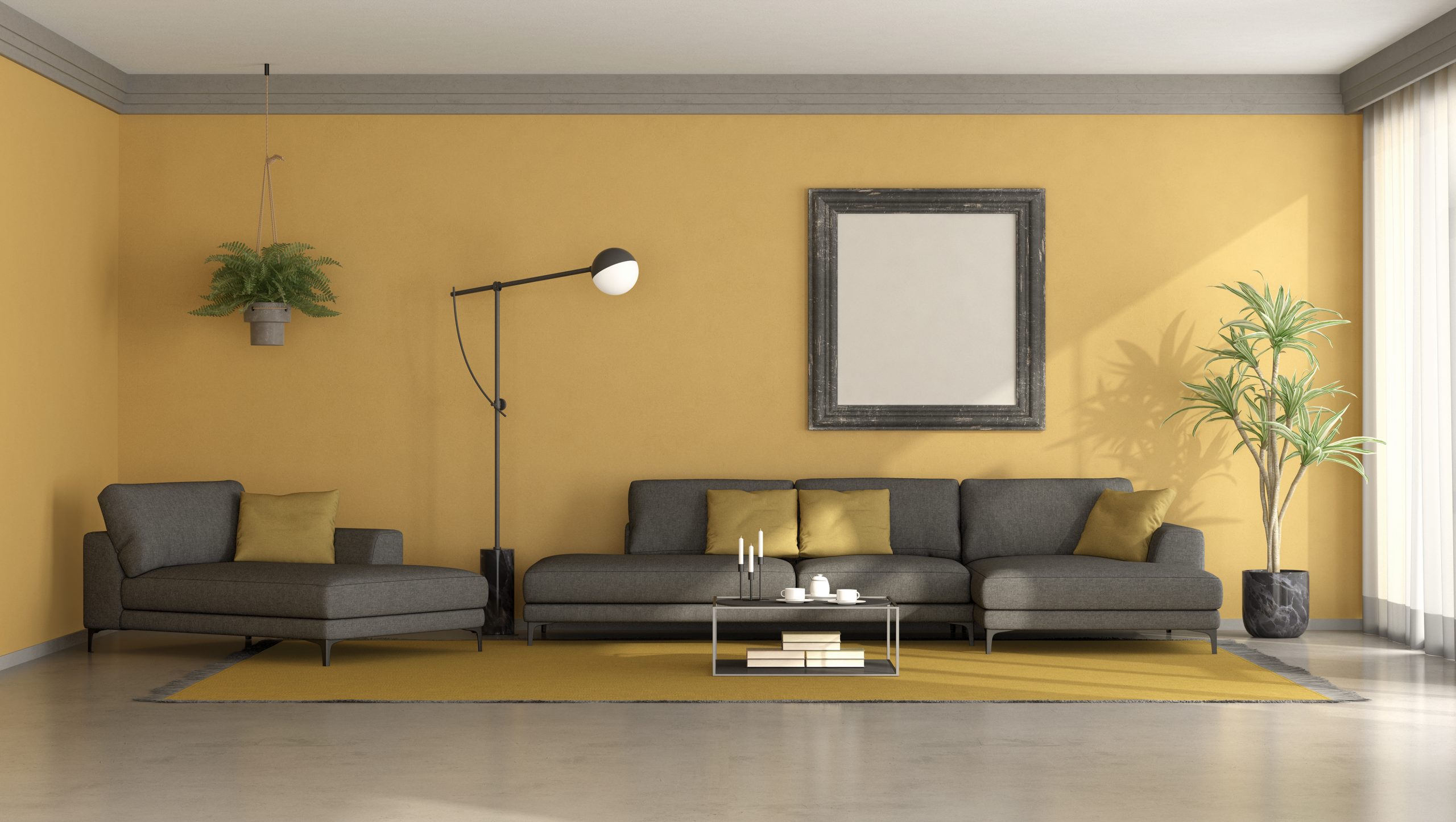
Neutral-Yellow


If you want something a little warmer and lighter, you might want to try the neutral-yellow living room.

The great thing about this paint scheme is that you can use it to bring warmth and style into your home. Make signature elements ochre and then apply the neutrals to your heart’s content. 

Here are the colours:

● Ochre (Pantone: 14-1036)
● Pumice stone (Pantone: 14-002)
● Simply taupe (Pantone: 16-0906)
● Sparrow (Pantone: 18-1404)

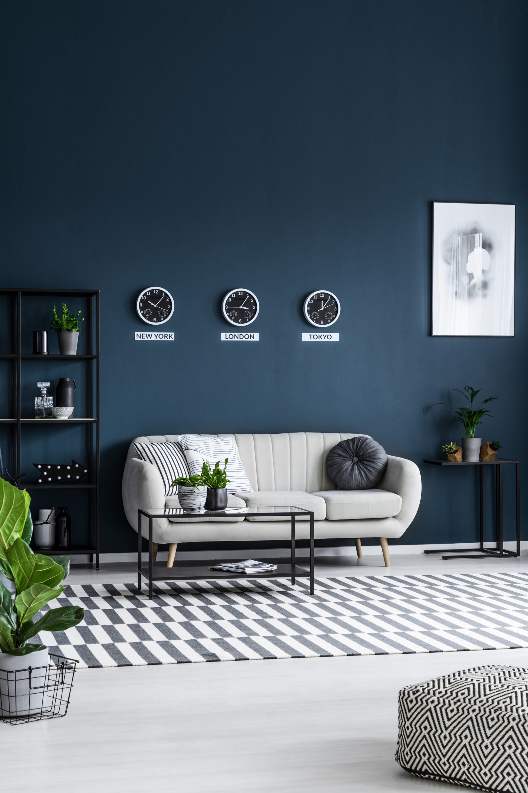
Blue and White


Do you want your living room to have a regal look? Then why not try a blue and white theme?

Create an elegant room that contrasts beautiful lightness with moody, vibrant blues and blacks.

In fact, Pantone Colour Institute had chosen Classic Blue as the colour of the year 2020.

The colours are: 

  • Dark Sapphire (Pantone: 19-4020)
  • Jet Black (Pantone: 19-0303)
  • Snow White (Pantone: 11-0602)
  • Vintage Indigo (Pantone: 19-3929).

My Writing Blog

Follow Along

Contact Let's Revamp Property Styling and Decorating

Tel: 02 9659 2556

info@letsrevamp.com.au

Some Call It A Sofa. Some Call It A Couch. Which Is It? – A Sofa Or A Couch?

Some Call It A Sofa. Some Call It A Couch. Which Is It? – A Sofa Or A Couch?

What’s The Difference? Is There A Difference? Apparently, Yes!


https://pixabay.com/en/couch-sofa-furniture-447484/

Though the two are actually very similar in appearance and characteristics and often referred to interchangeably, differences do exist. They are not synonymous.

ORIGIN

There is no similarity whatsoever in the origin of these two pieces of household furniture. A bench covered with blankets and cushions originated from the Arabic “suffah” – hence sofa. Sofa is a place to sit down more so than to lie-down on.

From the French comes “couche”, a popular piece of furniture used in the Victorian era and when translated means to lie down.


Photo by Sarah Pflug from Burst

STRUCTURE, SHAPE AND SIZE

The other notable difference between a sofa and a couch is in the size.

Sofas provide seating space for four or more and therefore occupy more floor space. Something to consider when you purchase a sofa for your lounge/living room or living space.

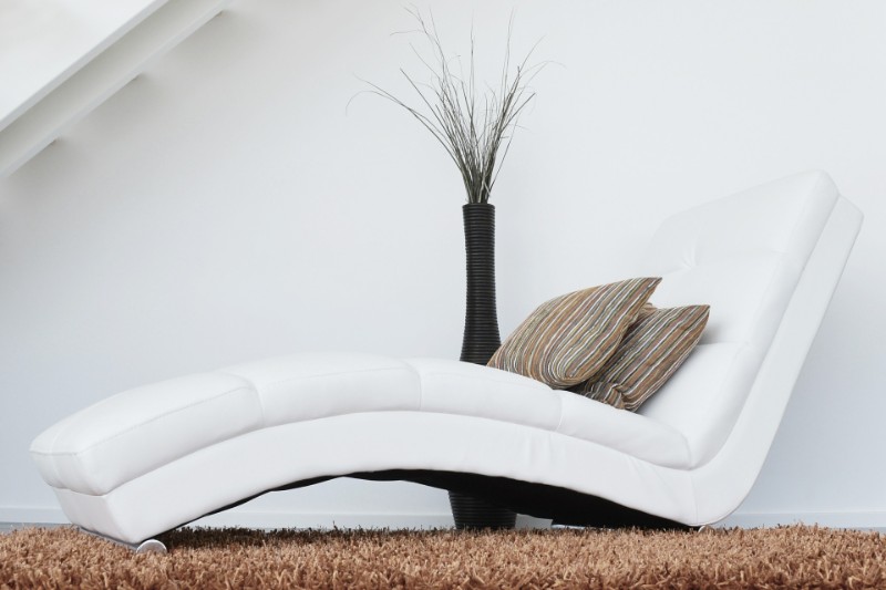
Sofas are generally larger and plush and usually have two armrests and a full uniform back, whereas a couch usually has one armrest, or none (not so much these days though) – and tapered back. Having one or no armrest lends itself to spaciousness so it can be used to lie down on. Couches can comfortably seat two or three people, though seating can be little more compact than that of the sofa.

FUNCTIONALITY

 In terms of functionality, the difference between a sofa and a couch is also notable.

Couches are generally more functional and used in casual and informal settings. For example shared family space, cozy living space, living room or entertainment room. It would be the go to place to sit, lie down or simply relax after a busy day.


  • Sofas on the other hand are more formal, and resonate elegance and classiness. Probably more suited to formal lounge areas and space, and bearing in mind they tend to take up more space than a couch.

ACCESSORISE

Most definitely you will need to accessorise your sofa and/or couch since they are housed within your living space and form part of the bigger presentation.

How and what you accessorise with it purely up to you and the statement you wish to make – i.e. whether formal lounge or living room. If you are unsure, contact a decorating stylist/interior decorator.

Use display cushions that are appealing to the area. With the couch add a throw for those cooler nights. A throw can also be added to the sofa.

Complement the area with a pouf or ottoman  too.

Identifying your Style

Identifying your Style

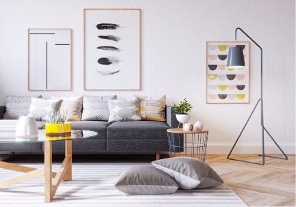
From Contemporary to Mid-Century Modern to Scandinavian, there are so many different styles of Interior Design out there and identifying which one resonates with your personal taste is important in order to achieve the vision you have for your home. You may need to convey your taste to your Designer, or if you’re working on your own, having a clear understanding of your personal style will help you to narrow down the correct suppliers in order to help you find the most suitable items for your space.

Step 1: Write down a list of colours, textures and patterns you like

This is a great starting point to come back to later, after you’ve done more research on which materials correlate with which styles. For example, if you are leaning towards pastels, light/oak wood and abstract patterns you may be describing Scandinavian without even realising!

Step 2: Use Pinterest to find common themes in your pinned images

Pinterest is one of the best ways to develop a better sense of your style. Often we will see things that we like, but not realise that there is a common theme until we see them all side by side. I would recommend pinning any images you love for whatever reason and seeing if there are any resemblances between the images afterwards.

Step 3: Research different interior styles


Scandinavian

Mid-Century Modern

Modern/Contemporary

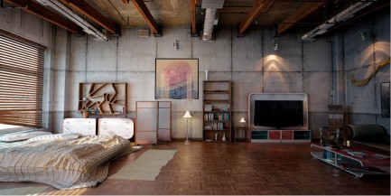
Industrial

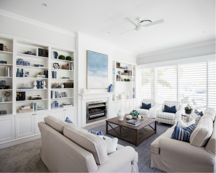
Hamptons

Other popular styles:

  • French Country
  • French Provincial
  • Rustic
  • Bohemian
  • Minimalist
  • Traditional
  • Farmhouse
  • Hollywood Regency


Step 4: Take another look through what you did in Steps 1 & 2

At this stage after researching your own preferences and the different styles out there you should be able to find a correlation or pattern of some sort. Of course it is still very general and you may not like every piece used in an image but it is definitely a great starting point in identifying what you are drawn to and gather a stronger idea of how you’d like your home to look. Happy Styling!


Style and Interior Decorate Your Rental Apartment

Style and Interior Decorate Your Rental Apartment

Style and Interior Decorate Your Rental Apartment

 1. The Rental Agreement

 A lease agreement, is property that is leased for a period of six to twelve months or longer. The lease period and monthly rent documented cannot be changed prior to the end date of the agreement.

 A rental agreement on the other hand is on a month to month basis, with no long term requirements. Any changes can therefore be made after one month.

                                                                                                                                                   (Photo by rawpixel on Unsplash)

2.  Make It Your Own, Make It Your Home, And Get Creative!

Your boxes are packed and you’re are ready to move in. You have signed all the legal documents, understood the terms of agreement and have the keys to your place.

Moving into a place that you do not own, the agreed upon terms and conditions determine the changes you are able to make to the rented property.

You also do not want to spend too much money on something that does not belong to you, knowing too that you will not be living there permanently.

Yet, until such time you need to live there and call it home.

The good news is, that you can actually make huge changes without breaking your budget or the terms of agreement, to give it a well-deserved personal touch and make over.


Our home styling professionals look forward to assist you with your professional interior styling or home staging needs in the Sydney area.

3.  Decorate/Style Your Rental Home.

(The possibilities are endless)

Please note:

  • Before making any changes ensure that you are within the parameters of the legal signed Terms and Conditions.

Apartment therapy

Scenario – bland, poor light, dull rental beige walls.

The floor – laminated flooring. Some areas were too well worn, and not in a very good condition. The landlord felt they were still good enough. So I was faced with “blah” flooring.

This called for definite non-invasive apartment therapy.

Image Source

Armed with a bucket of warm water, a cloth, with a few drops of dishwashing liquid soap, I proceeded to wash the walls from the top to bottom. With a damp cloth I cleaned the laminated flooring, a few times over. What a complete workout (ha ha) and difference this had made to the visual of the apartment.

Entrance – the Lounge

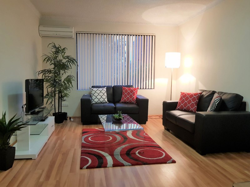
 Entrance to my one bedroom apartment – the lounge!

After washing the walls and floors, the rental beige walls were more accommodating, and the golden brown hues of the laminated floor really added a richness and natural flair to the space.

Imagine this area without the artificial plants – artificial pants are just such a plus factor to bring balance and nature to a living space.

The vertical blinds were drab, so I replaced them. These are easy to purchase from your hardware store, or on line.

To lend balance to the wall with the window, I placed at one end a large artificial plant and at the other, a floor lamp with a beige lamp shade.

Centred is the claret or maroon rug, graced by rings of grey, black and ivory.

The one sheet glass coffee table presents sophistication, stylishness and renders spaciousness. A good choice for small areas.

The low line and chic entertainment unit in high gloss white, with a glass tabletop and glass middle shelf combines elegance and functionality.

The welcoming comfort and classiness of the two black two seaters sofas, certainly adds splendour to the living space.

The display cushions completed the look of welcoming and home and stylishness.

You have just got to love your bedroom

I started by changing the door knobs of the cupboards. I kept the replaced ones in a safe place to as to screw them back on when I vacated the apartment. I chose quite large round black doorknobs. They immediately added boldness to the room.

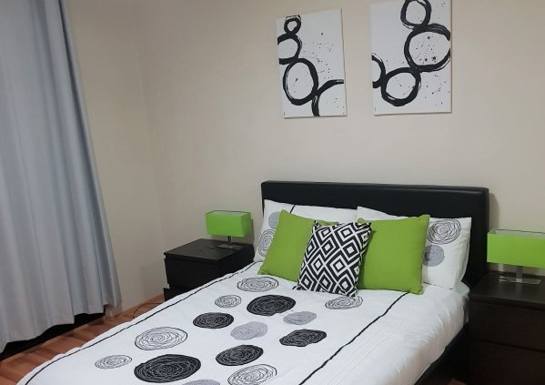
I strategically placed my black faux leather double bed over the damaged area of the floor. I suppose I could have made use of a carpet, but the laminated flooring (the good areas) was a beautiful blend of rich golden-browns, I decided against it, and wanted to make use of the natural feel that they exhibited. With the badly worn part successfully hidden under the bed, I was able to do just that.

Because grey is a colour without a colour, it just blends in with the surroundings. Hence the use of matt grey curtains for the patio door. This blended well with the beige wall, and actually made the wall quite unnoticeable, and made the room seem larger than what it really was.

I bought canvases and painted my own circular abstracted wall art, with a few splashes of black. A job well done, even if I do have to say so myself.

The white duvet cover, with varying circles of grey and black simply looked stunning. So we now have large black circular door knobs (I do apologise for them not being in the photo) abstract circular art work and circles reproduced on the duvet cover and pillows. Modern and picture perfect.

Adding modern appeal to my bedroom, I added stylish contemporary black, two drawer bedside tables, featuring bedside table lamps, with bright green rectangular lampshades on chrome stands. This created quite a remarkable stylish look.

The green colour of the lamp shades are replicated in the mono green display cushions.

To finish off my picture perfect bedroom, I added a black and white square patterned display cushion. This defiantly enhances and simultaneously brings distraction from what could have been an overdose on circular patterns.

Rental Space my Home

Though this rental apartment was not exactly pristine, though it ticked all the boxes I required for accommodation close to work, I was able to transform the otherwise drab, lifeless and dull place into a sunny and welcoming home.

Brighten up with purple

Brighten up with purple

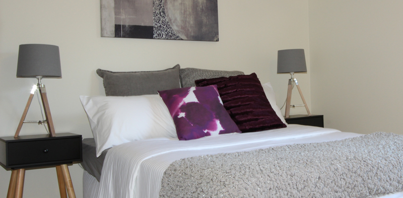
A great bedroom in The Hills District.  The subtle use of purple adds a layer of sophistication to the neutral tones in this bedroom.  #hillsdistrict #purple #guestbedroom